
Line chart
definition - mistake - related - code
A line chart or line graph displays the evolution of one
or several numeric variables. Data points are connected by straight line
segments. It is similar to a scatter plot
except that the measurement points are ordered (typically by their
x-axis value) and joined with straight line segments. A line chart is
often used to visualize a trend in data over intervals of time – a time
series – thus the line is often drawn chronologically.
The following example shows the evolution of the bitcoin price between April 2013 and April 2018. Data comes from the CoinMarketCap website.
# Libraries
library(tidyverse)
library(hrbrthemes)
library(plotly)
library(patchwork)
library(babynames)
library(viridis)

# Load dataset from github
data <- read.table("https://raw.githubusercontent.com/holtzy/data_to_viz/master/Example_dataset/3_TwoNumOrdered.csv", header=T)
data$date <- as.Date(data$date)

# plot
data %>%
  ggplot( aes(x=date, y=value)) +
    geom_line(color="#69b3a2") +
    ggtitle("Evolution of Bitcoin price") +
    ylab("bitcoin price ($)") +
    theme_ipsum()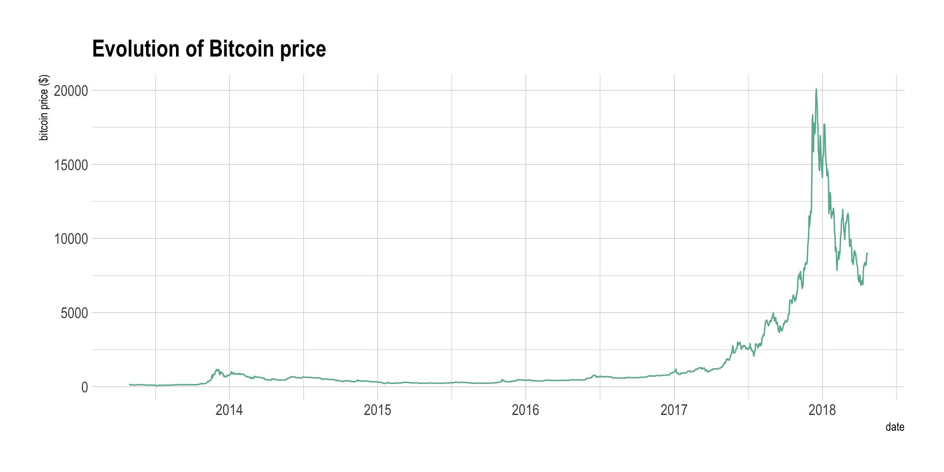
Note: You can read more about this project here.
Line chart can be used to show the evolution of one (like above) or several variables. Here is an example showing the evolution of three baby name frequencies in the US between 1880 and 2015. Note that this works well for a low number of group to display. With more than a few, the graphic get cluttered and becomes unreadable. This is called a spaghetti chart and you can read more about it here.
# Load dataset from github
don <- babynames %>%
  filter(name %in% c("Ashley", "Patricia", "Helen")) %>%
  filter(sex=="F")

# Plot
don %>%
  ggplot( aes(x=year, y=n, group=name, color=name)) +
    geom_line() +
    scale_color_viridis(discrete = TRUE) +
    ggtitle("Popularity of American names in the previous 30 years") +
    theme_ipsum() +
    ylab("Number of babies born")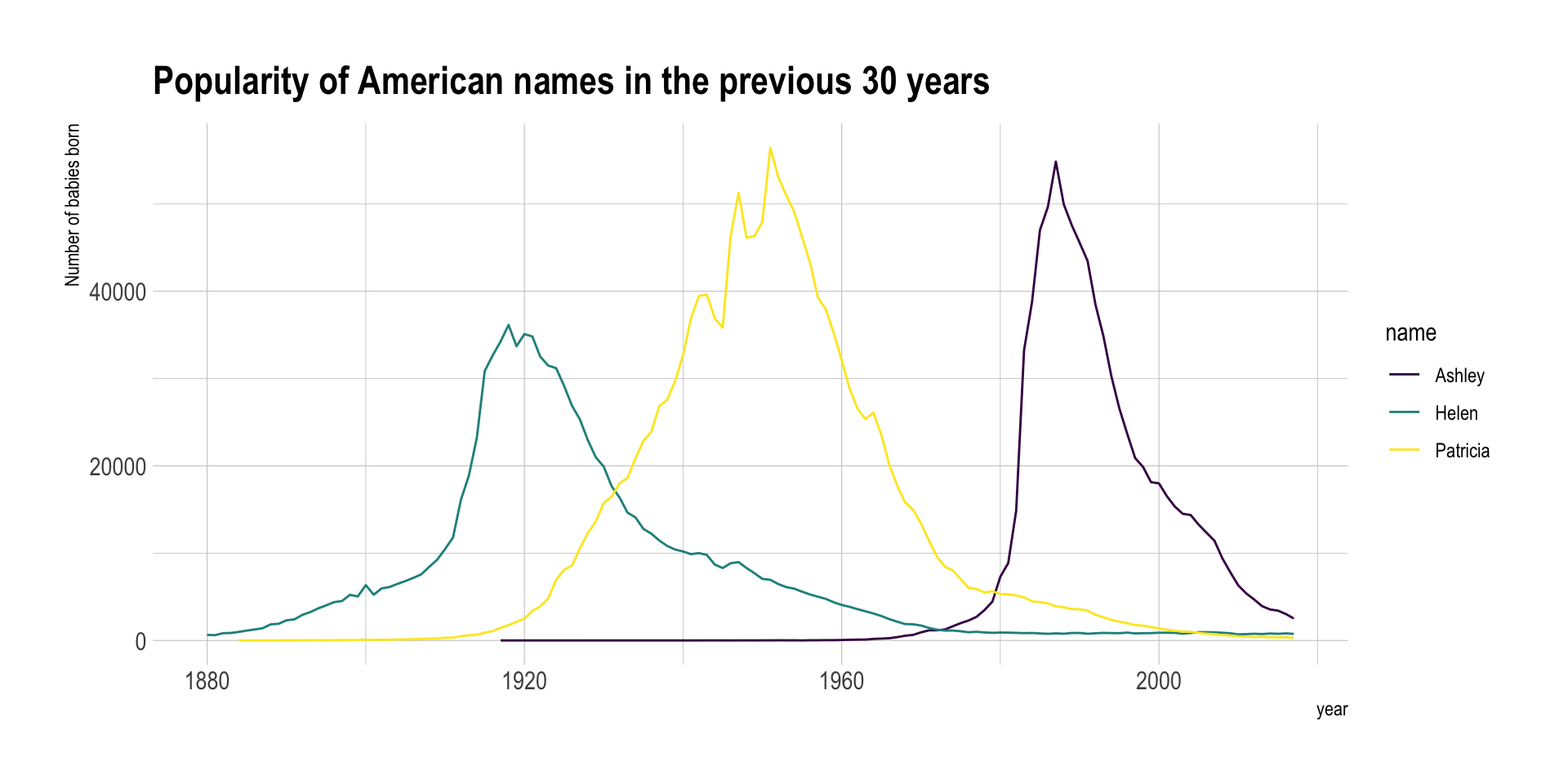
If the number of data points is low, it is advised to represent each individual observation with a dot. It allows to understand when exactly the observation have been made:
data %>%
  tail(10) %>%
  ggplot( aes(x=date, y=value)) +
    geom_line(color="#69b3a2") +
    geom_point(color="#69b3a2", size=4) +
    ggtitle("Cuting") +
    ylab("bitcoin price ($)") +
    theme_ipsum()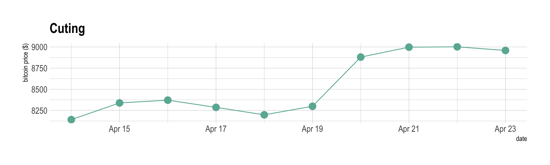
Note that lines are also used to show trends in a scatterplot. Here is an example using Smoothed conditional means and showing confidence interval around it:
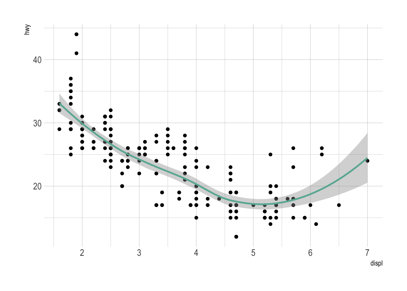
Note: this example comes from the ggplot2 documentaion.
The line chart is subject to a lot of discussion concerning potential caveats. Here is an overview:
p1 <- data %>%
  tail(10) %>%
  ggplot( aes(x=date, y=value)) +
    geom_line(color="#69b3a2") +
    geom_point(color="#69b3a2", size=4) +
    ggtitle("Not cuting") +
    ylab("bitcoin price ($)") +
    theme_ipsum() +
    ylim(0,10000)

p2 <- data %>%
  tail(10) %>%
  ggplot( aes(x=date, y=value)) +
    geom_line(color="#69b3a2") +
    geom_point(color="#69b3a2", size=4) +
    ggtitle("Cuting") +
    ylab("bitcoin price ($)") +
    theme_ipsum()

p1 + p2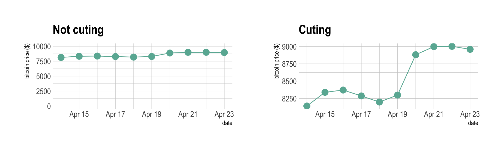
Data To Viz is a comprehensive classification of chart types organized by data input format. Get a high-resolution version of our decision tree delivered to your inbox now!

A work by Yan Holtz for data-to-viz.com


