Evolution of the bitcoin price
A few data analytics ideas from
Data-to-Viz.com


This document gives a few suggestions to analyse a
dataset composed by two ordered numeric variables. It considers the
evolution of the bitcoin price between
April 2013 and April 2018.
This dataset has been built using
the crypto R package
that allows to access the CoinMarketCap website. The first
column, date, represents an ordered numeric variable. The
second, value gives the bitcoin price. This dataset is
available on github.
# Libraries
library(tidyverse)
library(hrbrthemes)
library(DT)
library(plotly)
library(kableExtra)
options(knitr.table.format = "html")

# Load dataset from github
data <- read.table("https://raw.githubusercontent.com/holtzy/data_to_viz/master/Example_dataset/3_TwoNumOrdered.csv", header=T)
data$date <- as.Date(data$date)

# Show long format
data %>%
  head(5) %>%
  kable() %>%
kable_styling(bootstrap_options = "striped", full_width = F)| date | value |
|---|---|
| 2013-04-28 | 135.98 |
| 2013-04-29 | 147.49 |
| 2013-04-30 | 146.93 |
| 2013-05-01 | 139.89 |
| 2013-05-02 | 125.60 |
#Line plot *** The most comon way to represent that kind of dataset is probably to produce a line plot. It allows to give a good overview of the bitcoin price on the period, reaching a value of 20,000 $ in december 2017.
data %>%
  ggplot( aes(x=date, y=value)) +
    geom_line(color="#69b3a2") +
    ggtitle("Evolution of Bitcoin price") +
    ylab("bitcoin price ($)") +
    theme_ipsum()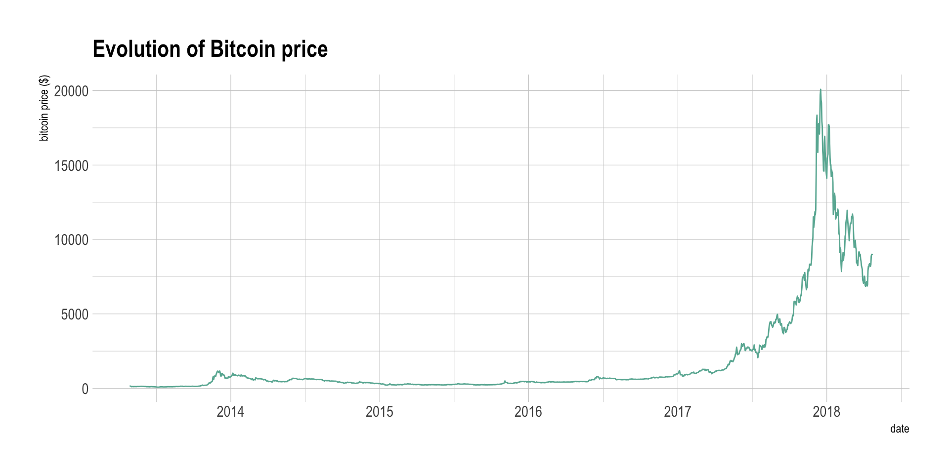
#Area chart *** Even if the line chart is a very good way to convey the information, when only one variable is represented like here, the plot can appear to be slightly empty. Thus, an interesting alternative is the area chart. It is basically the same thing, except that the area between the X axis and the line is filled.
data %>%
  ggplot( aes(x=date, y=value)) +
    geom_area(fill="#69b3a2", alpha=0.5) +
    geom_line(color="#69b3a2") +
    ggtitle("Evolution of Bitcoin price") +
    ylab("bitcoin price ($)") +
    theme_ipsum()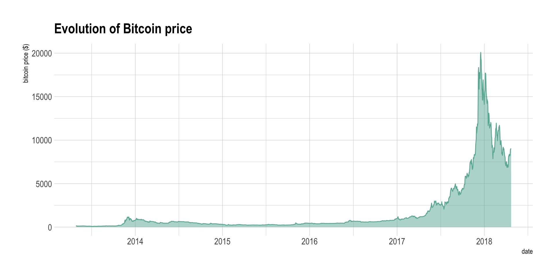
Note that using the same color for the filled area and the line is often a good looking choice, with a bit more transparency for the filled area.
#Interactivity *** Using interactivity gives a great added value to your line or area chart. Indeed, it is very useful to ba able to zoom on a specific time slot of interest on the graphic. For instance, have a look to what happened in 2014: bitcoin already experienced a huge evolution, comparable to 2017 in terme of relative evolution, but not mediatised at all.
p <- data %>%
  ggplot( aes(x=date, y=value)) +
    geom_area(fill="#69b3a2", alpha=0.5) +
    geom_line(color="#69b3a2") +
    ggtitle("Evolution of Bitcoin price") +
    ylab("bitcoin price ($)") +
    theme_ipsum()
ggplotly(p)
#Few points? Use connected scatter *** If you have just a few point in your dataset, you probably want to use a connected scatterplot instead. it is basically the same thing where each individual point is represented. It greatly helps to understand when observation have been made. Let’s consider the last 10 observation of the bitcoin dataset:
data %>%
  tail(10) %>%
  ggplot( aes(x=date, y=value)) +
    geom_area(fill="#69b3a2", alpha=0.5) +
    geom_line(color="#69b3a2") +
    geom_point() +
    ggtitle("Evolution of Bitcoin price") +
    ylab("bitcoin price ($)") +
    theme_ipsum()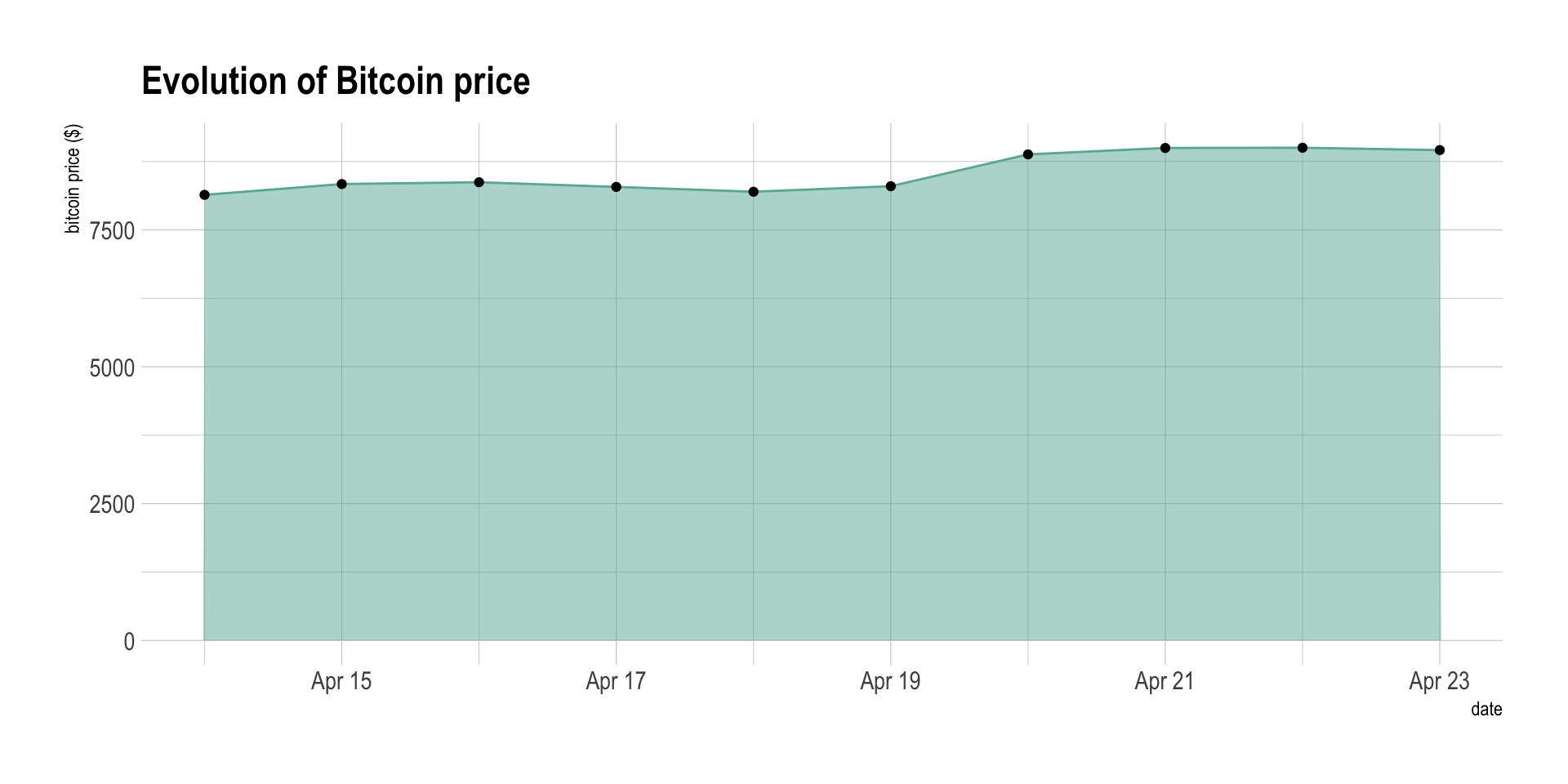
#To cut or not to cut? *** The previous chart can be a bit frustrating. It is indeed hard to study the evolution of the bitcoin in this graphic since the price ranges between 7,500 and 10,000 dollars in this period, when the Y axis ranges between 0 and 10,000. In this case, it is a good practice to cut the Y axis to zoom on the variation. This subject is subject to many debates in the dataviz community and you can read more about it in the dedicated page.
data %>%
  tail(10) %>%
  ggplot( aes(x=date, y=value)) +
    geom_ribbon(aes(ymin=8000, ymax=value),  fill="#69b3a2", color="transparent", alpha=0.5) +
    geom_line(color="#69b3a2") +
    geom_point() +
    ggtitle("Evolution of Bitcoin price") +
    ylab("bitcoin price ($)") +
    theme_ipsum()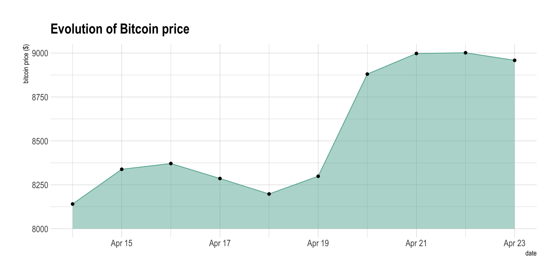
#Comparing to a limit *** Sometimes one can be interested in comparing the value to a specific threshold. In this case, you can fill the area depending on this threshold, with 2 different colors depending if the value is over or below the threshold:
data %>%
  tail(300) %>%
  mutate( mycolor=ifelse(value>7500, "yes", "no")) %>%
  ggplot( aes(x=date, y=value)) +
    geom_ribbon(aes(ymin=7500, ymax=value, fill=mycolor), color="black", alpha=0.5) +
    scale_fill_manual(values=c("#69b3a2","#271569")) +
    ggtitle("Evolution of Bitcoin price") +
    ylab("bitcoin price ($)") +
    theme_ipsum() +
    theme(legend.position="none")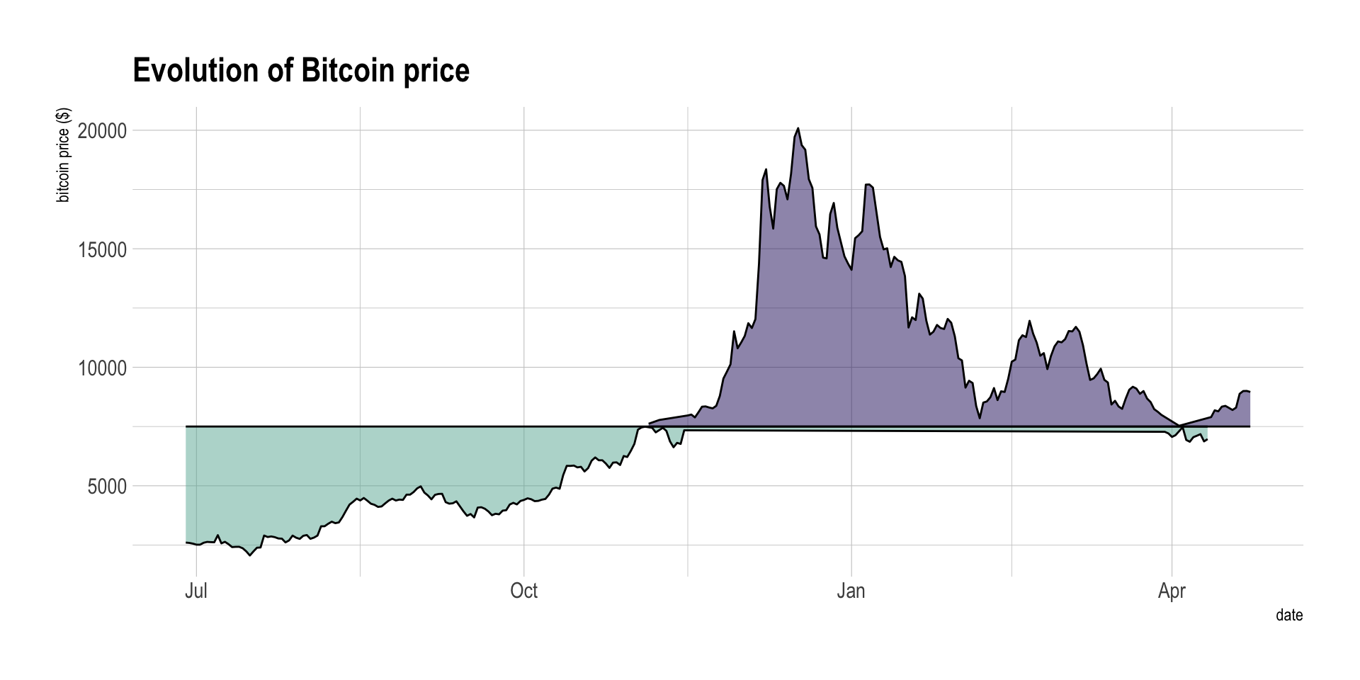
Note: this graphic is imperfect and must be improved (don’t
understand the behavior of geom_ribbon)
You can learn more about each type of graphic presented in this story in the dedicated sections. Click the icon below:
Data To Viz is a comprehensive classification of chart types organized by data input format. Get a high-resolution version of our decision tree delivered to your inbox now!

A work by Yan Holtz for data-to-viz.com