
Area chart
definition - mistake - related - code
An area chart is really similar to a line chart and
represents the evolution of a numeric variable. Basically, the X axis
represents time or an ordered variable, and the Y axis gives the value
of another variable. Data points are connected by straight line segments
and the area between the x axis and the line is filled in with color or
shading.
The following example shows the evolution of the bitcoin price between April 2013 and April 2018. Data comes from the CoinMarketCap website.
# Libraries
library(tidyverse)
library(hrbrthemes)
library(plotly)
library(patchwork)
library(babynames)
library(viridis)

# Load dataset from github
data <- read.table("https://raw.githubusercontent.com/holtzy/data_to_viz/master/Example_dataset/3_TwoNumOrdered.csv", header=T)
data$date <- as.Date(data$date)

# plot
data %>%
  ggplot( aes(x=date, y=value)) +
    geom_area(fill="#69b3a2", alpha=0.5) +
    geom_line(color="#69b3a2") +
    ggtitle("Evolution of Bitcoin price") +
    ylab("bitcoin price ($)") +
    theme_ipsum()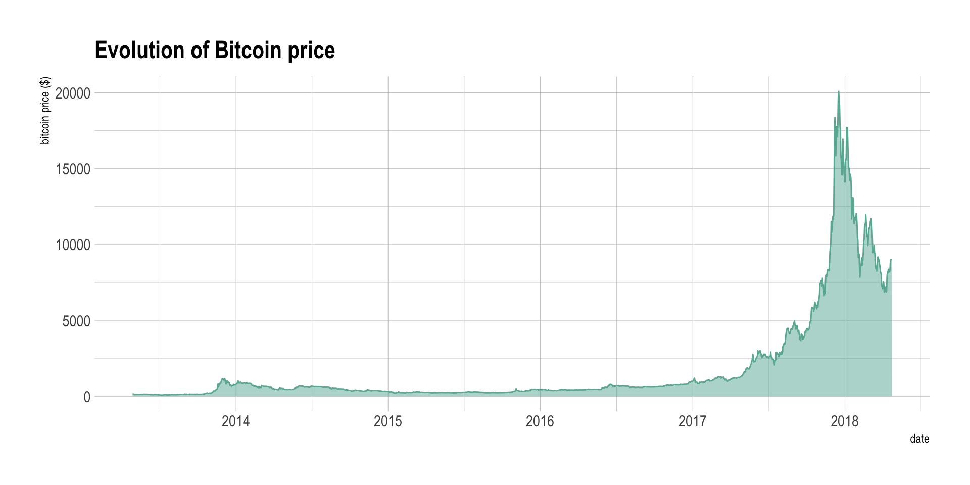
Note: You can read more about this project here.
Area chart is used to show the evolution of numeric variable. It is sometimes criticized for not optimizing the data-ink ratio, a data visualization principle that checks that no inks is used for nothing on the chart. Indeed, removing the area under the curve would make a line chart that conveys the same information. In my opinion area chart make a very good work to show an evolution and the filled area makes the pattern even more obvious.
Area chart can also be used to show the evolution of
several variables. The most classic way is through a stacked area
chart that is discussed in another section,
but this can also be done using small multiple. Here is an
example showing the evolution of a few baby name frequencies in the US
between 1880 and 2015.
# Load dataset from github
don <- babynames %>%
  filter(name %in% c("Ashley", "Amanda", "Mary", "Deborah",   "Dorothy", "Betty", "Helen", "Jennifer", "Shirley")) %>%
  filter(sex=="F")

# Plot
don %>%
  ggplot( aes(x=year, y=n, group=name, fill=name)) +
    geom_area() +
    scale_fill_viridis(discrete = TRUE) +
    theme(legend.position="none") +
    ggtitle("Popularity of American names in the previous 30 years") +
    theme_ipsum() +
    theme(
      legend.position="none",
      panel.spacing = unit(0, "lines"),
      strip.text.x = element_text(size = 8),
      plot.title = element_text(size=13)
    ) +
facet_wrap(~name, scale="free_y")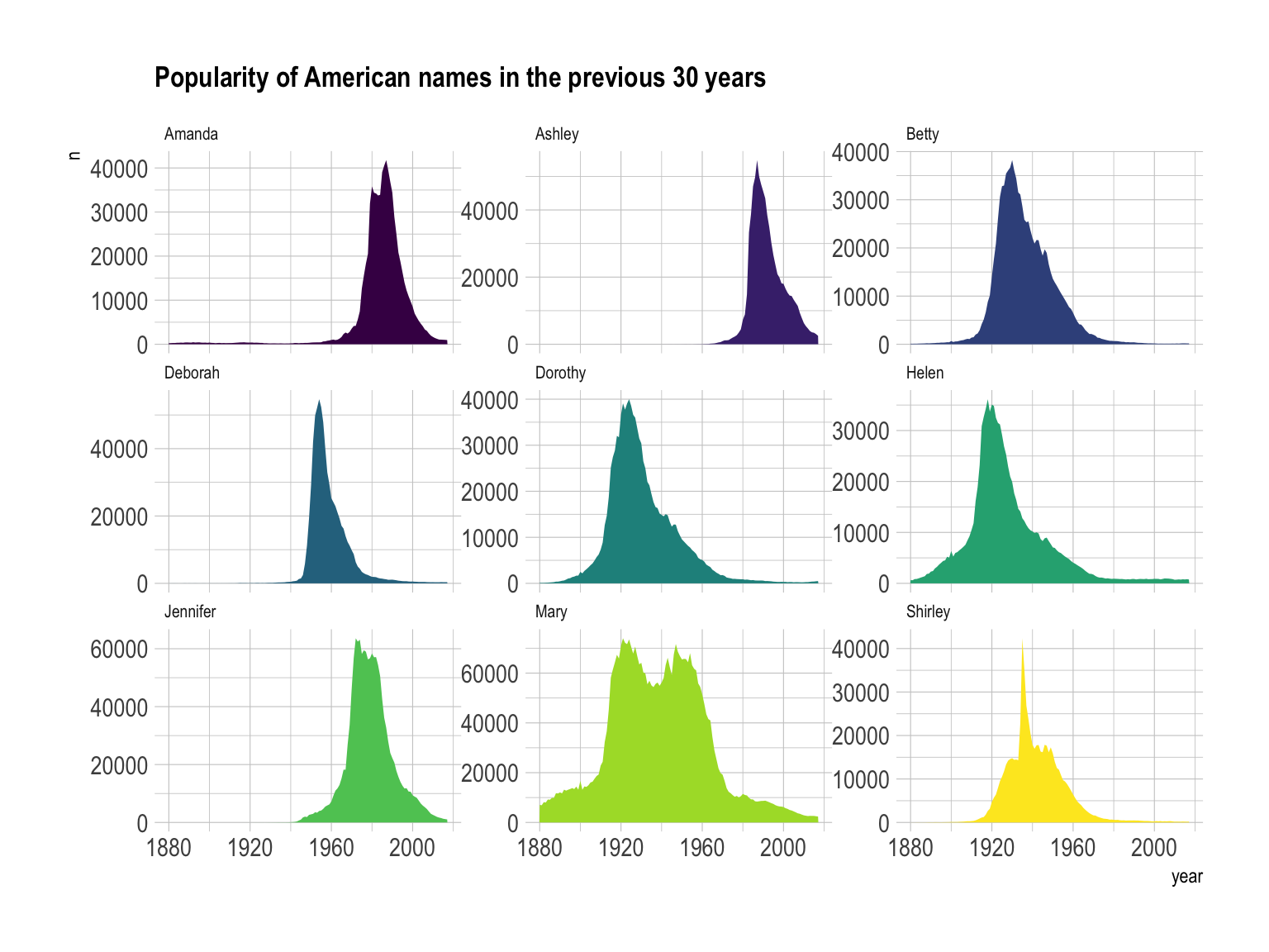 Note: this graphic would deserve a discussion on the Y axis
range to use and on the number of row & column to set. Watch this
space.
Note: this graphic would deserve a discussion on the Y axis
range to use and on the number of row & column to set. Watch this
space.
If the number of data points is low, it is advised to represent each individual observation with a dot. It allows to understand when exactly the observation have been made:
data %>%
  tail(10) %>%
  ggplot( aes(x=date, y=value)) +
    geom_line(color="#69b3a2") +
    geom_point(color="#69b3a2", size=4) +
    ggtitle("Cuting") +
    ylab("bitcoin price ($)") +
    theme_ipsum()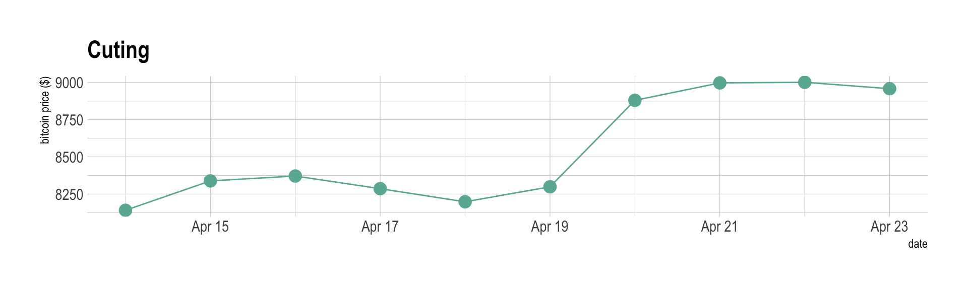
Note that lines are also used to show trends in a scatterplot. Here is an example using Smoothed conditional means and showing confidence interval around it:
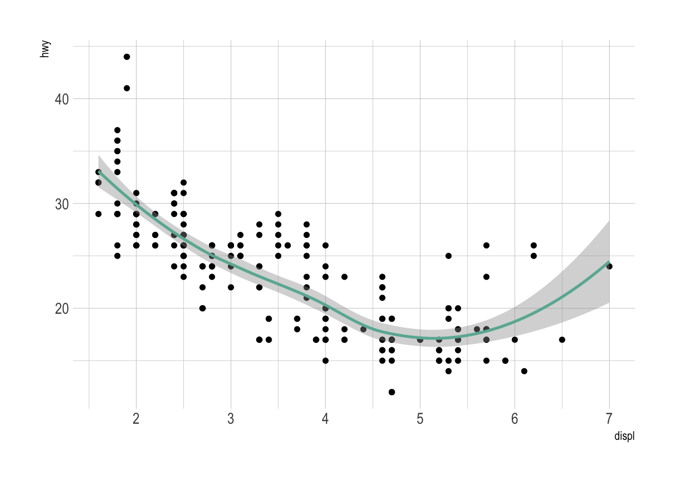
Note: this example comes from the ggplot2 documentaion.
The line chart is subject to a lot of discussion concerning potential caveats. Here is an overview:
p1 <- data %>%
  tail(10) %>%
  ggplot( aes(x=date, y=value)) +
    geom_line(color="#69b3a2") +
    geom_point(color="#69b3a2", size=4) +
    ggtitle("Not cuting") +
    ylab("bitcoin price ($)") +
    theme_ipsum() +
    ylim(0,10000)

p2 <- data %>%
  tail(10) %>%
  ggplot( aes(x=date, y=value)) +
    geom_line(color="#69b3a2") +
    geom_point(color="#69b3a2", size=4) +
    ggtitle("Cuting") +
    ylab("bitcoin price ($)") +
    theme_ipsum()

p1 + p2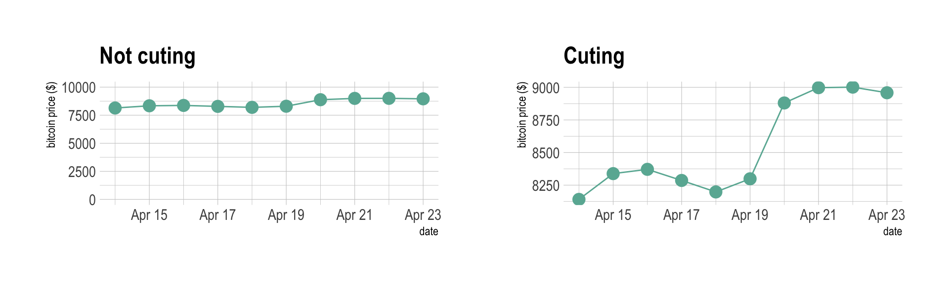
Data To Viz is a comprehensive classification of chart types organized by data input format. Get a high-resolution version of our decision tree delivered to your inbox now!

A work by Yan Holtz for data-to-viz.com


