
Hexbin map
definition - mistake - related - code
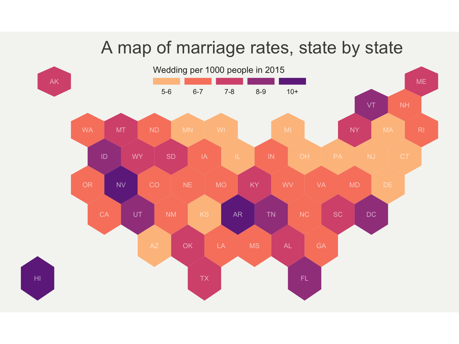
The term hexbin map refers to two different
concepts:
one value per state and a
specific shape file with hexagone boundaries.# library
library(tidyverse)
library(sf)
library(RColorBrewer)
# Download the Hexagon boundaries at geojson format here: https://team.carto.com/u/andrew/tables/andrew.us_states_hexgrid/public/map.
# Load this file. (Note: I stored in a folder called DATA)
my_sf <- read_sf("us_states_hexgrid.geojson.json")
# Bit of reformatting
my_sf <- my_sf %>%
mutate(google_name = gsub(" \\(United States\\)", "", google_name))
data <- read.table("https://raw.githubusercontent.com/holtzy/R-graph-gallery/master/DATA/State_mariage_rate.csv",
header = T, sep = ",", na.strings = "---"
)
# Show it
my_sf_wed <- my_sf %>%
left_join(data, by = c("google_name" = "state"))
# Prepare binning
my_sf_wed$bin <- cut(my_sf_wed$y_2015,
breaks = c(seq(5, 10), Inf),
labels = c("5-6", "6-7", "7-8", "8-9", "9-10", "10+"),
include.lowest = TRUE
)
# Prepare a color scale coming from the viridis color palette
library(viridis)
my_palette <- rev(magma(8))[c(-1, -8)]
# plot
ggplot(my_sf_wed) +
geom_sf(aes(fill = bin), linewidth = 0, alpha = 0.9) +
geom_sf_text(aes(label = iso3166_2), color = "white", size = 3, alpha = 0.6) +
theme_void() +
scale_fill_manual(
values = my_palette,
name = "Wedding per 1000 people in 2015",
guide = guide_legend(
keyheight = unit(3, units = "mm"),
keywidth = unit(12, units = "mm"),
label.position = "bottom", title.position = "top", nrow = 1
)
) +
ggtitle("A map of marriage rates, state by state") +
theme(
legend.position = c(0.5, 0.9),
text = element_text(color = "#22211d"),
plot.background = element_rect(fill = "#f5f5f2", color = NA),
panel.background = element_rect(fill = "#f5f5f2", color = NA),
legend.background = element_rect(fill = "#f5f5f2", color = NA),
plot.title = element_text(
size = 22, hjust = 0.5, color = "#4e4d47",
margin = margin(b = -0.1, t = 0.4, l = 2, unit = "cm")
)
)
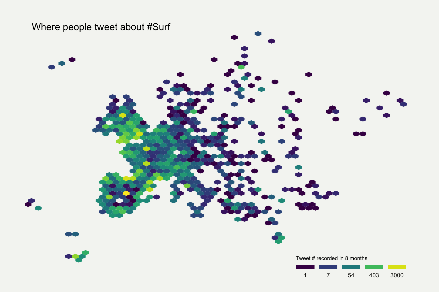
no map boundaries is needed. It requires only a
list of latitude and longitude.# Libraries
library(tidyverse)
library(viridis)
library(hrbrthemes)
library(kableExtra)
options(knitr.table.format = "html")
library(mapdata)
# Load dataset from github
data <- read.table("https://raw.githubusercontent.com/holtzy/data_to_viz/master/Example_dataset/17_ListGPSCoordinates.csv", sep=",", header=T)
# plot
data %>%
filter(homecontinent=='Europe') %>%
ggplot( aes(x=homelon, y=homelat)) +
geom_hex(bins=59) +
ggplot2::annotate("text", x = -27, y = 72, label="Where people tweet about #Surf", colour = "black", size=5, alpha=1, hjust=0) +
ggplot2::annotate("segment", x = -27, xend = 10, y = 70, yend = 70, colour = "black", size=0.2, alpha=1) +
theme_void() +
xlim(-30, 70) +
ylim(24, 72) +
scale_fill_viridis(
trans = "log",
breaks = c(1,7,54,403,3000),
name="Tweet # recorded in 8 months",
guide = guide_legend( keyheight = unit(2.5, units = "mm"), keywidth=unit(10, units = "mm"), label.position = "bottom", title.position = 'top', nrow=1)
) +
ggtitle( "" ) +
theme(
legend.position = c(0.8, 0.09),
legend.title=element_text(color="black", size=8),
text = element_text(color = "#22211d"),
plot.background = element_rect(fill = "#f5f5f2", color = NA),
panel.background = element_rect(fill = "#f5f5f2", color = NA),
legend.background = element_rect(fill = "#f5f5f2", color = NA),
plot.title = element_text(size= 13, hjust=0.1, color = "#4e4d47", margin = margin(b = -0.1, t = 0.4, l = 2, unit = "cm")),
)
Note on the first map: You can learn more about this
story here.
Data comes from here.
Code has been inspired from this
post and that
one.
Note on the second map: This map shows the geographic
position of about 200k tweets containing the hashtags
#surf, #windsurf or #kitesurf.
Read more about it here.
Hexbin or grid map has an advantage over usual choropleth
maps. In choropleths, a large polygon’s data looks more emphasized
just because of its size, what introduces a bias. Here with hexbin, each
region is represented equally dismissing the bias.
There’s a drawback to this format though. Map readers
generally recognize a geographic area by it’s shape and orientation to
other areas. For instance, the geography of the US is well known and
people easily identify different regions. In hexbin maps, these
landmarks do not exist anymore what can confuse the audience. One
solution for this is to choose a basemap that uses labels on top of your
data layer.
Hexbin map uses hexagons to split the area in several parts and attribute a color to it. Note that it is possible to use square instead of hexagones, resulting in a 2D histogram map.
Data To Viz is a comprehensive classification of chart types organized by data input format. Get a high-resolution version of our decision tree delivered to your inbox now!

A work by Yan Holtz for data-to-viz.com


