
Cartogram
definition - mistake - related - code
A cartogram is a map in which the geometry of regions is
distorted in order to convey the information of an
alternate variable. The region area will be inflated or deflated
according to its numeric value.
Most of the time, a cartogram is also a choropleth map where regions are colored according to a numeric variable (not necessarily the one use to build the cartogram).
# Libraries
library(maptools)
library(cartogram)
library(tidyverse)
library(broom)
library(viridis)
library(patchwork)

# Get the shape file of Africa
data(wrld_simpl)
afr=wrld_simpl[wrld_simpl$REGION==2,]

# Usual choropleth map:
spdf_fortified <- tidy(afr)
spdf_fortified = spdf_fortified %>% left_join(. , afr@data, by=c("id"="ISO3"))
p1 <- ggplot() +
  geom_polygon(data = spdf_fortified, aes(fill = POP2005/1000000, x = long, y = lat, group = group) , size=0, alpha=0.9) +
  theme_void() +
  scale_fill_viridis(name="Population (M)", breaks=c(1,50,100, 140), guide = guide_legend( keyheight = unit(3, units = "mm"), keywidth=unit(12, units = "mm"), label.position = "bottom", title.position = 'top', nrow=1)) +
  labs( title = "Real boundaries" ) +
  ylim(-35,35) +
  theme(
    text = element_text(color = "#22211d"),
    plot.title = element_text(size= 22, hjust=0.5, color = "#4e4d47", margin = margin(b = -0.1, t = 0.4, l = 2, unit = "cm")),
    legend.position = c(0.2, 0.26)
  ) +
  coord_map()

# construct a cartogram using the population in 2005
afr_cartogram <- cartogram(afr, "POP2005", itermax=5)

# It is a new geospatial object: we can use all the usual techniques on it! Let's start with a basic ggplot2 chloropleth map:
spdf_fortified <- tidy(afr_cartogram)
spdf_fortified = spdf_fortified %>% left_join(. , afr_cartogram@data, by=c("id"="ISO3"))
ggplot() +
  geom_polygon(data = spdf_fortified, aes(fill = POP2005, x = long, y = lat, group = group) , size=0, alpha=0.9) +
  coord_map() +
  theme_void()

# As seen before, we can do better with a bit of customization
p2 <- ggplot() +
  geom_polygon(data = spdf_fortified, aes(fill = POP2005/1000000, x = long, y = lat, group = group) , size=0, alpha=0.9) +
  theme_void() +
  scale_fill_viridis(name="Population (M)", breaks=c(1,50,100, 140), guide = guide_legend( keyheight = unit(3, units = "mm"), keywidth=unit(12, units = "mm"), label.position = "bottom", title.position = 'top', nrow=1)) +
  labs( title = "Cartogram" ) +
  ylim(-35,35) +
  theme(
    text = element_text(color = "#22211d"),
    plot.title = element_text(size= 22, hjust=0.5, color = "#4e4d47", margin = margin(b = -0.1, t = 0.4, l = 2, unit = "cm")),
    legend.position = c(0.2, 0.26)
  ) +
  coord_map()

# Save them
ggsave(p1, filename="IMG/cartogram1.png", dpi=100, width=7, height=7)
ggsave(p2, filename="IMG/cartogram2.png", dpi=100, width=7, height=7)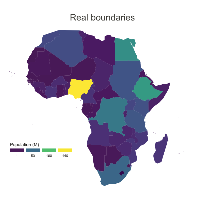
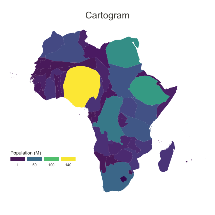
The above maps illustrate the difference between real african country boundaries (left), and a cartogram (right). Each country area is inflated or deflated according to their population in 2005. (data). For instance, Nigeria (in yellow) appears much bigger in the cartogram than in the classic map, according to its huge population.
Cartogram aims to correct the bias that can be observed in a choropleth map: when a variable is aggregated per region, a region with very few data points will look as important as a region with many data points.
For instance, imagine you display the average salary per region on your choropleth map. A region with 3 inhabitants with a huge area will have more importance on your map than a small one with 3,000 inhabitants, what induces a strong bias. The cartogram aims to reduce this bias.
Hexbin map represents every region of the map as hexagons. It is possible to build a cartogram to hexbin map following the same strategy. Here is an example with the population in the US states:
# library
library(tidyverse)
library(geojsonio)
library(RColorBrewer)

# Hexbin available in the geojson format here: https://team.carto.com/u/andrew/tables/andrew.us_states_hexgrid/public/map. Download it and load it in R:
spdf <- geojson_read("us_states_hexgrid.geojson.json",  what = "sp")
spdf@data = spdf@data %>% mutate(google_name = gsub(" \\(United States\\)", "", google_name))

# Load the population per states (source: https://www.census.gov/data/tables/2017/demo/popest/nation-total.html)
pop=read.table("https://www.r-graph-gallery.com/wp-content/uploads/2018/01/pop_US.csv", sep=",", header=T)
pop$pop = pop$pop / 1000000

# merge both
spdf@data = spdf@data %>% left_join(., pop, by=c("google_name"="state"))

# Compute the cartogram, using this population information
cartogram <- cartogram(spdf, 'pop')

# First look!
plot(cartogram)

# tidy data to be drawn by ggplot2 (broom library of the tidyverse)
carto_fortified <- tidy(cartogram, region = "google_name")
carto_fortified = carto_fortified %>% left_join(. , cartogram@data, by=c("id"="google_name"))

# Calculate the position of state labels
centers <- cbind.data.frame(data.frame(gCentroid(cartogram, byid=TRUE), id=cartogram@data$iso3166_2))

# plot
ggplot() +
  geom_polygon(data = carto_fortified, aes(fill = pop, x = long, y = lat, group = group) , size=0.05, alpha=0.9, color="black") +
  scale_fill_gradientn(colours=brewer.pal(7,"BuPu"), name="population (in M)", guide=guide_legend( keyheight = unit(3, units = "mm"), keywidth=unit(12, units = "mm"), title.position = 'top', label.position = "bottom") ) +
  geom_text(data=centers, aes(x=x, y=y, label=id), color="white", size=3, alpha=0.6) +
  theme_void() +
  ggtitle( "Another look on the US population" ) +
  theme(
    legend.position = c(0.5, 0.9),
    legend.direction = "horizontal",
    text = element_text(color = "#22211d"),
    plot.background = element_rect(fill = "#f5f5f9", color = NA),
    panel.background = element_rect(fill = "#f5f5f9", color = NA),
    legend.background = element_rect(fill = "#f5f5f9", color = NA),
    plot.title = element_text(size= 22, hjust=0.5, color = "#4e4d47", margin = margin(b = -0.1, t = 0.4, l = 2, unit = "cm")),
  ) +
  coord_map()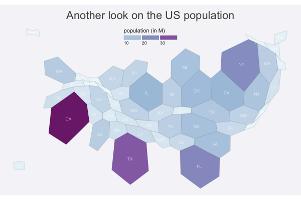
Since a cartogram is often used as a choropleth map, all the related pitfalls apply:
Moreover, note that a cartogram distorts real boundaries and thus make the map harder to identify. Be carefull not to confuse your audience: you need to introduce it with good explanations and showing the initial map is probably a good practice.
Data To Viz is a comprehensive classification of chart types organized by data input format. Get a high-resolution version of our decision tree delivered to your inbox now!

A work by Yan Holtz for data-to-viz.com


