
Choropleth map
definition - mistake - related - code
A choropleth map displays divided geographical areas or
regions that are coloured in relation to a numeric variable. It allows
to study how a variable evolutes along a territory. It is a powerful and
widely used data visualization technique. However, its downside is that
regions with bigger sizes tend to have a bigger weight in the map
interpretation, which includes a bias.
Here is an example describing the distribution of restaurants in the south of france.
# Libraries
library(sf)
library(cartogram)
library(tidyverse)
library(broom)
library(viridis)
library(patchwork)
library(geojsonio)

# Import region boundaries
spdf <- geojson_read("https://raw.githubusercontent.com/gregoiredavid/france-geojson/master/communes.geojson",  what = "sp")

# Select a subset of the data
spdf <- spdf[substr(spdf@data$code, 1, 2) %in% c("06", "83", "13", "30", "34", "11", "66"), ]

# Convert the spatial data to an sf object
spdf_sf <- st_as_sf(spdf)

# Read the additional data
data <- read.table("https://raw.githubusercontent.com/holtzy/R-graph-gallery/master/DATA/data_on_french_states.csv", header = TRUE, sep = ";")

# Make sure the column names match for the join
names(spdf_sf)[names(spdf_sf) == "code"] <- "id"

# Merge the fortified data with the additional data
spdf_fortified <- spdf_sf %>%
  left_join(data, by = c("id" = "depcom"))
# Note that if the number of restaurant is NA, it is in fact 0
spdf_fortified$nb_equip[ is.na(spdf_fortified$nb_equip)] = NA

# Plot
p <- ggplot(spdf_fortified) +
  geom_sf(aes(fill = nb_equip), linewidth=0, alpha=0.9) +
  theme_void() +
  scale_fill_viridis(direction=-1, trans = "log", breaks=c(1,5,10,20,50,100), name="Number of restaurant", guide = guide_legend( keyheight = unit(3, units = "mm"), keywidth=unit(12, units = "mm"), label.position = "bottom", title.position = 'top', nrow=1) ) +
  labs(
    title = "South of France Restaurant concentration",
    subtitle = "Number of restaurant per city district",
    caption = "Data: INSEE | Creation: Yan Holtz | r-graph-gallery.com"
  ) +
  theme(
    text = element_text(color = "#22211d"),
    plot.background = element_rect(fill = "#f5f5f2", color = NA),
    panel.background = element_rect(fill = "#f5f5f2", color = NA),
    legend.background = element_rect(fill = "#f5f5f2", color = NA),

    plot.title = element_text(size= 15, hjust=0.01, color = "#4e4d47", margin = margin(b = -0.1, t = 0.4, l = 2, unit = "cm")),
    plot.subtitle = element_text(size= 12, hjust=0.01, color = "#4e4d47", margin = margin(b = -0.1, t = 0.43, l = 2, unit = "cm")),
    plot.caption = element_text( size=8, color = "#4e4d47", margin = margin(b = 0.3, r=-99, unit = "cm") ),

    legend.position = c(0.7, 0.09)
  ) +
  coord_sf(datum = NA)
p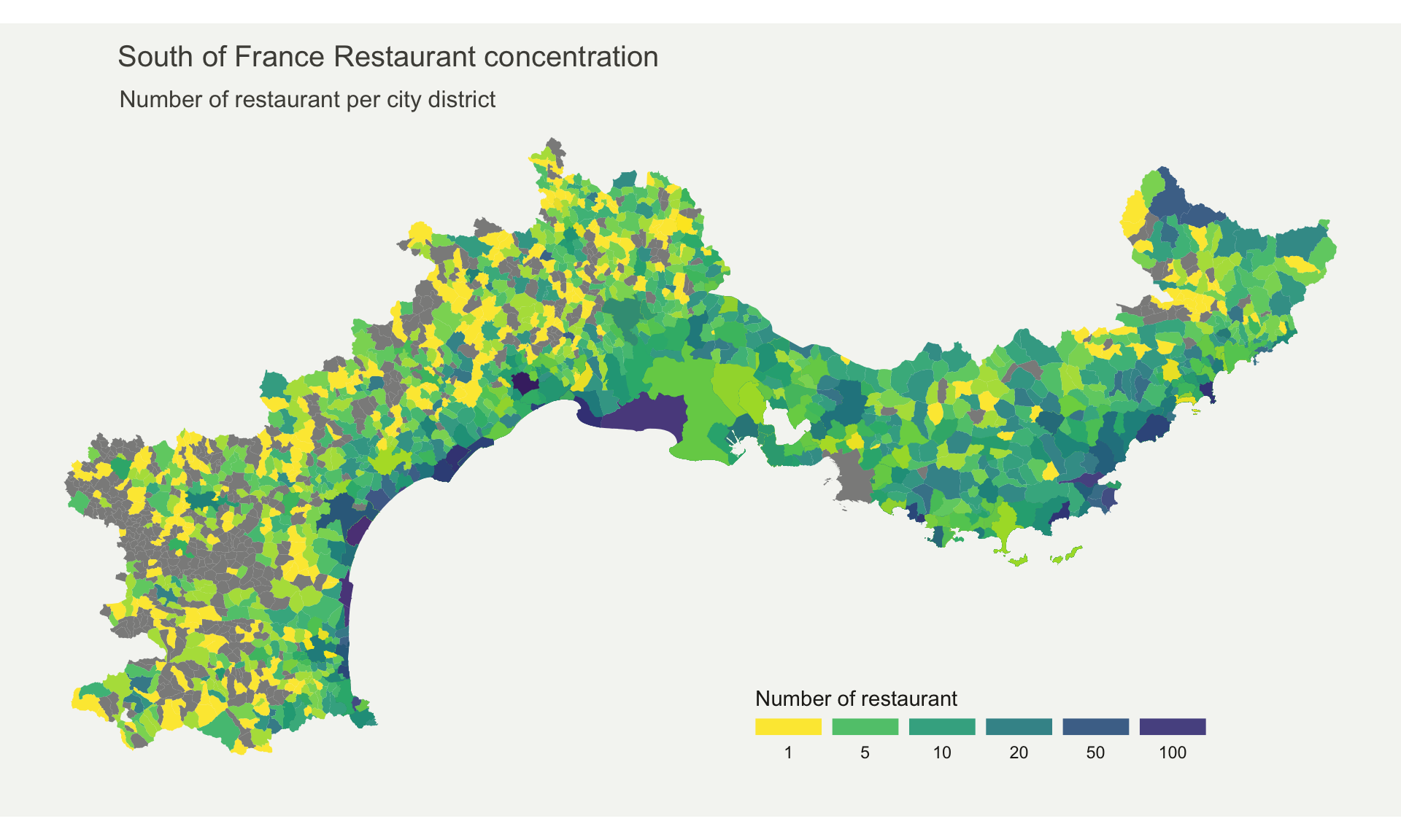
Note: Boundaries of city districts come from here. Number of restaurant per district comes from here.
Important Note: Here, the absolute number of restaurant per district is shown. Keep in mind that an important bias is present: districts with large area and / or high number of inhabitants are more prone to have a lot of restaurants.
Choropleth maps are used to represent a variable on a map. It is a great way to show the distribution of a variable across a territory. It is often used in the field of demography, sociology, economy, etc. Here is a more concise version of the “What for” section:
They offer several key benefits:
Data To Viz is a comprehensive classification of chart types organized by data input format. Get a high-resolution version of our decision tree delivered to your inbox now!

A work by Yan Holtz for data-to-viz.com


