
2D density plot
definition - mistake - related - code
This page is dedicated to a group of graphics allowing to study the
combined distribution of two quantitative variables. These
graphics are basically extensions of the well known density plot
and histogram.
The global concept is the same for each variation. One variable
is represented on the X axis, the other on the Y axis, like for a scatterplot
(1). Then, the number of observations within a particular
area of the 2D space is counted and represented by a
color gradient. The shape can vary:
2)3)5) or contour plots (6)
Here is an overview of these different possibilities
# Libraries
import numpy as np
import matplotlib.pyplot as plt
from scipy.stats import gaussian_kde as kde

# Create data: 200 points
data = np.random.multivariate_normal([0, 0], [[1, 0.5], [0.5, 3]], 200)
x, y = data.T

# Create a figure with 6 plot areas
fig, axes = plt.subplots(ncols=6, nrows=1, figsize=(21, 5))

# Everything starts with a Scatterplot
axes[0].set_title('Scatterplot')
axes[0].plot(x, y, 'ko')

# Thus we can cut the plotting window in several hexbins
nbins = 20
axes[1].set_title('Hexbin')
axes[1].hexbin(x, y, gridsize=nbins, cmap=plt.cm.BuGn_r)

# 2D Histogram
axes[2].set_title('2D Histogram')
axes[2].hist2d(x, y, bins=nbins, cmap=plt.cm.BuGn_r)

# Evaluate a gaussian kde on a regular grid of nbins x nbins over data extents
k = kde(data.T)
xi, yi = np.mgrid[x.min():x.max():nbins*1j, y.min():y.max():nbins*1j]
zi = k(np.vstack([xi.flatten(), yi.flatten()]))

# plot a density
axes[3].set_title('Calculate Gaussian KDE')
axes[3].pcolormesh(xi, yi, zi.reshape(xi.shape), cmap=plt.cm.BuGn_r)

# add shading
axes[4].set_title('2D Density with shading')
axes[4].pcolormesh(xi, yi, zi.reshape(xi.shape), shading='gouraud', cmap=plt.cm.BuGn_r)

# contour
axes[5].set_title('Contour')
axes[5].pcolormesh(xi, yi, zi.reshape(xi.shape), shading='gouraud', cmap=plt.cm.BuGn_r)
axes[5].contour(xi, yi, zi.reshape(xi.shape) )
## <matplotlib.contour.QuadContourSet object at 0x16502df10>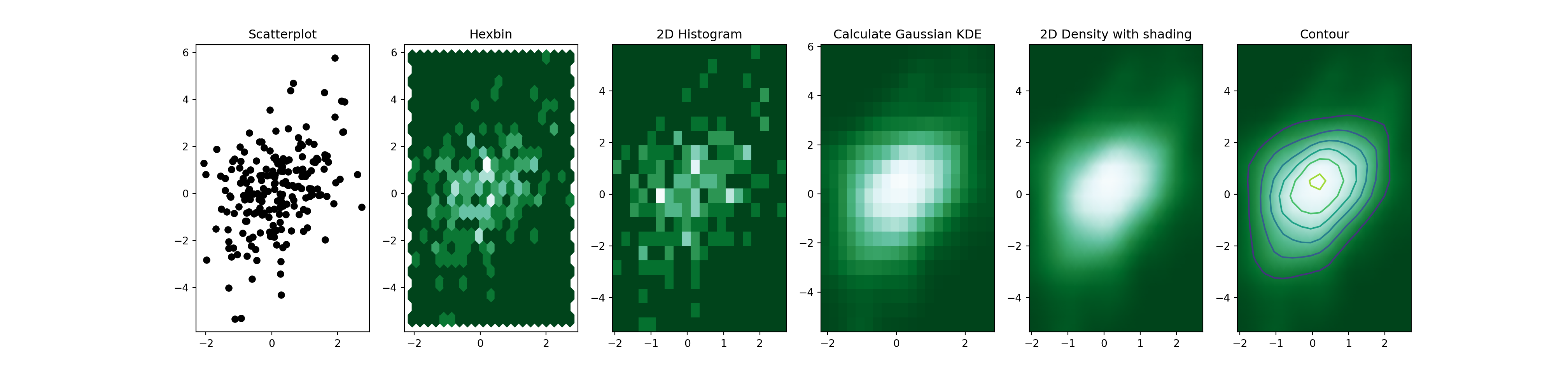
2d distribution are very useful to avoid overplotting in a scatterplot. Here is an example showing the difference between an overplotted scatterplot and a 2d density plot. In the second case, a very obvious hidden pattern appears:
# Libraries
library(tidyverse)
library(hrbrthemes)
library(viridis)
library(patchwork)

# Dataset:
a <- data.frame( x=rnorm(20000, 10, 1.2), y=rnorm(20000, 10, 1.2), group=rep("A",20000))
b <- data.frame( x=rnorm(20000, 14.5, 1.2), y=rnorm(20000, 14.5, 1.2), group=rep("B",20000))
c <- data.frame( x=rnorm(20000, 9.5, 1.5), y=rnorm(20000, 15.5, 1.5), group=rep("C",20000))
data <- do.call(rbind, list(a,b,c))

p1 <- data %>%
  ggplot( aes(x=x, y=y)) +
    geom_point(color="#69b3a2", size=2) +
    theme_ipsum() +
    theme(
      legend.position="none"
    )

p2 <- ggplot(data, aes(x=x, y=y) ) +
  stat_density_2d(aes(fill = ..density..), geom = "raster", contour = FALSE) +
  scale_x_continuous(expand = c(0, 0)) +
  scale_y_continuous(expand = c(0, 0)) +
  scale_fill_viridis() +
  theme(
    legend.position='none'
  )

p1 + p2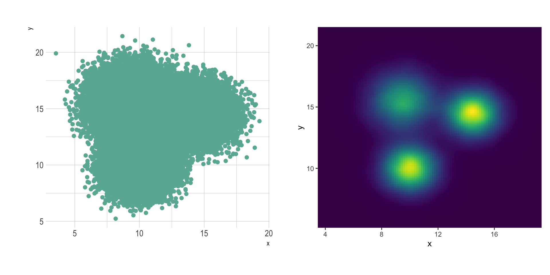
2d distribution is one of the rare cases where using 3d can be worth it.
It is possible to transform the scatterplot
information in a grid, and count the number of data points on each
position of the grid. Then, instead of representing this number by a
graduating color, the surface plot use 3d to represent
dense are higher than others.
In this case, the position of the 3 groups become obvious:
Data To Viz is a comprehensive classification of chart types organized by data input format. Get a high-resolution version of our decision tree delivered to your inbox now!

A work by Yan Holtz for data-to-viz.com


