
Bubble plot
definition - mistake - related - code
A bubble plot is a scatterplot
where a third dimension is added: the value of an
additional numeric variable is represented through the size
of the dots.
You need 3 numerical variables as input: one is represented by the X axis, one by the Y axis, and one by the dot size.
Here is an example using an abstract of the Gapminder dataset made famous through the Hans Rosling Ted Talk. It provides the average life expectancy, gdp per capita and population size for more than 100 countries. This dataset is available through the gapminder R package.
# Libraries
library(tidyverse)
library(hrbrthemes)
library(viridis)
library(gridExtra)
library(ggrepel)
library(plotly)

# The dataset is provided in the gapminder library
library(gapminder)
data <- gapminder %>% filter(year=="2007") %>% dplyr::select(-year)

# Show a bubbleplot
data %>%
  mutate(pop=pop/1000000) %>%
  arrange(desc(pop)) %>%
  mutate(country = factor(country, country)) %>%
  ggplot( aes(x=gdpPercap, y=lifeExp, size = pop, color = continent)) +
    geom_point(alpha=0.7) +
    scale_size(range = c(1.4, 19), name="Population (M)") +
    scale_color_viridis(discrete=TRUE, guide=FALSE) +
    theme_ipsum() +
    theme(legend.position="bottom")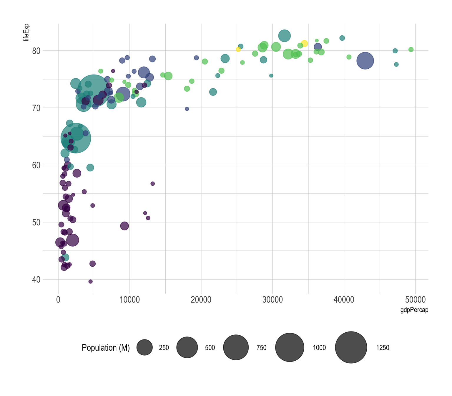
In this chart, the relationship between gdp per capita and life Expectancy is quite obvious: rich countries tend to live longuer, with a threshold effect when gdp per capita reaches ~10,000. This relationship could have been detected using a classic scatterplot, but the bubble size allows to nuance this result with a third level of information: the country population.
This last variable is much more difficult to interpret than the one on the X and Y axis. Indeed, area is hardly interpreted by the human eye. But the information is here, and if a clear relationship between population and gdp per capita or life expectancy existed, we would spot it.
The previous graphic is quite interesting since it allows to
understand the relationship between gdp per capita and life expectancy.
However it can be frustrating not to know what are the countries in the
extreme part of the graphic, or what are the one out of the general
trend. As usual annotating the graphic is a crucial step to
make it insightful:
# Prepare data
tmp <- data %>%
 mutate(
   annotation = case_when(
    gdpPercap > 5000 & lifeExp < 60 ~ "yes",
    lifeExp < 30 ~ "yes",
     gdpPercap > 40000 ~ "yes"
    )
) %>%
mutate(pop=pop/1000000) %>%
  arrange(desc(pop)) %>%
  mutate(country = factor(country, country))

# Plot
ggplot( tmp, aes(x=gdpPercap, y=lifeExp, size = pop, color = continent)) +
    geom_point(alpha=0.7) +
    scale_size(range = c(1.4, 19), name="Population (M)") +
    scale_color_viridis(discrete=TRUE) +
    theme_ipsum() +
    theme(legend.position="none") +
    geom_text_repel(data=tmp %>% filter(annotation=="yes"), aes(label=country), size=4 )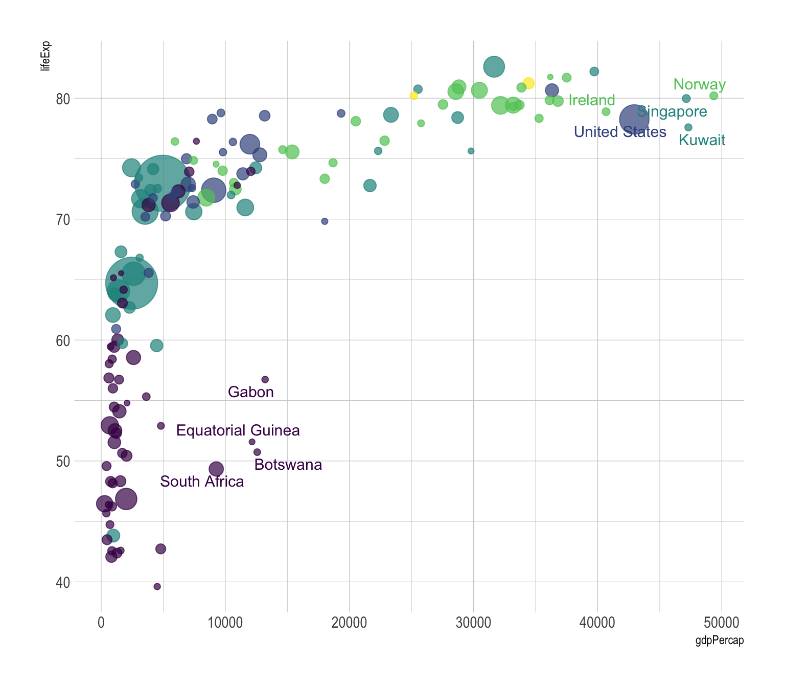
Following the same idea, bubble plot is probably the type of chart
where using interactivity makes the more sense. In the
following plot you can hover bubbles to get conutry name and zoom on a
specific part of the graphic.
# Interactive version
p <- data %>%
  mutate(gdpPercap=round(gdpPercap,0)) %>%
  mutate(pop=round(pop/1000000,2)) %>%
  mutate(lifeExp=round(lifeExp,1)) %>%
  arrange(desc(pop)) %>%
  mutate(country = factor(country, country)) %>%
  mutate(text = paste("Country: ", country, "\nPopulation (M): ", pop, "\nLife Expectancy: ", lifeExp, "\nGdp per capita: ", gdpPercap, sep="")) %>%
  ggplot( aes(x=gdpPercap, y=lifeExp, size = pop, color = continent, text=text)) +
    geom_point(alpha=0.7) +
    scale_size(range = c(1.4, 19), name="Population (M)") +
    scale_color_viridis(discrete=TRUE, guide=FALSE) +
    theme_ipsum() +
    theme(legend.position="none")

ggplotly(p, tooltip="text")prioritize your
variables and be sure of what you want to show. Before doing that kind
of chart, I believe it is a good practice to try other
combinations:p2 <- data %>%
mutate(pop=pop/1000000) %>%
arrange(desc(pop)) %>%
mutate(country = factor(country, country)) %>%
ggplot( aes(x=gdpPercap, y=pop, size = lifeExp, color = continent)) +
geom_point(alpha=0.7) +
scale_color_viridis(discrete=TRUE) +
scale_y_log10() +
theme_ipsum() +
theme(legend.position="none")
p3 <- data %>%
mutate(pop=pop/1000000) %>%
arrange(desc(pop)) %>%
mutate(country = factor(country, country)) %>%
ggplot( aes(x=lifeExp, y=pop, size = gdpPercap, color = continent)) +
geom_point(alpha=0.7) +
scale_color_viridis(discrete=TRUE) +
scale_y_log10() +
theme_ipsum() +
theme(legend.position="none")
grid.arrange(p2,p3, ncol=2)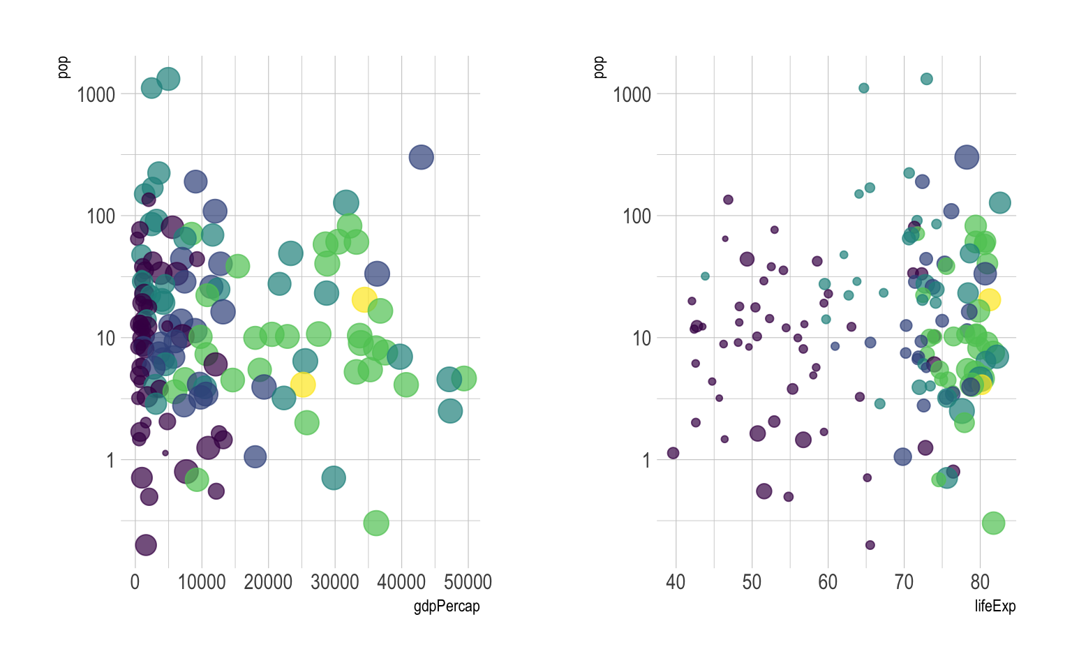
area as metrics, not
diameter.Data To Viz is a comprehensive classification of chart types organized by data input format. Get a high-resolution version of our decision tree delivered to your inbox now!

A work by Yan Holtz for data-to-viz.com


