
Scatter plot
definition - mistake - related - code
A scatterplot displays the relationship between 2 numeric variables. For each data point, the value of its first variable is represented on the X axis, the second on the Y axis.
Here is an example considering the price of 1460 apartements and their ground living area. This dataset comes from a kaggle machine learning competition. You can read more about this example here.
# Libraries
library(tidyverse)
library(hrbrthemes)
library(viridis)

# Load dataset from github
data <- read.table("https://raw.githubusercontent.com/holtzy/data_to_viz/master/Example_dataset/2_TwoNum.csv", header=T, sep=",") %>% dplyr::select(GrLivArea, SalePrice)

# plot
data %>%
  ggplot( aes(x=GrLivArea, y=SalePrice/1000)) +
    geom_point(color="#69b3a2", alpha=0.6) +
    ggtitle("Ground living area partially explains sale price of apartments") +
    theme_ipsum() +
    theme(
      plot.title = element_text(size=12)
    ) +
    ylab('Sale price (k$)') +
    xlab('Ground living area')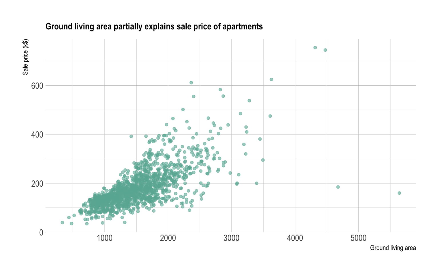
A scatterplot is made to study the relationship between 2 variables.
Thus it is often accompanied by a correlation
coefficient calculation, that usually tries to measure the
linear relationship.
However other types of relationship can be detected using scatterplots, and a common task consists to fit a model explaining Y in function of X. Here is a few pattern you can detect doing a scatterplot.
# Create data
d1 <- data.frame(x=seq(1,100), y=rnorm(100), name="No trend")
d2 <- d1 %>% mutate(y=x*10 + rnorm(100,sd=60)) %>% mutate(name="Linear relationship")
d3 <- d1 %>% mutate(y=x^2 + rnorm(100,sd=140)) %>% mutate(name="Square")
d4 <- data.frame( x=seq(1,10,0.1), y=sin(seq(1,10,0.1)) + rnorm(91,sd=0.6)) %>% mutate(name="Sin")
don <- do.call(rbind, list(d1, d2, d3, d4))

# Plot
don %>%
  ggplot(aes(x=x, y=y)) +
    geom_point(color="#69b3a2", alpha=0.8) +
    theme_ipsum() +
    facet_wrap(~name, scale="free")
Interactivity is a real plus for scatterplot. It allows to
zoom on a specific part of the graphic to detect more
precise pattern. It also allows to hover dots to get more
information about them, like below:
# Plotly allows to turn any ggplot2 graphic interactive
library(plotly)

p <- data %>%
  mutate(text=paste("Apartment Number: ", seq(1:nrow(data)), "\nLocation: New York\nAny other information you need..", sep="")) %>%
  ggplot( aes(x=GrLivArea, y=SalePrice/1000, text=text)) +
    geom_point(color="#69b3a2", alpha=0.8) +
    ggtitle("Ground living area partially explains sale price of apartments") +
    theme_ipsum() +
    theme(
      plot.title = element_text(size=12)
    ) +
    ylab('Sale price (k$)') +
    xlab('Ground living area')

ggplotly(p, tooltip="text")
Scatterplot are sometimes supported by marginal distributions. It indeed adds insight to the graphic, revealing the distribution of both variables:
library(ggExtra)

# create a ggplot2 scatterplot
p <- data %>%
  ggplot( aes(x=GrLivArea, y=SalePrice/1000)) +
    geom_point(color="#69b3a2", alpha=0.8) +
    theme_ipsum() +
    theme(
      legend.position="none"
    )

# add marginal histograms
ggExtra::ggMarginal(p, type = "histogram", color="grey")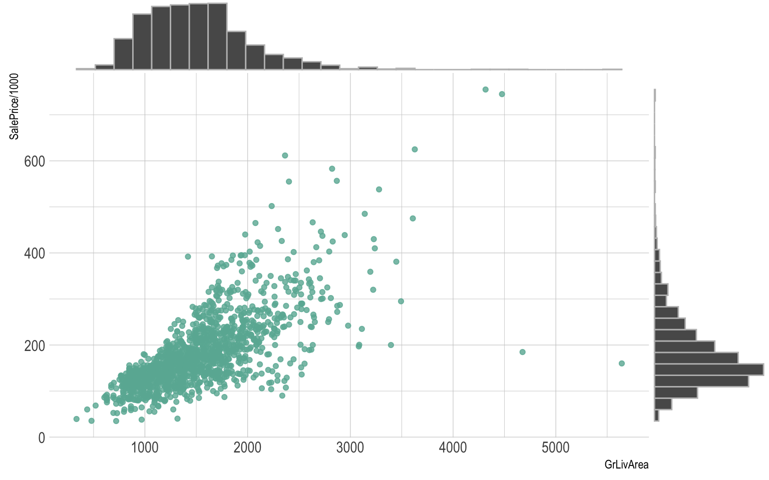
Overplotting is the most common mistake when sample size is high. This post describes about 10 different workarounds to fix this issue.
Don’t forget to show subgroups if you have some. Indeed it can reveal important hidden patterns in your data, like in the case of the Simpson paradox.
Data To Viz is a comprehensive classification of chart types organized by data input format. Get a high-resolution version of our decision tree delivered to your inbox now!

A work by Yan Holtz for data-to-viz.com


