Apartment price vs ground living area.
A few data analytics ideas from
Data-to-Viz.com


This document gives a few suggestions to analyse a
dataset composed by two numeric variables. It considers the price of
1460 apartements (SalePrice) and their ground living area
(GrLivArea).
This dataset comes from a kaggle
machine learning competition. The two variables studied here are
available on Github
repository. Basically it looks like the table beside.
# Libraries
library(tidyverse)
library(hrbrthemes)
library(kableExtra)
options(knitr.table.format = "html")
library(viridis)
library(ggExtra)
library(patchwork)

# Load dataset from github
data <- read.table("https://raw.githubusercontent.com/holtzy/data_to_viz/master/Example_dataset/2_TwoNum.csv", header=T, sep=",") %>% select(GrLivArea, SalePrice)

# show data
data %>% head(6) %>% kable() %>%
kable_styling(bootstrap_options = "striped", full_width = F)| GrLivArea | SalePrice |
|---|---|
| 1710 | 208500 |
| 1262 | 181500 |
| 1786 | 223500 |
| 1717 | 140000 |
| 2198 | 250000 |
| 1362 | 143000 |
#Distribution *** As usual when working with numeric variables, it is always a good practice to check their distributions. Here Prices and Ground living areas are on two different scales so it makes sense to study them in two different graphics. This can be done using a histogram or a density plot.
p1 <- data %>%
  ggplot( aes(x=GrLivArea)) +
    geom_histogram(fill="#69b3a2", color="#e9ecef", alpha=0.9, bins=50) +
    ggtitle("Ground living area distribution") +
    theme_ipsum() +
    theme(
      plot.title = element_text(size=12)
    ) +
    xlab('area')

p2 <- data %>%
  ggplot( aes(x=SalePrice/1000)) +
    geom_histogram(fill="#69b3a2", color="#e9ecef", alpha=0.9, bins=50) +
    ggtitle("Sale price distribution") +
    theme_ipsum() +
    theme(
      plot.title = element_text(size=12)
    )+
    xlab('Sale price (k$)')

p1 + p2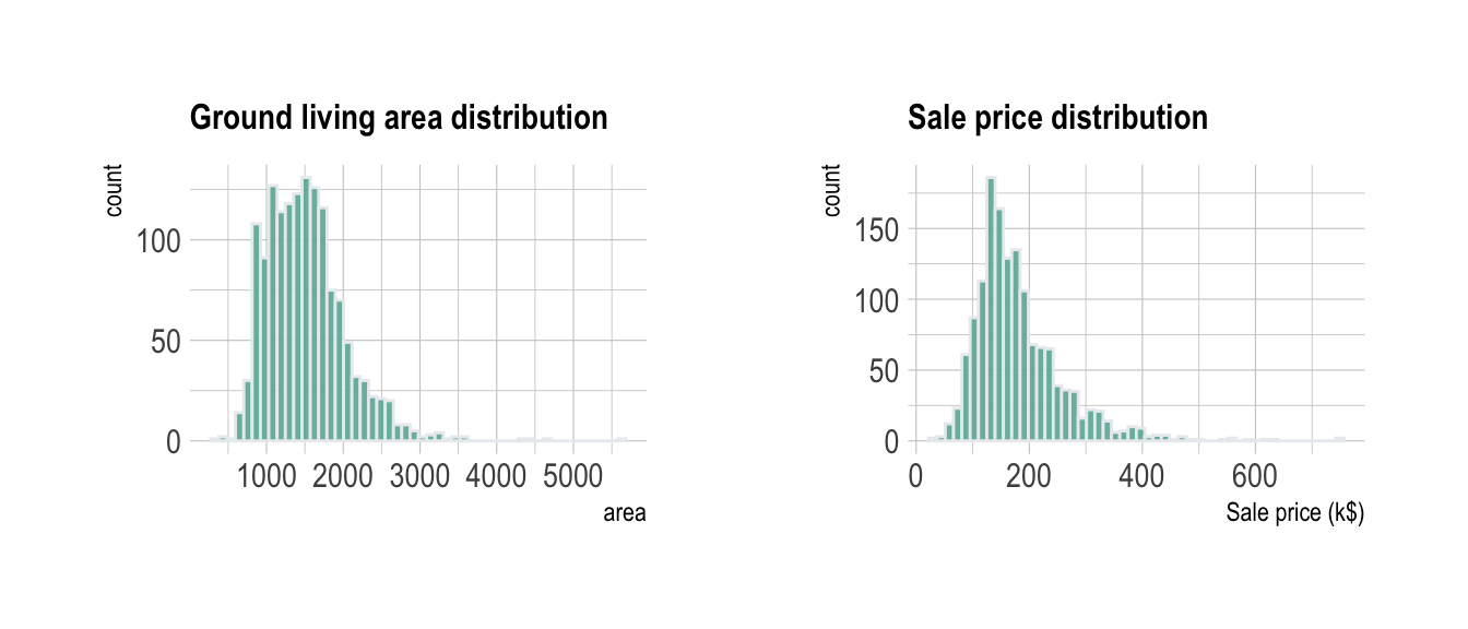
This allows to understand that most of the prices range between 100 and 300 k$ with extreme values reaching 750 k$.
#Scatterplot *** The next step is to study the relationship between the 2 variables. Basically to explore if there is a correlation between sale price and living area. The first chart type to try in this case is the scatterplot.
data %>%
ggplot( aes(x=GrLivArea, y=SalePrice/1000)) +
geom_point(color="#69b3a2", alpha=0.8) +
ggtitle("Ground living area partially explains sale price of apartments") +
theme_ipsum() +
theme(
plot.title = element_text(size=12)
) +
ylab('Sale price (k$)') +
xlab('Ground living area')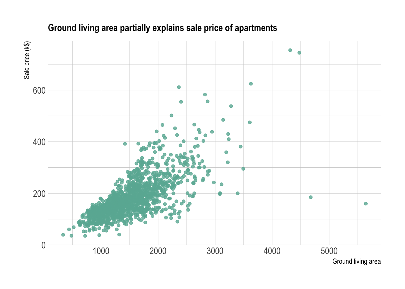 It is quite obvious that there is a relationship between prices and
ground living area.
It is quite obvious that there is a relationship between prices and
ground living area.
#Improving the scatter plot {.tabset} *** The previous graphic convey most of the information efficiently. Still, there are a few customizations that can be done to make the chart even more insightful:
trend line with confidence interval to
illustrate and clarify the relationshipinteractive version to get more information
concerning each data point.marginal distribution##Trend Help the reader seing the trend on the chart by showing it explicitely. Several models exist to show a trend. A linear regression is used on the left plot, and a local regression is used on the right. Showing the confindence interval is a good practice as well.
p <- data %>%
  ggplot( aes(x=GrLivArea, y=SalePrice/1000)) +
    geom_point(color="#69b3a2", alpha=0.8) +
    theme_ipsum() +
    theme(
      plot.title = element_text(size=12)
    ) +
    ylab('Sale price (k$)') +
    xlab('Ground living area')

p1 <- p + ggtitle("Linear regression") +
    geom_smooth(method='lm', color="black", alpha=0.8, size=0.5, fill="skyblue", se=FALSE)
## Warning: Using `size` aesthetic for lines was deprecated in ggplot2 3.4.0.
## ℹ Please use `linewidth` instead.
## This warning is displayed once every 8 hours.
## Call `lifecycle::last_lifecycle_warnings()` to see where this warning was
## generated.p2 <- p + ggtitle("Loess") +
geom_smooth(method='loess', color="black", alpha=0.8, size=0.5, fill="skyblue")
p1 + p2## `geom_smooth()` using formula = 'y ~ x'
## `geom_smooth()` using formula = 'y ~ x'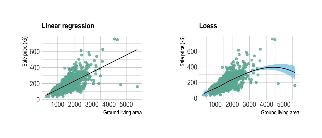
##Interactivity Scatter plot is probably the chart type for which it makes the most sense to use interactivity. For instance, it allows to hover a dot to have more information about it. It allows to zoom on a specific part of the chart as well.
# Plotly allows to turn any ggplot2 graphic interactive
library(plotly)

p <- data %>%
  mutate(text=paste("Apartment Number: ", seq(1:nrow(data)), "\nLocation: New York\nAny other information you need..", sep="")) %>%
  ggplot( aes(x=GrLivArea, y=SalePrice/1000, text=text)) +
    geom_point(color="#69b3a2", alpha=0.8) +
    ggtitle("Ground living area partially explains sale price of apartments") +
    theme_ipsum() +
    theme(
      plot.title = element_text(size=12)
    ) +
    ylab('Sale price (k$)') +
    xlab('Ground living area')

ggplotly(p, tooltip="text")
##Marginal distribution If the number of data points on the scatterplot is high, it is a good practice to display the marginal distributions arount the graphic.
#Overplotting *** The most common pitfall with scatterplot is overplotting: when the sample size gets big, dots are plotted on top of each other what makes the chart unreadable. There are several work around to avoid this issue as describe in this specific post. Here is a summary of the different offered techniques:
# code for all graphics:
p <- data %>%
  ggplot( aes(x=GrLivArea, y=SalePrice/1000)) +
    theme_ipsum() +
    theme(
      plot.title = element_text(size=12)
    ) +
    ylab('Sale price (k$)') +
    xlab('Ground living area')

# Reduce dot size
p1 <- p + geom_point(color="#69b3a2", alpha=0.8, size=0.2) + ggtitle("Dot size")

# Use density estimate
p2 <- p + geom_density2d(color="#69b3a2") + ggtitle("Density 2d: contour")

# Use density estimate (area)
p3 <- p + stat_density_2d(aes(fill = ..level..), geom = "polygon") + ggtitle("Density 2d: area") + theme(legend.position="none")

# With raster
p4 <- p +
  stat_density_2d(aes(fill = ..density..), geom = "raster", contour = FALSE) +
  scale_fill_distiller(palette=4, direction=1) +
  scale_x_continuous(expand = c(0, 0)) +
  scale_y_continuous(expand = c(0, 0)) +
  theme(
    legend.position='none'
  ) +
  ggtitle("Density 2d: raster") +
  xlim(0,2500) +
  ylim(0,400)

# Hexbin
p5 <- p + geom_hex() +
    scale_fill_viridis() +
    theme(legend.position="none") +
    ggtitle("Hexbin")

# 2d histogram
p6 <- p + geom_bin2d( ) +
    scale_fill_viridis( ) +
    theme(legend.position="none")  +
    ggtitle("2d histogram")

p1 + p2 + p3 + p4 + p5 + p6 + plot_layout(ncol = 2)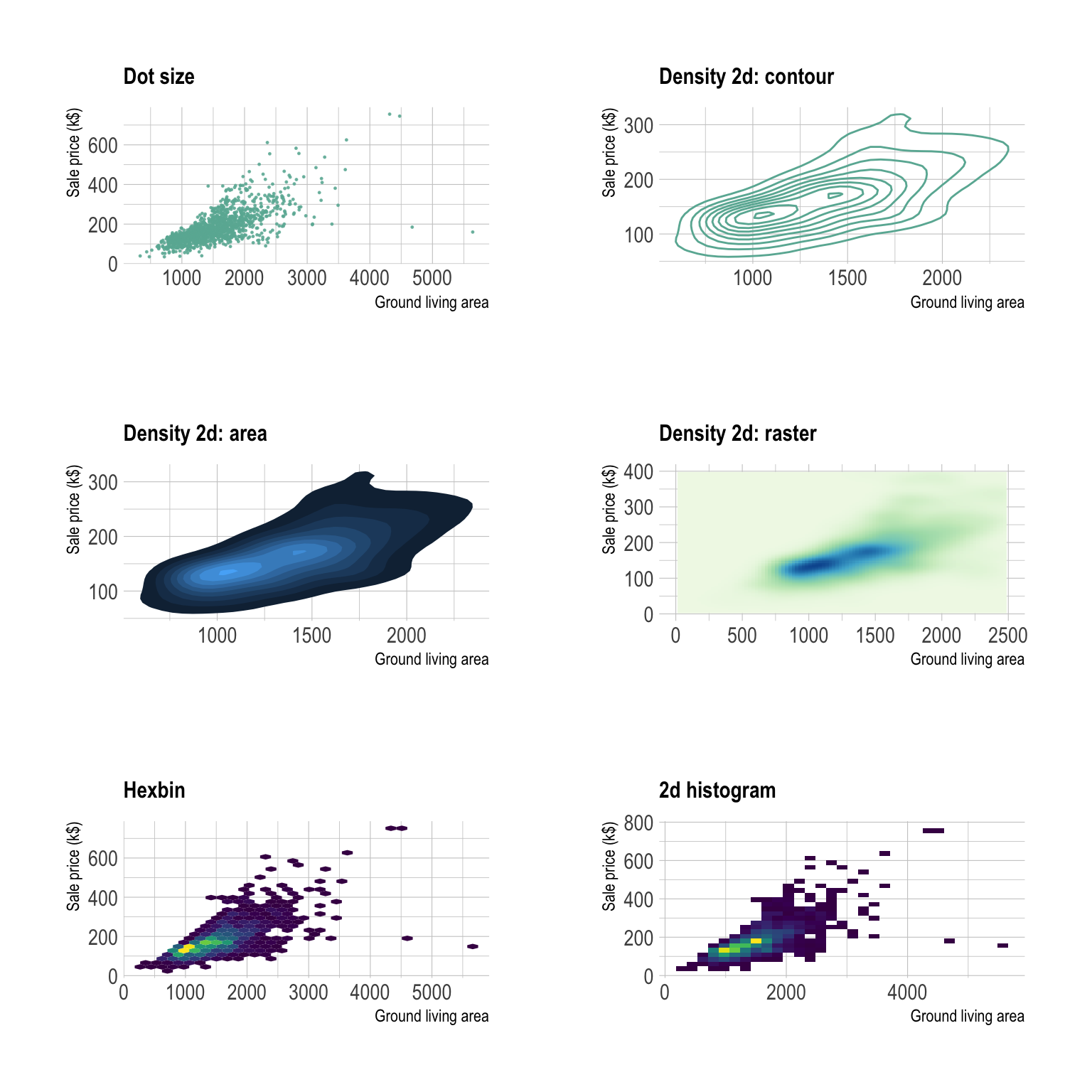
You can learn more about each type of graphic presented in this story in the dedicated sections. Click the icon below:
Data To Viz is a comprehensive classification of chart types organized by data input format. Get a high-resolution version of our decision tree delivered to your inbox now!

A work by Yan Holtz for data-to-viz.com