Eleven features for 32 cars
A few data analytics ideas from
Data-to-Viz.com


This page provides a few hints to visualize a dataset composed of several numeric variables. As an example the famous mtcars dataset will be considered. It provides several features like the number of cylinders, the gross horsepower, the weight etc. for 32 car models.
# Libraries
library(tidyverse)
library(hrbrthemes)
library(viridis)
library(DT)
library(plotly)
library(dendextend)
library(car)
library(FactoMineR)
library(kableExtra)
options(knitr.table.format = "html")

# This dataset is available in R by default, and on the datatoviz github repo
data <- read.csv("https://raw.githubusercontent.com/holtzy/data_to_viz/master/Example_dataset/6_SeveralNum.csv", header=T)
rownames(data) <- data[,1]
data <- data[,-1]

# Save it at .csv for the github repo
#write.csv(mtcars, file="../Example_dataset/6_SeveralNum.csv", quote=F)

# show data
data %>% head(6) %>% kable() %>%
kable_styling(bootstrap_options = "striped", full_width = F)| mpg | cyl | disp | hp | drat | wt | qsec | vs | am | gear | carb | |
|---|---|---|---|---|---|---|---|---|---|---|---|
| Mazda RX4 | 21.0 | 6 | 160 | 110 | 3.90 | 2.620 | 16.46 | 0 | 1 | 4 | 4 |
| Mazda RX4 Wag | 21.0 | 6 | 160 | 110 | 3.90 | 2.875 | 17.02 | 0 | 1 | 4 | 4 |
| Datsun 710 | 22.8 | 4 | 108 | 93 | 3.85 | 2.320 | 18.61 | 1 | 1 | 4 | 1 |
| Hornet 4 Drive | 21.4 | 6 | 258 | 110 | 3.08 | 3.215 | 19.44 | 1 | 0 | 3 | 1 |
| Hornet Sportabout | 18.7 | 8 | 360 | 175 | 3.15 | 3.440 | 17.02 | 0 | 0 | 3 | 2 |
| Valiant | 18.1 | 6 | 225 | 105 | 2.76 | 3.460 | 20.22 | 1 | 0 | 3 | 1 |
In my opinion, the first thing to do when you have several numeric
variables is to observe their distribution one by one. This can be done
using a violin
plot, a boxplot or a
ridgeline
plot if your variables are all on the same scale. In the case of the
mtcars dataset the variables are completely different one
to each other so it make more sense to make an histogram
for each of them:
# Keep the numeric variables of the mtcars dataset
data <- mtcars %>% select( disp, drat, hp, mpg, qsec, wt)

# Show the histogram of these variables
data %>%
  as.tibble() %>%
  gather(variable, value) %>%
  ggplot( aes(x=value) ) +
    geom_histogram( fill= "#69b3a2") +
    facet_wrap(~variable, scale="free") +
    theme_ipsum()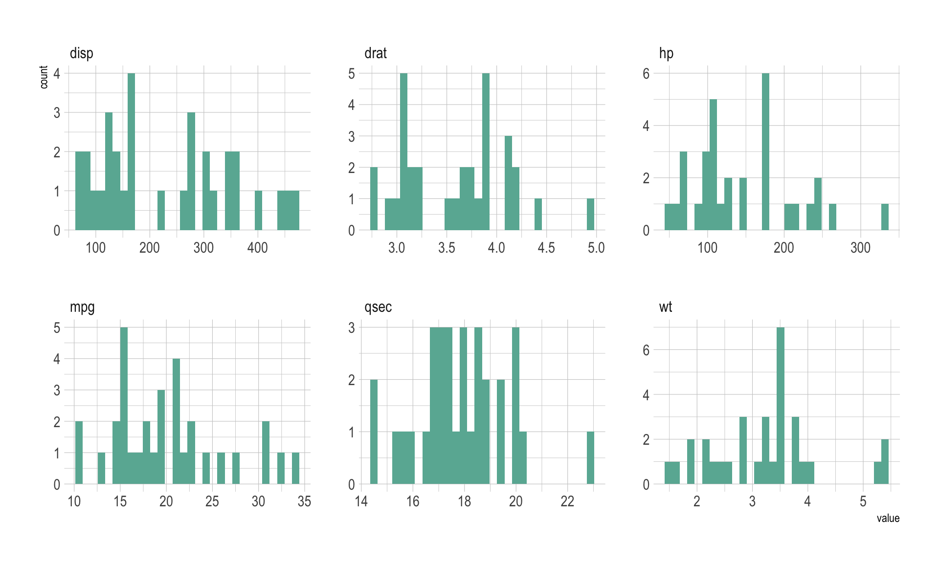
A correlogram or correlation matrix allows to analyse the relationship between each pair of numeric variables of a dataset. The relationship between each pair of variable is visualised through a scatterplot, or a symbol that represents the correlation (bubble, line, number..). The diagonal often represents the distribution of each variable, using an histogram or a density plot.
scatterplotMatrix(~mpg+disp+drat+hp+qsec+wt, data=data , reg.line=FALSE, col="#69b3a2", id.col="#69b3a2", smooth=FALSE , cex=1.5 , pch=20 )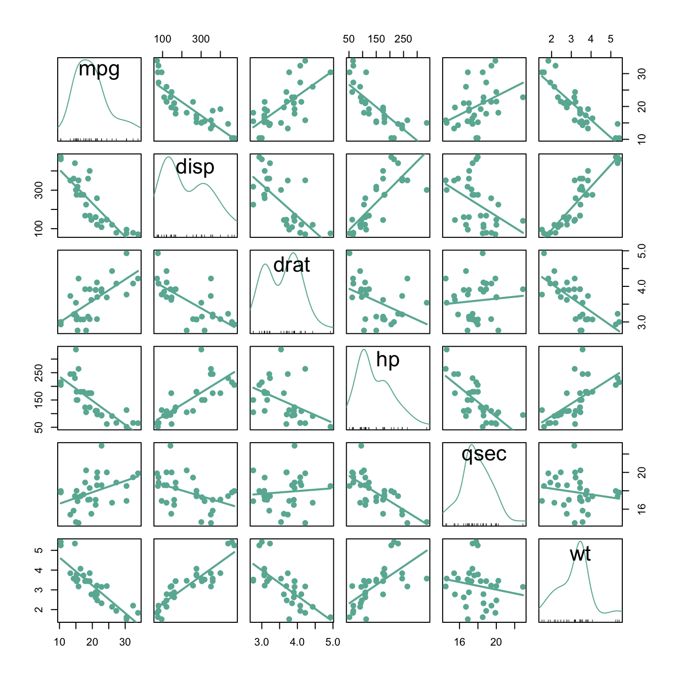 It is a powerful method that give a good overview of the dataset in an
unique graphic. For instance, it is obvious that displacement
(
It is a powerful method that give a good overview of the dataset in an
unique graphic. For instance, it is obvious that displacement
(disp) and gross horsepower (hp) have a strong
correlation.
A dendrogram can be used to check the result of a clustering algorythm on the dataset. Basically, the steps are:
correlation or euclidean distance.# Clusterisation using 3 variables
data %>% dist() %>% hclust() %>% as.dendrogram() -> dend
# Color in function of the cluster
par(mar=c(1,1,1,7))
dend %>%
set("labels_col", value = c("#69b3a2", "#404080", "orange"), k=3) %>%
set("branches_k_color", value = c("#69b3a2", "#404080", "orange"), k = 3) %>%
plot(horiz=TRUE, axes=FALSE)
abline(v = 350, lty = 2)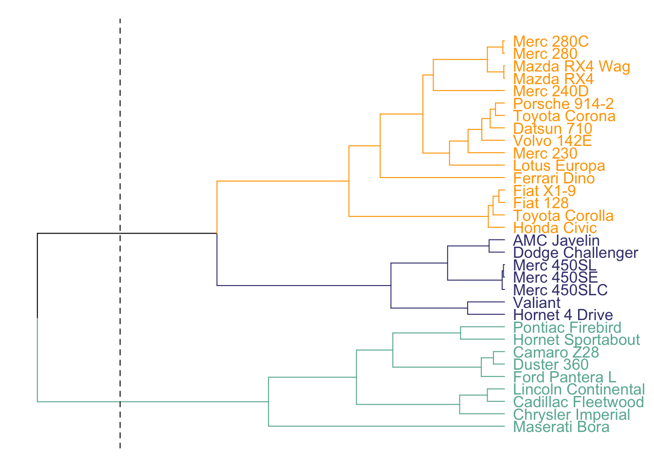
Here, the dendrogram informs us that the Mercedes 280 and the Mercedes 280C have similar features, what makes sense. Basically, it gives an idea of group of cars that are similar one another.
See more about it here.
The heatmap is often used in complement of a dendrogram. It is a graphical representation of data where the individual values contained in a matrix are represented as colors. It is a bit like looking a data table from above.
In addition of a dendrogram, it allows to understand why samples ore features are grouped together.
The heatmap above allows to understand why cars are split in 2 main
clusters. For instance the weight (wt) is much higher for
the group on top than for the other.
The Principal Component Analysis is a statistical procedure that aims to summarize all the available numeric variables in a set of principal components.
myPCA <- PCA(data, scale.unit=TRUE, graph=F)

myPCA$ind %>%
  as.data.frame() %>%
  mutate(name=rownames(.)) %>%
  ggplot( aes(x=coord.Dim.1, y=coord.Dim.2, label=name)) +
    geom_point( color="#69b3a2") +
    theme_ipsum() +
    geom_label(color="#69b3a2")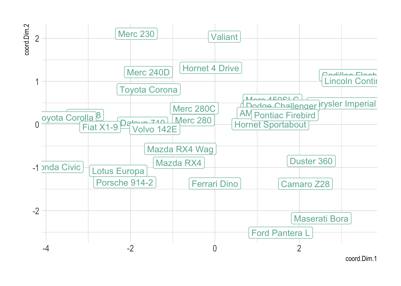
Note: this section needs improvement
It is of importance to note that this kind of dataset can be converted to a correlation matrix that is an adjacency matrix. Indeed, we can compute the correlation between each pair of variable or each pair of entities of the dataset and try to visualize this new dataset. But this is a new story: how to visualize an adjacency matrix.
You can learn more about each type of graphic presented in this story in the dedicated sections. Click the icon below:
Data To Viz is a comprehensive classification of chart types organized by data input format. Get a high-resolution version of our decision tree delivered to your inbox now!

A work by Yan Holtz for data-to-viz.com