Researchers network and migration flows
A few data analytics ideas from
Data-to-Viz.com


Adjacency and incidence matrices provide relationship between several nodes. The information they contain can have different nature, thus this document will consider several examples:
directed and
weighted. Like the number of people migrating from one
country to another. Data used comes from this
scientific publication
from Guy J. Abel.
# Libraries
library(tidyverse)
library(hrbrthemes)
library(circlize)
library(kableExtra)
options(knitr.table.format = "html")
library(viridis)
library(igraph)
library(ggraph)
library(colormap)

# Load dataset from github
data <- read.table("https://raw.githubusercontent.com/holtzy/data_to_viz/master/Example_dataset/13_AdjacencyDirectedWeighted.csv", header=TRUE)

# show data
data %>% head(3) %>% select(1:3) %>% kable() %>%
kable_styling(bootstrap_options = "striped", full_width = F)| Africa | East.Asia | Europe | |
|---|---|---|---|
| Africa | 3.142471 | 0.000000 | 2.107883 |
| East Asia | 0.000000 | 1.630997 | 0.601265 |
| Europe | 0.000000 | 0.000000 | 2.401476 |
undirected and
unweighted. I will consider all the co-authors of a
researcher and study who is connected through a common publication.
Data have been retrieved using the
scholar package,
the pipeline is describe in this
github repository. The result is an adjacency matrix with about 100 researchers,
filled with 1 if they have published a paper together, 0 otherwise.
# Load data
dataUU <- read.table("https://raw.githubusercontent.com/holtzy/data_to_viz/master/Example_dataset/13_AdjacencyUndirectedUnweighted.csv", header=TRUE)

# show data
dataUU %>% head(3) %>% select(1:4) %>% kable() %>%
kable_styling(bootstrap_options = "striped", full_width = F)| from | A.Bateman | A.Besnard | A.Breil |
|---|---|---|---|
| A Armero | NA | NA | 1 |
| A Bateman | NA | NA | NA |
| A Besnard | NA | NA | NA |
Relationships can also be undirected and
weighted
Relationships can also be directed and
unweighted
A chord diagram is a good way to represent migration flows. It works well if your data are directed and weighted like for migration flows between country.
Disclaimer: this plot is made using the circlize library, and very strongly inspired from the Migest package from Guy J. Abel, who is also the author of the migration dataset used here.
Since this kind of graphic is used to display flows, it can be
applied only on networks in which connections are
weighted. It does not work for the other example on
authors connections.
# short names
colnames(data) <- c("Africa", "East Asia", "Europe", "Latin Ame.",   "North Ame.",   "Oceania", "South Asia", "South East Asia", "Soviet Union", "West.Asia")
rownames(data) <- colnames(data)

# I need a long format
data_long <- data %>%
  rownames_to_column %>%
  gather(key = 'key', value = 'value', -rowname)

# parameters
circos.clear()
circos.par(start.degree = 90, gap.degree = 4, track.margin = c(-0.1, 0.1), points.overflow.warning = FALSE)
par(mar = rep(0, 4))

# color palette
mycolor <- viridis(10, alpha = 1, begin = 0, end = 1, option = "D")
mycolor <- mycolor[sample(1:10)]

# Base plot
chordDiagram(
  x = data_long,
  grid.col = mycolor,
  transparency = 0.25,
  directional = 1,
  direction.type = c("arrows", "diffHeight"),
  diffHeight  = -0.04,
  annotationTrack = "grid",
  annotationTrackHeight = c(0.05, 0.1),
  link.arr.type = "big.arrow",
  link.sort = TRUE,
  link.largest.ontop = TRUE)

# Add text and axis
circos.trackPlotRegion(
  track.index = 1,
  bg.border = NA,
  panel.fun = function(x, y) {

    xlim = get.cell.meta.data("xlim")
    sector.index = get.cell.meta.data("sector.index")

    # Add names to the sector.
    circos.text(
      x = mean(xlim),
      y = 3.2,
      labels = sector.index,
      facing = "bending",
      cex = 0.8
      )

    # Add graduation on axis
    circos.axis(
      h = "top",
      major.at = seq(from = 0, to = xlim[2], by = ifelse(test = xlim[2]>10, yes = 2, no = 1)),
      minor.ticks = 1,
      major.tick.percentage = 0.5,
      labels.niceFacing = FALSE)
  }
)
## `major.tick.percentage` is not used any more, please directly use argument `major.tick.length`.
## `major.tick.percentage` is not used any more, please directly use argument `major.tick.length`.
## `major.tick.percentage` is not used any more, please directly use argument `major.tick.length`.
## `major.tick.percentage` is not used any more, please directly use argument `major.tick.length`.
## `major.tick.percentage` is not used any more, please directly use argument `major.tick.length`.
## `major.tick.percentage` is not used any more, please directly use argument `major.tick.length`.
## `major.tick.percentage` is not used any more, please directly use argument `major.tick.length`.
## `major.tick.percentage` is not used any more, please directly use argument `major.tick.length`.
## `major.tick.percentage` is not used any more, please directly use argument `major.tick.length`.
## `major.tick.percentage` is not used any more, please directly use argument `major.tick.length`.
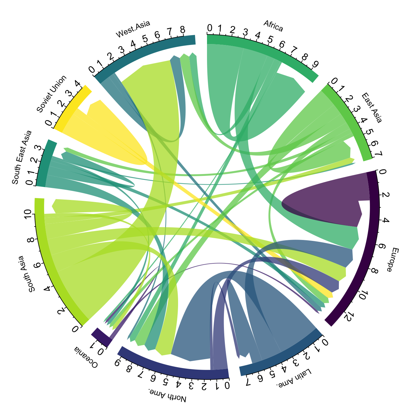 In my opinion this is a powerful way to display information. Major
flows are easy to detect, like the migration from South Asia towards
Westa Asia, or Africa to Europe. Moreover, for each continent it is
quite easy to quantify the proportion of people leaving and
arriving.
In my opinion this is a powerful way to display information. Major
flows are easy to detect, like the migration from South Asia towards
Westa Asia, or Africa to Europe. Moreover, for each continent it is
quite easy to quantify the proportion of people leaving and
arriving.
However chord diagram is not an usual way of displaying information. Thus, it is advised to give a good amount of explanation to educate your audience. A good way to do so is to draw just a few connections in a first step, before displaying the whole graphic. See this blog post by Nadieh Bremer for more ideas on this topic.
Sankey diagram is another option to display weighted connection. Intead of displaying regions on a circle, they are duplicated and represented on both sides of the graphic. Origin is usually on the left, destination on the right.
# Package
library(networkD3)

# I need a long format
data_long <- data %>%
  rownames_to_column %>%
  gather(key = 'key', value = 'value', -rowname) %>%
  filter(value > 0)
colnames(data_long) <- c("source", "target", "value")
data_long$target <- paste(data_long$target, " ", sep="")

# From these flows we need to create a node data frame: it lists every entities involved in the flow
nodes <- data.frame(name=c(as.character(data_long$source), as.character(data_long$target)) %>% unique())

# With networkD3, connection must be provided using id, not using real name like in the links dataframe.. So we need to reformat it.
data_long$IDsource=match(data_long$source, nodes$name)-1
data_long$IDtarget=match(data_long$target, nodes$name)-1

# prepare colour scale
ColourScal ='d3.scaleOrdinal() .range(["#FDE725FF","#B4DE2CFF","#6DCD59FF","#35B779FF","#1F9E89FF","#26828EFF","#31688EFF","#3E4A89FF","#482878FF","#440154FF"])'

# Make the Network
sankeyNetwork(Links = data_long, Nodes = nodes,
                     Source = "IDsource", Target = "IDtarget",
                     Value = "value", NodeID = "name",
sinksRight=FALSE, colourScale=ColourScal, nodeWidth=40, fontSize=13, nodePadding=20)The heatmap is another great alternative to represent an adjacency matrix. Here, all the origin countries are represented as row, and all the destination as columns. The diagonal pops out with a lot of yellow squares, which means that most of the migrations are intra continental.
library(heatmaply)
p <- heatmaply(data,
        dendrogram = "none",
        xlab = "", ylab = "",
        main = "",
        scale = "column",
        margins = c(60,100,40,20),
        grid_color = "white",
        grid_width = 0.00001,
        titleX = FALSE,
        hide_colorbar = TRUE,
        branches_lwd = 0.1,
        label_names = c("From", "To:", "Value"),
        fontsize_row = 7, fontsize_col = 7,
        labCol = colnames(data),
        labRow = rownames(data),
        heatmap_layers = theme(axis.line=element_blank())
        )
Note that if the matrix is unweighted, each connection
can have only 2 values: 1 if there is a connection, 0 otherwise. It
is the case for the co-authorship network example, where researchers
are connected if they have already published a paper together. The
heatmap below shows these connections and also applies a clustering
algorithm to the data: researchers that tend to be involved in the
same papers are grouped together.
# Format data
tmp <- dataUU
rownames(tmp) <- tmp$from
tmp <- tmp %>% select(-from)
tmp[is.na(tmp)] <- 0

# Keep people with more than 1 connections
tmp <- tmp[which(rowSums(tmp)>3), which(colSums(tmp)>3)]

# Heatmap
p <- heatmaply(tmp,
        dendrogram = "both",
        xlab = "", ylab = "",
        main = "",
        scale = "none",
        margins = c(60,100,40,20),
        grid_color = "white",
        grid_width = 0.0000000001,
        titleX = FALSE,
        hide_colorbar = TRUE,
        branches_lwd = 0.1,
        label_names = c("Name", "With:", "Value"),
        fontsize_row = 7, fontsize_col = 7,
        labCol = colnames(tmp),
        labRow = rownames(tmp),
        heatmap_layers = theme(axis.line=element_blank())
        )
Since an adjacency matrix is a network structure, it is
possible to build a
network graph. In a network graph, each entity is represented as a
node, and each connection as an edge.
In my opinion, this type of representation makes more sense when the
connections are unweighted, since drawing edges with
different sizes tends to clutter the figure and make it unreadable.
Thus, here is an application of this chart type to the coauthor network. Researchers are the nodes, represented as dots. If 2 researchers have published at least one scientific paper together, they are connected. The node size is proportionnal to the number of coauthors.
# Transform the adjacency matrix in a long format
connect <- dataUU %>%
  gather(key="to", value="value", -1) %>%
  mutate(to = gsub("\\.", " ",to)) %>%
  na.omit()

# Number of connection per person
c( as.character(connect$from), as.character(connect$to)) %>%
  as.tibble() %>%
  group_by(value) %>%
  summarize(n=n()) -> coauth
colnames(coauth) <- c("name", "n")

# Create a graph object with igraph
mygraph <- graph_from_data_frame( connect, vertices = coauth, directed = FALSE )

# Find community
com <- walktrap.community(mygraph)

#Reorder dataset and make the graph
coauth <- coauth %>%
  mutate( grp = com$membership) %>%
  arrange(grp) %>%
  mutate(name=factor(name, name))

# keep only 10 first communities
coauth <- coauth %>%
  filter(grp<16)

# keep only this people in edges
connect <- connect %>%
  filter(from %in% coauth$name) %>%
  filter(to %in% coauth$name)

# Create a graph object with igraph
mygraph <- graph_from_data_frame( connect, vertices = coauth, directed = FALSE )

# prepare a vector of n color in the viridis scale
mycolor <- colormap(colormap=colormaps$viridis, nshades=max(coauth$grp))
mycolor <- sample(mycolor, length(mycolor))

# Make the graph
ggraph(mygraph) +
  geom_edge_link(edge_colour="black", edge_alpha=0.2, edge_width=0.3, fold=TRUE) +
  geom_node_point(aes(size=n, color=as.factor(grp), fill=grp), alpha=0.9) +
  scale_size_continuous(range=c(0.5,8)) +
  scale_color_manual(values=mycolor) +
  geom_node_text(aes(label=ifelse(n>6, as.character(name), "")), angle=65, hjust=rep(c(0,1),58), nudge_y = rep(c(0.5,-0.5),58), size=2.3, color="grey") +
  theme_void() +
  theme(
    legend.position="none",
    plot.margin=unit(c(0,0,0,0), "null"),
    panel.spacing=unit(c(0,0,0,0), "null")
  ) +
  expand_limits(x = c(-1.2, 1.2), y = c(-1.2, 1.2))
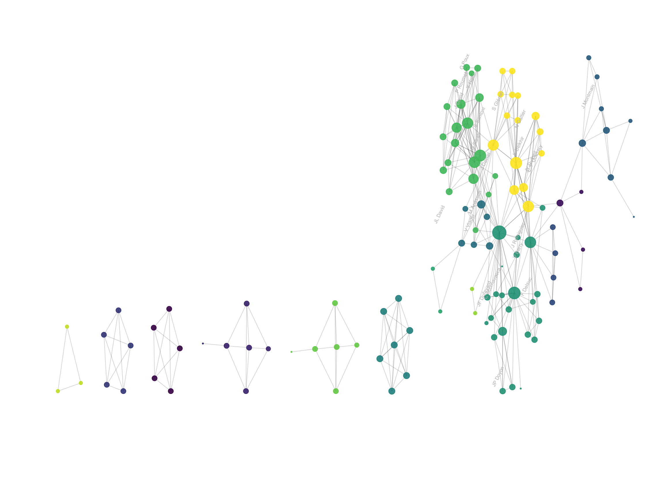
Network graphs are very powerful to study the global structure of the network. Here, a few groups of researchers are isolated. Each actually represents one single paper where Vincent Ranwez was involved. In the middle a massive network of researchers appear: these are the people who Vincent published with most often, and are therefore all linked together.
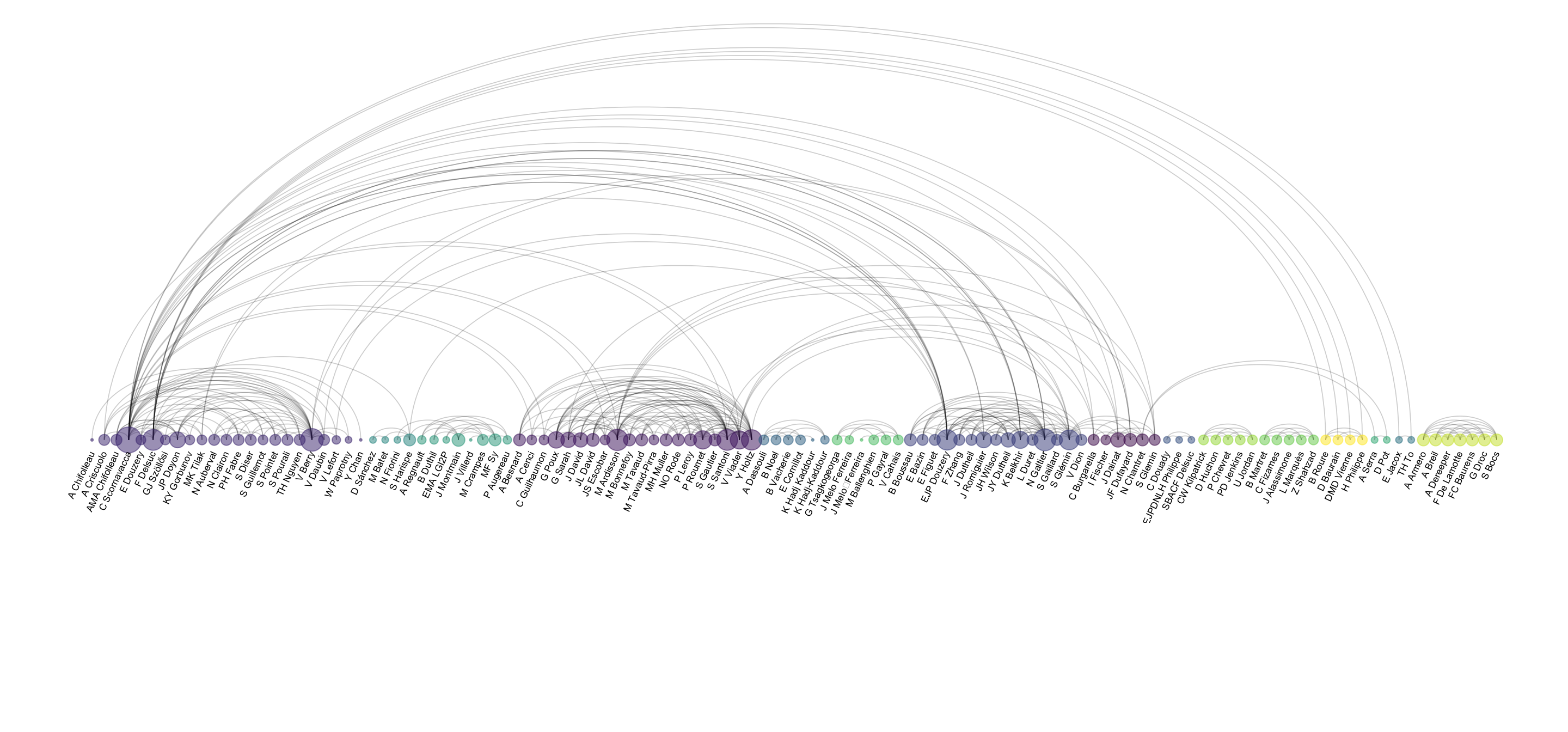
However, network charts are very bad at annotating every single points: names tend to overlap edges making the figure unreadable. The arc diagram described below is a good alternative if you want to show labels.
Instead of using a custom algorithm to position each nodes, it is possible to place them all around a circle, making a chord diagram. But this kind of chart makes sense only if the order of nodes around the circle is carefully chosen, to avoid having a cluttered and unreadable figure.
# Transform the adjacency matrix in a long format
connect <- dataUU %>%
  gather(key="to", value="value", -1) %>%
  mutate(to = gsub("\\.", " ",to)) %>%
  na.omit()

# Number of connection per person
c( as.character(connect$from), as.character(connect$to)) %>%
  as.tibble() %>%
  group_by(value) %>%
  summarize(n=n()) -> coauth
colnames(coauth) <- c("name", "n")

# Create a graph object with igraph
mygraph <- graph_from_data_frame( connect, vertices = coauth, directed = FALSE )

# Find community
com <- walktrap.community(mygraph)

#Reorder dataset and make the graph
coauth <- coauth %>%
  mutate( grp = com$membership) %>%
  arrange(grp) %>%
  mutate(name=factor(name, name))

# keep only 10 first communities
coauth <- coauth %>%
  filter(grp<16)

# keep only this people in edges
connect <- connect %>%
  filter(from %in% coauth$name) %>%
  filter(to %in% coauth$name)

# Add label angle
number_of_bar=nrow(coauth)
coauth$id = seq(1, nrow(coauth))
angle= 360 * (coauth$id-0.5) /number_of_bar     # I substract 0.5 because the letter must have the angle of the center of the bars. Not extreme right(1) or extreme left (0)
coauth$hjust <- ifelse(angle > 90 & angle<270, 1, 0)
coauth$angle <- ifelse(angle > 90 & angle<270, angle+180, angle)

# Create a graph object with igraph
mygraph <- graph_from_data_frame( connect, vertices = coauth, directed = FALSE )

# prepare a vector of n color in the viridis scale
mycolor <- colormap(colormap=colormaps$viridis, nshades=max(coauth$grp))
mycolor <- sample(mycolor, length(mycolor))

# Make the graph
ggraph(mygraph, layout="circle") +
  geom_edge_link(edge_colour="black", edge_alpha=0.2, edge_width=0.3, fold=FALSE) +
  geom_node_point(aes(size=n, color=as.factor(grp), fill=grp), alpha=0.9) +
  scale_size_continuous(range=c(0.5,8)) +
  scale_color_manual(values=mycolor) +
  geom_node_text(aes(label=paste("    ",name,"    "), angle=angle, hjust=hjust), size=2.3, color="black") +
  theme_void() +
  theme(
    legend.position="none",
    plot.margin=unit(c(0,0,0,0), "null"),
    panel.spacing=unit(c(0,0,0,0), "null")
  ) +
  expand_limits(x = c(-1.2, 1.2), y = c(-1.2, 1.2))
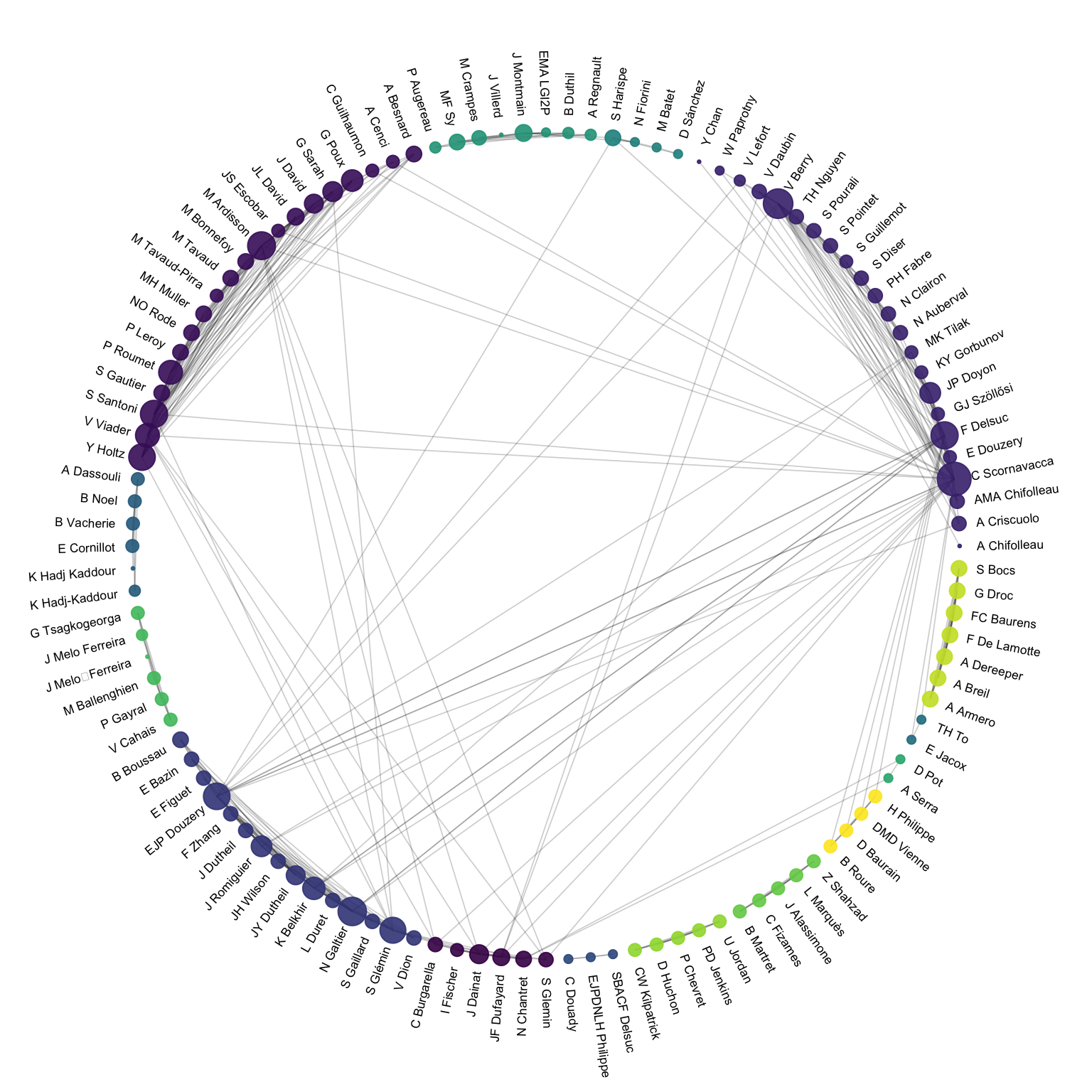
An arc diagram follows the same concept, but displays nodes along a single axis and links with arcs. The main advantage is that it allows to make the labels easy to read.
# Make the graph
ggraph(mygraph, layout="linear") +
  geom_edge_arc(edge_colour="black", edge_alpha=0.2, edge_width=0.3, fold=TRUE) +
  geom_node_point(aes(size=n, color=as.factor(grp), fill=grp), alpha=0.5) +
  scale_size_continuous(range=c(0.5,8)) +
  scale_color_manual(values=mycolor) +
  geom_node_text(aes(label=name), angle=65, hjust=1, nudge_y = -1.1, size=2.3) +
  theme_void() +
  theme(
    legend.position="none",
    plot.margin=unit(c(0,0,0.4,0), "null"),
    panel.spacing=unit(c(0,0,3.4,0), "null")
  ) +
  expand_limits(x = c(-1.2, 1.2), y = c(-5.6, 1.2))
You can learn more about each type of graphic presented in this story in the dedicated sections. Click the icon below:
Data To Viz is a comprehensive classification of chart types organized by data input format. Get a high-resolution version of our decision tree delivered to your inbox now!

A work by Yan Holtz for data-to-viz.com