
Sankey diagram
definition - mistake - related - code
A Sankey Diagram is a visualisation technique that
allows to display flows. Several entities (nodes) are
represented by rectangles or text. Their links are represented with
arrow or arcs that have a width proportional to the importance of the
flow.
Here is an example displaying the number of people migrating from one country (left) to another (right). Data used comes from this scientific publication.
# Libraries
library(tidyverse)
library(viridis)
library(patchwork)
library(hrbrthemes)
library(circlize)

# Load dataset from github
data <- read.table("https://raw.githubusercontent.com/holtzy/data_to_viz/master/Example_dataset/13_AdjacencyDirectedWeighted.csv", header=TRUE)
# Package
library(networkD3)

# I need a long format
data_long <- data %>%
  rownames_to_column %>%
  gather(key = 'key', value = 'value', -rowname) %>%
  filter(value > 0)
colnames(data_long) <- c("source", "target", "value")
data_long$target <- paste(data_long$target, " ", sep="")

# From these flows we need to create a node data frame: it lists every entities involved in the flow
nodes <- data.frame(name=c(as.character(data_long$source), as.character(data_long$target)) %>% unique())

# With networkD3, connection must be provided using id, not using real name like in the links dataframe.. So we need to reformat it.
data_long$IDsource=match(data_long$source, nodes$name)-1
data_long$IDtarget=match(data_long$target, nodes$name)-1

# prepare colour scale
ColourScal ='d3.scaleOrdinal() .range(["#FDE725FF","#B4DE2CFF","#6DCD59FF","#35B779FF","#1F9E89FF","#26828EFF","#31688EFF","#3E4A89FF","#482878FF","#440154FF"])'

# Make the Network
sankeyNetwork(Links = data_long, Nodes = nodes,
                     Source = "IDsource", Target = "IDtarget",
                     Value = "value", NodeID = "name",
sinksRight=FALSE, colourScale=ColourScal, nodeWidth=40, fontSize=13, nodePadding=20)Note: an Alluvial diagram is a sub category of Sankey diagrams where nodes are grouped in vertical nodes (sometimes called steps). In many cases, these steps represent different time stamp. Note that there are confusions on this topic as illustrated in this twitter discussion. Please reach me out if you have a better definition.
Sankey diagrams are used to show weighted networks, i.e. flows. It can happen with several data structure:
evolution: the nodes are duplicated in 2 or more groups that represent stages. Connections show the evolution between two states, like in the migration example above. This is more often visualized as a chord diagram.
source to end: consider a total amount, the diagram shows where it comes from and where it ends up, with possible intermediate steps. Each node is unique. (Example coming from the networkD3 package).
# Load package
library(networkD3)

# Load energy projection data
URL <- "https://cdn.rawgit.com/christophergandrud/networkD3/master/JSONdata/energy.json"
Energy <- jsonlite::fromJSON(URL)

# Now we have 2 data frames: a 'links' data frame with 3 columns (from, to, value), and a 'nodes' data frame that gives the name of each node.

# Thus we can plot it
sankeyNetwork(Links = Energy$links, Nodes = Energy$nodes, Source = "source",
              Target = "target", Value = "value", NodeID = "name",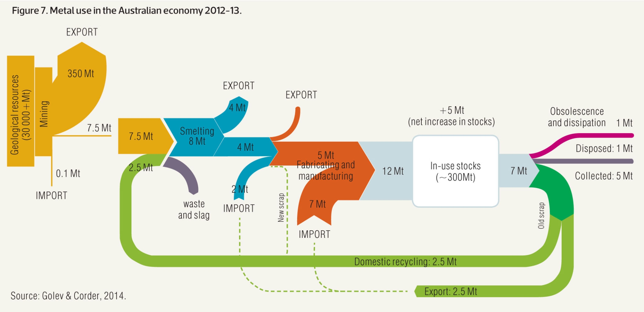
units = "TWh", fontSize = 12, nodeWidth = 30)Sankey diagram are prone to many visual variations, even if the underlying idea remain the same. Here is an example showing metal recovery and recycling in Australia (source):
If you’re interested to see more examples, there is a whole website about it.
Data To Viz is a comprehensive classification of chart types organized by data input format. Get a high-resolution version of our decision tree delivered to your inbox now!

A work by Yan Holtz for data-to-viz.com


