
Chord diagram
definition - mistake - related - code
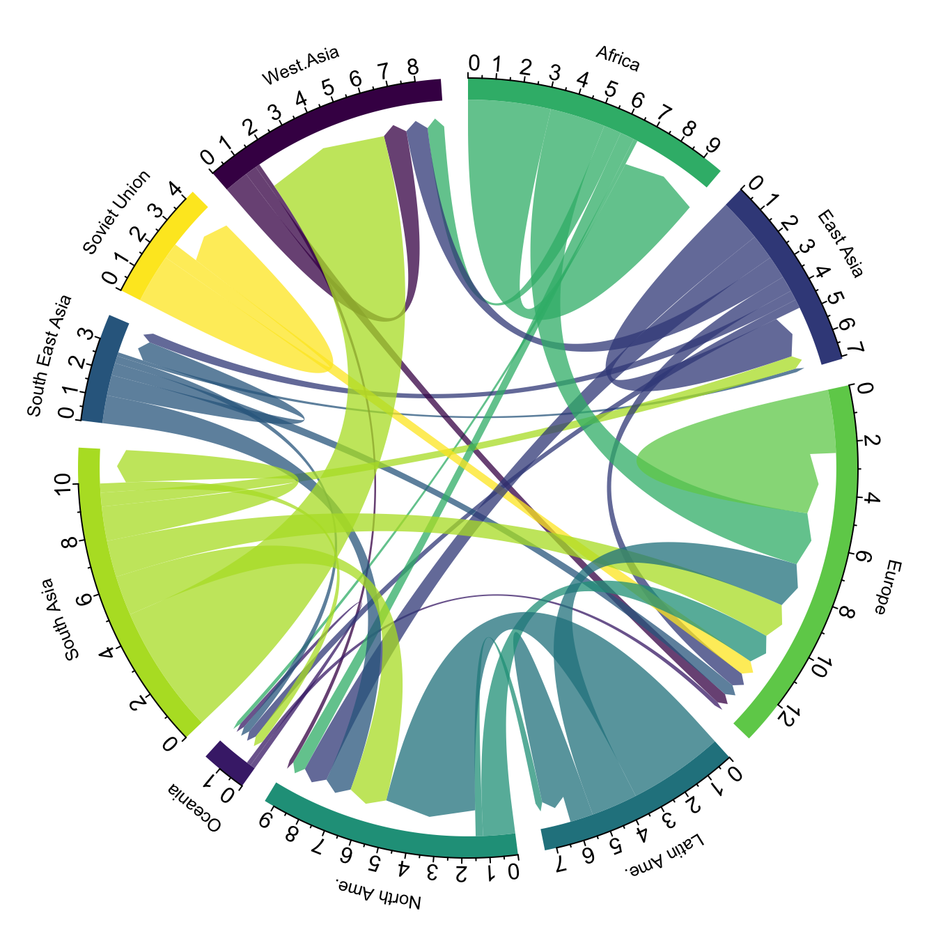
A chord diagram represents flows or connections between
several entities (called nodes). Each entity is
represented by a fragment on the outer part of the
circular layout. Then, arcs are drawn
between each entities. The size of the arc is proportional to the
importance of the flow.
Here is an example displaying the number of people migrating from one country to another. Data used comes from this scientific publication from Guy J. Abel.
# Libraries
library(tidyverse)
library(viridis)
library(patchwork)
library(hrbrthemes)
library(circlize)
library(chorddiag)  #devtools::install_github("mattflor/chorddiag")

# Load dataset from github
data <- read.table("https://raw.githubusercontent.com/holtzy/data_to_viz/master/Example_dataset/13_AdjacencyDirectedWeighted.csv", header=TRUE)

# short names
colnames(data) <- c("Africa", "East Asia", "Europe", "Latin Ame.",   "North Ame.",   "Oceania", "South Asia", "South East Asia", "Soviet Union", "West.Asia")
rownames(data) <- colnames(data)

# I need a long format
data_long <- data %>%
  rownames_to_column %>%
  gather(key = 'key', value = 'value', -rowname)

# parameters
circos.clear()
circos.par(start.degree = 90, gap.degree = 4, track.margin = c(-0.1, 0.1), points.overflow.warning = FALSE)
par(mar = rep(0, 4))

# color palette
mycolor <- viridis(10, alpha = 1, begin = 0, end = 1, option = "D")
mycolor <- mycolor[sample(1:10)]

# Base plot
chordDiagram(
  x = data_long,
  grid.col = mycolor,
  transparency = 0.25,
  directional = 1,
  direction.type = c("arrows", "diffHeight"),
  diffHeight  = -0.04,
  annotationTrack = "grid",
  annotationTrackHeight = c(0.05, 0.1),
  link.arr.type = "big.arrow",
  link.sort = TRUE,
  link.largest.ontop = TRUE)

# Add text and axis
circos.trackPlotRegion(
  track.index = 1,
  bg.border = NA,
  panel.fun = function(x, y) {

    xlim = get.cell.meta.data("xlim")
    sector.index = get.cell.meta.data("sector.index")

    # Add names to the sector.
    circos.text(
      x = mean(xlim),
      y = 3.2,
      labels = sector.index,
      facing = "bending",
      cex = 0.8
      )

    # Add graduation on axis
    circos.axis(
      h = "top",
      major.at = seq(from = 0, to = xlim[2], by = ifelse(test = xlim[2]>10, yes = 2, no = 1)),
      minor.ticks = 1,
      major.tick.percentage = 0.5,
      labels.niceFacing = FALSE)
  }
)
Note: this plot is made using the circlize library, and very strongly inspired from the Migest package from Guy J. Abel. Read more about this story here.
Chord diagrams are eye catching and quite popular in data
visualization. They allow to visualize
weigthed relationships between several entities. They
are adapted for several specific situations that slightly modify the
output and the way to read them:
Flow. This is the example decribed in the chord diagram above. But two ways to represent it:
Bipartite: nodes are grouped in a few categories. Connections go between categories but not within categories. In my opinion sankey diagrams are more adapted in this situation.
Note: this section is under construction.
Interactivity is a real plus to make the chord diagram understandable. In the example below, you can hover a specific group to highlight all its connections.
library(chorddiag)
m <- matrix(c(11975,  5871, 8916, 2868,
              1951, 10048, 2060, 6171,
              8010, 16145, 8090, 8045,
              1013,   990,  940, 6907),
            byrow = TRUE,
            nrow = 4, ncol = 4)
haircolors <- c("black", "blonde", "brown", "red")
dimnames(m) <- list(have = haircolors,
                    prefer = haircolors)

groupColors <- c("#000000", "#FFDD89", "#957244", "#F26223")
chorddiag(m, groupColors = groupColors, groupnamePadding = 20)Note: this example comes from the chorddiag package documentation.
Data To Viz is a comprehensive classification of chart types organized by data input format. Get a high-resolution version of our decision tree delivered to your inbox now!

A work by Yan Holtz for data-to-viz.com


