
Correlogram
definition - mistake - related - code
A correlogram or correlation matrix allows to analyse
the relationship between each pair of numeric variables of a dataset.
The relationship between each pair of variable is visualised through a
scatterplot,
or a symbol that represents the correlation (bubble, line,
number..).
The diagonal often represents the distribution of each
variable, using an histogram or
a density
plot.
# library & dataset
import seaborn as sns
df = sns.load_dataset('iris')
import matplotlib.pyplot as plt

# Basic correlogram
sns_plot = sns.pairplot(df)
sns_plot.savefig("IMG/correlogram1.png")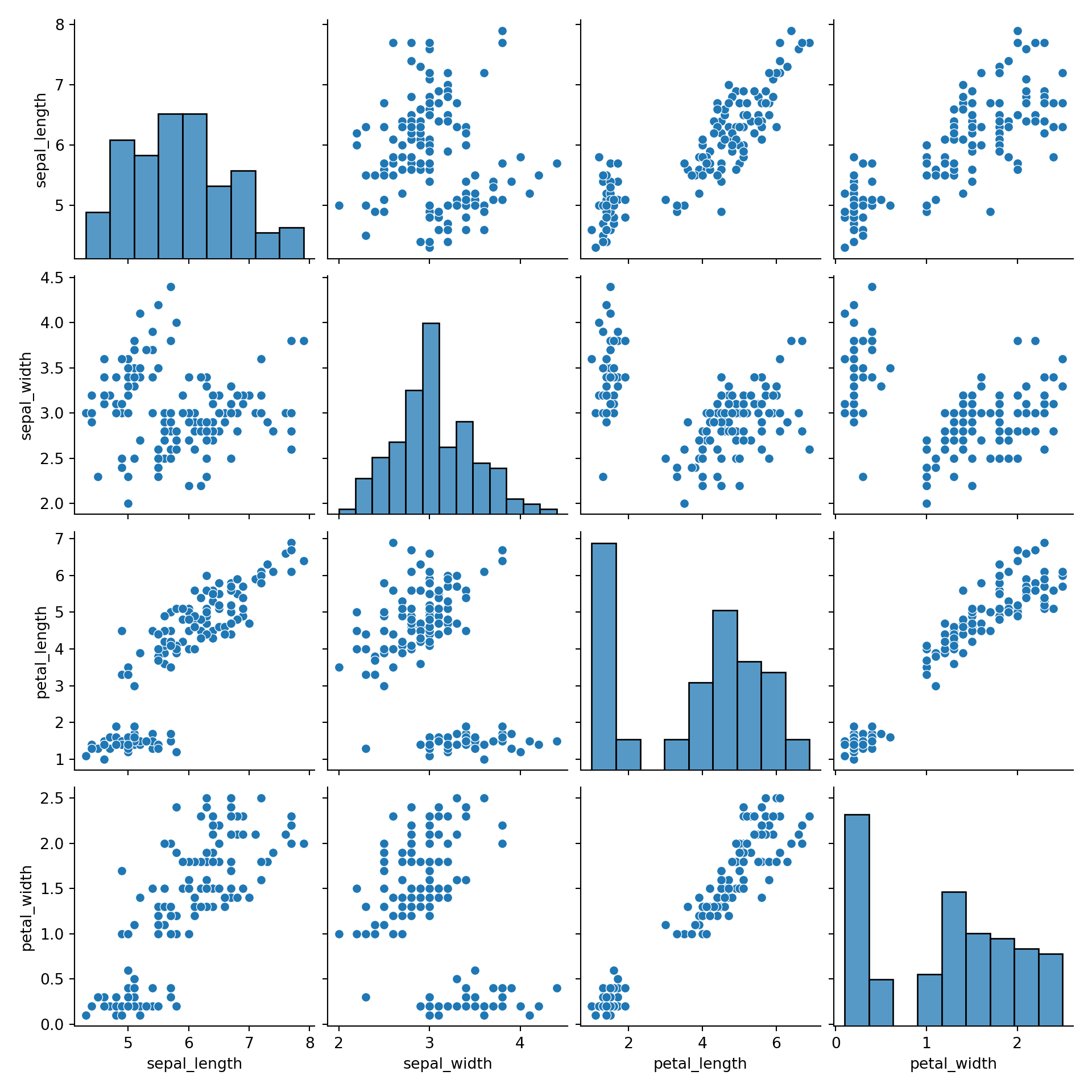
Note: exceptionally, graphic provided in this page are made
with Python,
since I really like the pairplot function of the seaborn
library.
Correlogram are really handy for exploratory analysis.
It allows to visualize the relationships of the whole dataset in a
glimpse. For instance, the linear relationship between petal length and
petal width is obvious here, as the one concerning sepal.
When you get a multivariate dataset, building a correlogram is one of the first step you should follow.
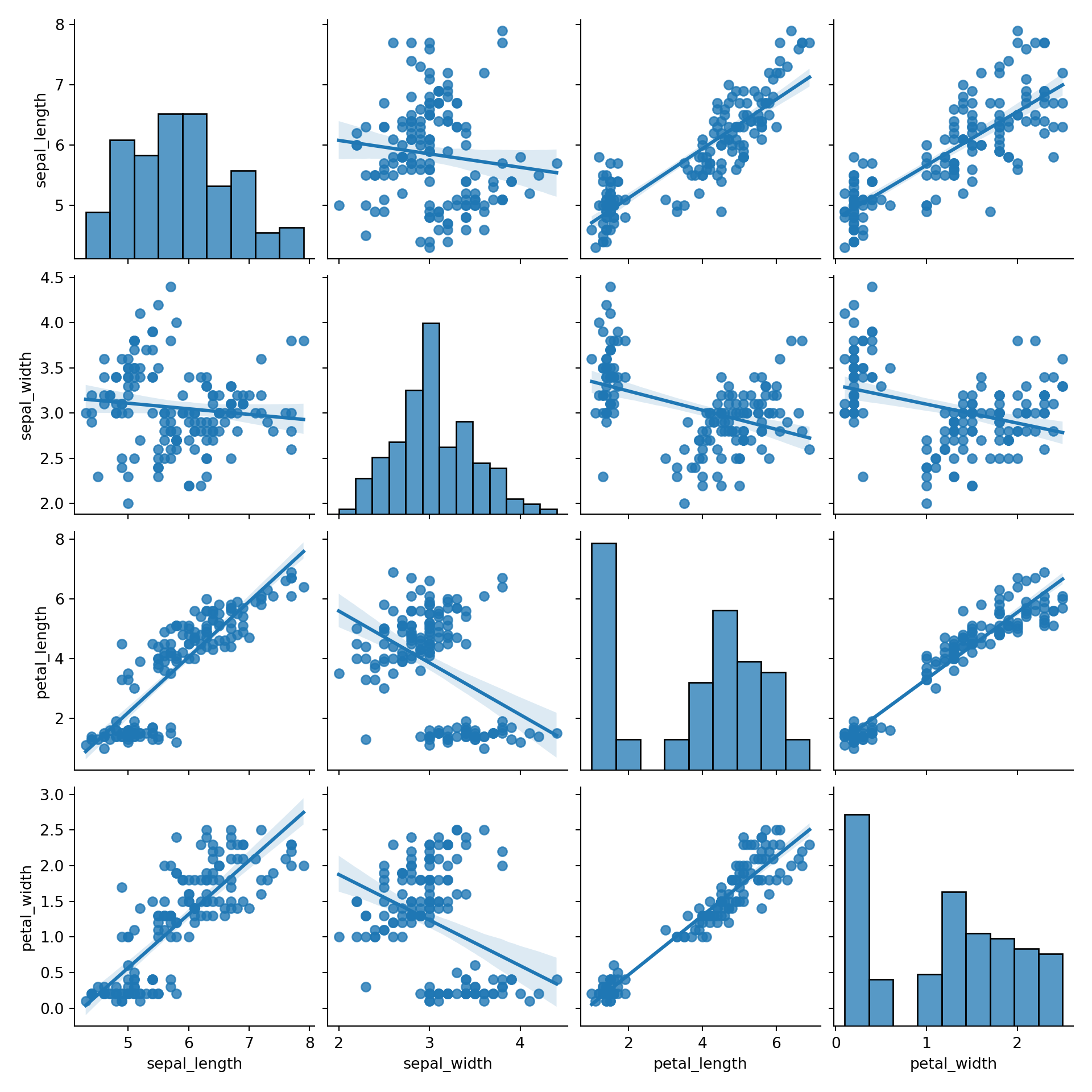
All the variations described in the scatterplot section are also available for correlogram. For example, why not applying a linear regression to each pair of variable:
As described in the scatterplot section, it is a good practice to display subgroups if a categoric variable is available as well:
# with regression
sns_plot = sns.pairplot(df, kind="scatter", hue="species", markers=["o", "s", "D"], palette="Set2")
sns_plot.savefig("IMG/correlogram3.png")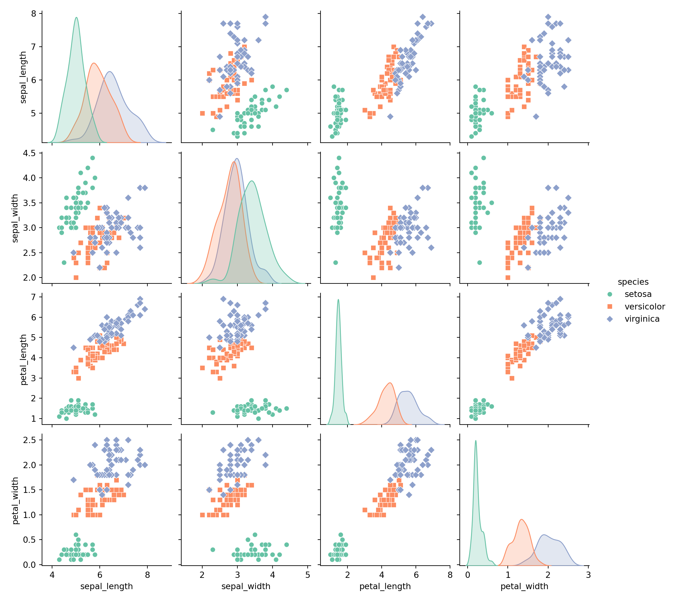
Data To Viz is a comprehensive classification of chart types organized by data input format. Get a high-resolution version of our decision tree delivered to your inbox now!

A work by Yan Holtz for data-to-viz.com


