
Violin plot
definition - mistake - related - code
Violin plot allows to visualize the distribution of a numeric variable for one or several groups. Each ‘violin’ represents a group or a variable. The shape represents the density estimate of the variable: the more data points in a specific range, the larger the violin is for that range. It is really close to a boxplot, but allows a deeper understanding of the distribution.
Here is an example showing how people perceive probability. On the /r/samplesize thread of reddit, questions like What probability would you assign to the phrase “Highly likely” were asked. Answers between 0 and 100 were recorded, and here is the distribution for each question:
# Libraries
library(tidyverse)
library(hrbrthemes)
library(viridis)

# Load dataset from github
data <- read.table("https://raw.githubusercontent.com/zonination/perceptions/master/probly.csv", header=TRUE, sep=",")
data <- data %>%
  gather(key="text", value="value") %>%
  mutate(text = gsub("\\.", " ",text)) %>%
  mutate(value = round(as.numeric(value),0)) %>%
  filter(text %in% c("Almost Certainly","Very Good Chance","We Believe","Likely","About Even", "Little Chance", "Chances Are Slight", "Almost No Chance"))

# Plot
data %>%
  mutate(text = fct_reorder(text, value)) %>%
  ggplot( aes(x=text, y=value, fill=text, color=text)) +
    geom_violin(width=2.1, size=0.2) +
    scale_fill_viridis(discrete=TRUE) +
    scale_color_viridis(discrete=TRUE) +
    theme_ipsum() +
    theme(
      legend.position="none"
    ) +
    coord_flip() +
    xlab("") +
    ylab("Assigned Probability (%)")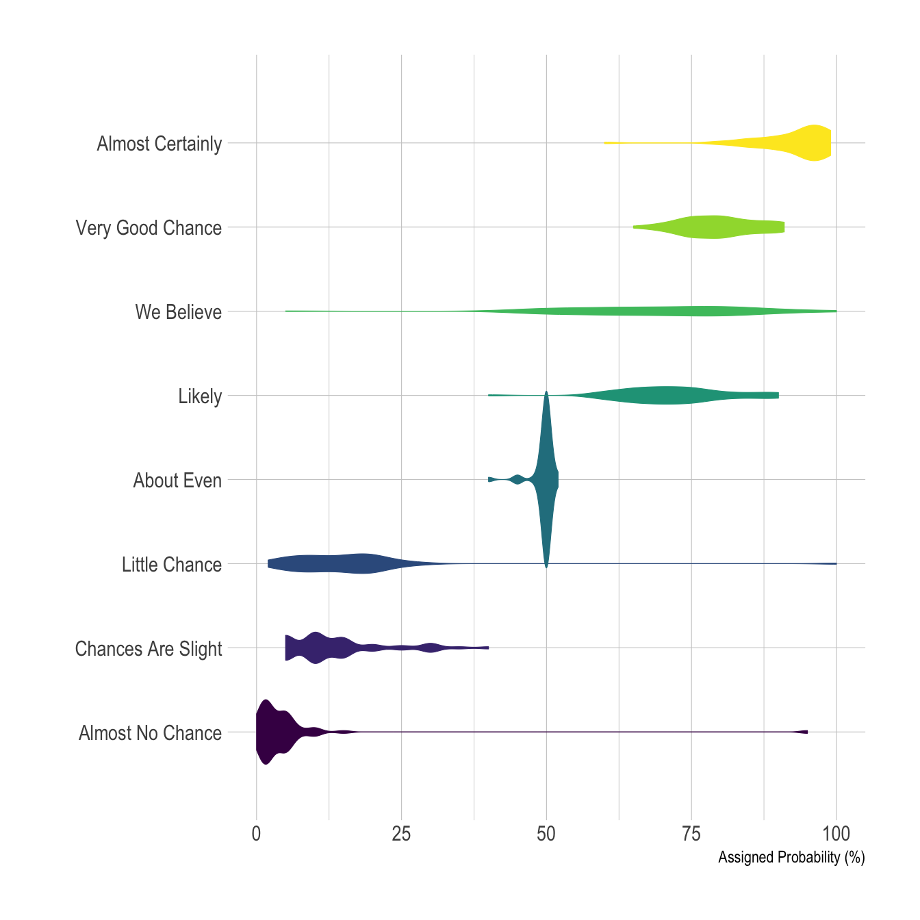
Disclaimer: This idea originally comes from a publication of the CIA which resulted in this figure. Then, Zoni Nation cleaned the reddit dataset and built graphics with R.
Violin plot is a powerful data visualization technique since it
allows to compare both the ranking of several groups and
their distribution. Surprisingly, it is less used than boxplot, even
if it provides more information in my opinion.
Violins are particularly adapted when the amount of data is huge and showing individual observations gets impossible. For small datasets, a boxplot with jitter is probably a better option since it really shows all the information.
Violin plot are made vertically most of the time. If
you have long labels, building an horizontal version like
above make the labels more readable.
It is possible to display a boxplot in the violin: it allows to assess the median and quartiles in a glimpse. See the boxplot section for more info.
# create a dataset
data <- data.frame(
  name=c( rep("A",500), rep("B",500), rep("B",500), rep("C",20), rep('D', 100)  ),
  value=c( rnorm(500, 10, 5), rnorm(500, 13, 1), rnorm(500, 18, 1), rnorm(20, 25, 4), rnorm(100, 12, 1) )
)

# sample size
sample_size = data %>% group_by(name) %>% summarize(num=n())

# Plot
data %>%
  left_join(sample_size) %>%
  mutate(myaxis = paste0(name, "\n", "n=", num)) %>%
  ggplot( aes(x=myaxis, y=value, fill=name)) +
    geom_violin(width=1.4) +
    geom_boxplot(width=0.1, color="grey", alpha=0.2) +
    scale_fill_viridis(discrete = TRUE) +
    theme_ipsum() +
    theme(
      legend.position="none",
      plot.title = element_text(size=11)
    ) +
    ggtitle("A Violin wrapping a boxplot") +
    xlab("")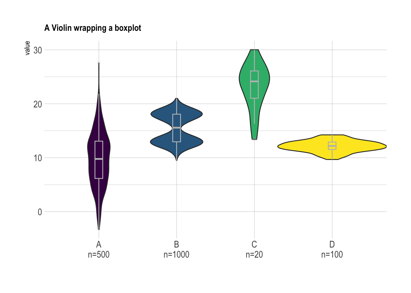
# Load dataset from github
data <- read.table("https://raw.githubusercontent.com/holtzy/data_to_viz/master/Example_dataset/10_OneNumSevCatSubgroupsSevObs.csv", header=T, sep=",") %>%
  mutate(tip = round(tip/total_bill*100, 1))

# Grouped
data %>%
  mutate(day = fct_reorder(day, tip)) %>%
  mutate(day = factor(day, levels=c("Thur", "Fri", "Sat", "Sun"))) %>%
  ggplot(aes(fill=sex, y=tip, x=day)) +
    geom_violin(position="dodge", alpha=0.5, outlier.colour="transparent") +
    scale_fill_viridis(discrete=T, name="") +
    theme_ipsum()  +
    xlab("") +
    ylab("Tip (%)") +
    ylim(0,40)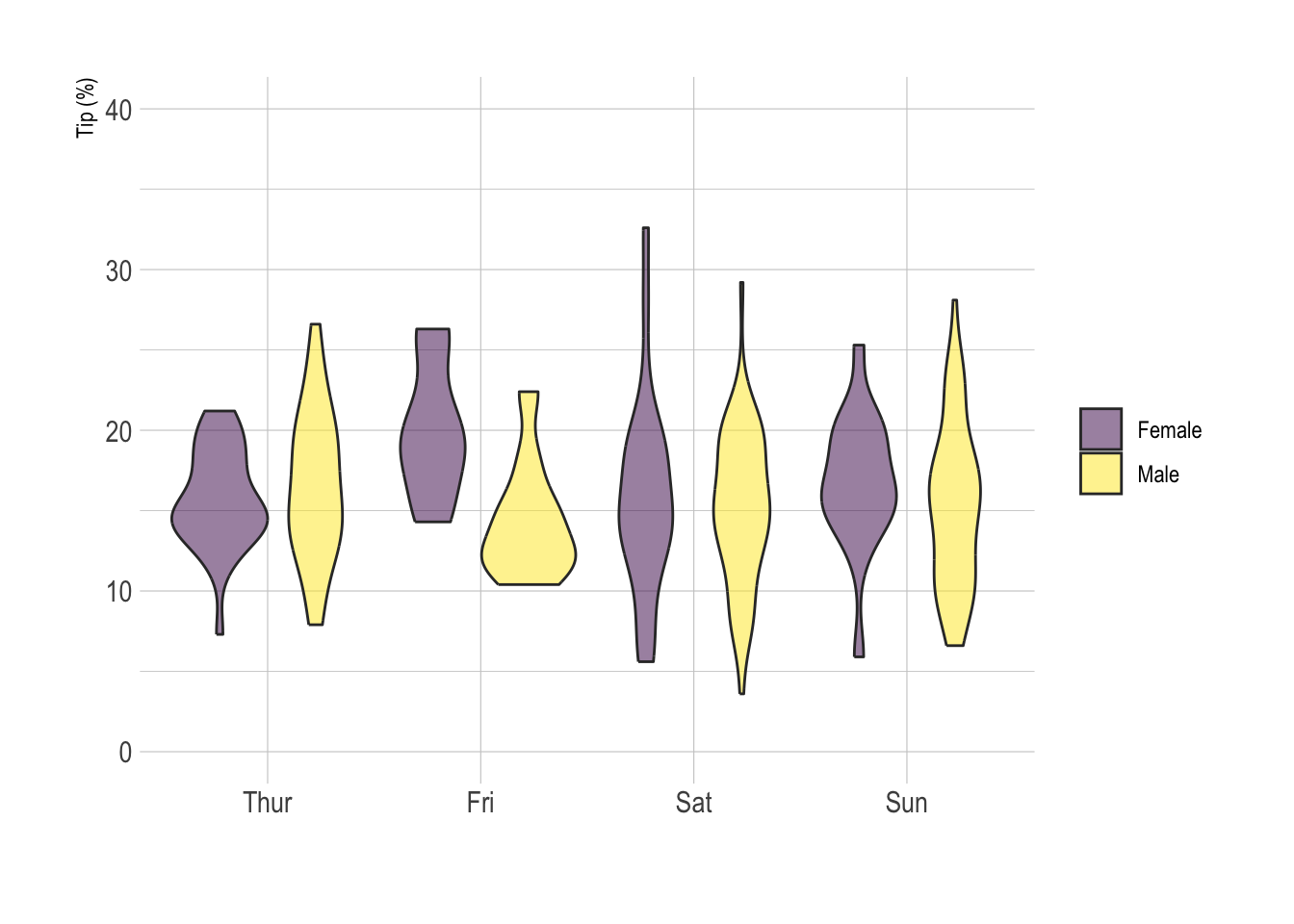
# Load dataset from github
data <- read.table("https://raw.githubusercontent.com/zonination/perceptions/master/probly.csv", header=TRUE, sep=",")
data <- data %>%
  gather(key="text", value="value") %>%
  mutate(text = gsub("\\.", " ",text)) %>%
  mutate(value = round(as.numeric(value),0)) %>%
  filter(text %in% c("Almost Certainly","Very Good Chance","We Believe","Likely","About Even", "Little Chance", "Chances Are Slight", "Almost No Chance"))

library(ggridges)

data %>%
  mutate(text = fct_reorder(text, value)) %>%
  ggplot( aes(y=text, x=value,  fill=text)) +
    geom_density_ridges(alpha=0.6, bandwidth=4) +
    scale_fill_viridis(discrete=TRUE) +
    scale_color_viridis(discrete=TRUE) +
    theme_ipsum() +
    theme(
      legend.position="none",
      panel.spacing = unit(0.1, "lines"),
      strip.text.x = element_text(size = 8)
    ) +
    xlab("") +
    ylab("Assigned Probability (%)")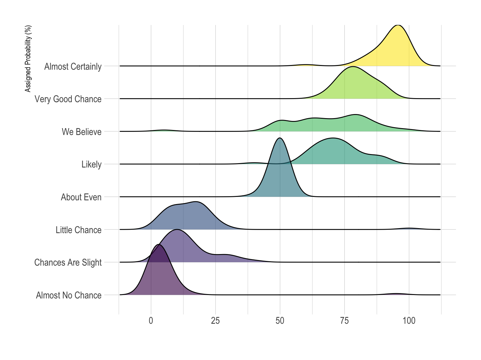
Data To Viz is a comprehensive classification of chart types organized by data input format. Get a high-resolution version of our decision tree delivered to your inbox now!

A work by Yan Holtz for data-to-viz.com


