How much do people tip?
A few data analytics ideas from
Data-to-Viz.com


This document gives a few suggestions to analyse a
dataset composed by a numeric variable measured on groups and subgroups,
with several observations for each combinations.
The dataset
used as an example describes the amount that restaurant staff receive in
tips based on various indicators like the client sex, the day of the
week and if the client smokes or not.
Data come from the Seaborn Python
library. A clean .csv version is available in the
data-to-viz.com github
repository.
# Libraries
library(tidyverse)
library(hrbrthemes)
library(kableExtra)
options(knitr.table.format = "html")
library(viridis)
library(ggrepel)
library(plotly)

# Load dataset from github
data <- read.table("https://raw.githubusercontent.com/holtzy/data_to_viz/master/Example_dataset/10_OneNumSevCatSubgroupsSevObs.csv", header=T, sep=",") %>%
  mutate(tip = round(tip/total_bill*100, 1))

# show data
data %>% head(6) %>% select(tip, sex, day, smoker) %>% kable() %>%
kable_styling(bootstrap_options = "striped", full_width = F)| tip | sex | day | smoker |
|---|---|---|---|
| 5.9 | Female | Sun | No |
| 16.1 | Male | Sun | No |
| 16.7 | Male | Sun | No |
| 14.0 | Male | Sun | No |
| 14.7 | Female | Sun | No |
| 18.6 | Male | Sun | No |
The most common way to represent that kind of dataset is probably the grouped boxplot. Each combination of group is represented by a box. This allows to quickly understand what is the distribution of the numeric variable for each combination.
Here, it looks like there is not much difference in tip values from
one day to the other in average, except a slight increase on sunday.
Moreover, it looks like females tend to tip more than males on friday.
Note that individual data points are presented using
jittering, what allows to detect more particular pattern
and assess the sample size of each group.
# Counts the number of value per group and subgroup
counts = data %>%
  group_by(day, sex) %>%
  summarize(
    n=n(),
    median=median(tip)
  )

# Grouped
data %>%
  mutate(day = fct_reorder(day, tip)) %>%
  mutate(day = factor(day, levels=c("Thur", "Fri", "Sat", "Sun"))) %>%
  ggplot(aes(fill=sex, y=tip, x=day)) +
    geom_boxplot(position=position_dodge2(preserve = "total"), alpha=0.5, outlier.colour="transparent", varwidth = TRUE) +
    geom_point(color="grey", size=1, width=0.1, position=position_jitterdodge() , alpha=0.4) +
    scale_fill_viridis(discrete=T, name="") +
    geom_text(data=counts, aes(label=paste0("n: ",n), y=median-2), position=position_dodge(1), hjust=0.5) +
    theme_ipsum()  +
    xlab("") +
    ylab("Tip (%)") +
    ylim(0,35)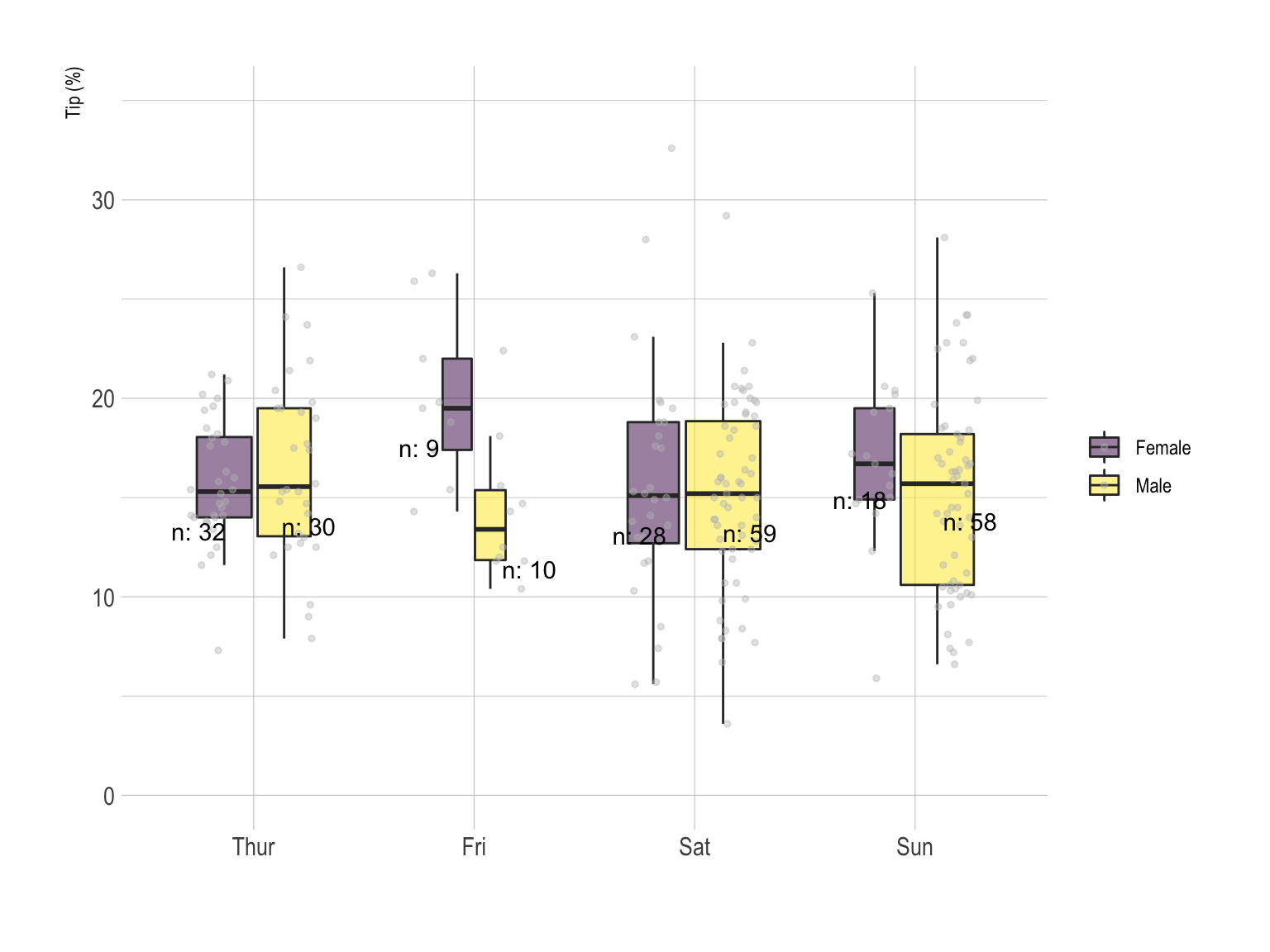
In the above chart categories are grouped by day. It is possible to build the same kind of visualization, grouping by Sex instead. In the first case, it is easy to compare the behavior or each sex day by day. On the second one, the idea is more to compare the difference by day for each sex.
# Grouped
data %>%
  mutate(day = fct_reorder(day, tip)) %>%
  mutate(day = factor(day, levels=c("Thur", "Fri", "Sat", "Sun"))) %>%
  ggplot(aes(fill=day, y=tip, x=sex)) +
    geom_boxplot(position="dodge", alpha=0.5, outlier.colour="transparent") +
    geom_point(color="grey", size=1, width=0.1, position=position_jitterdodge() , alpha=0.4) +
    scale_fill_viridis(discrete=T, name="") +
    theme_ipsum()  +
    xlab("") +
    ylab("Tip (%)") +
    ylim(0,40)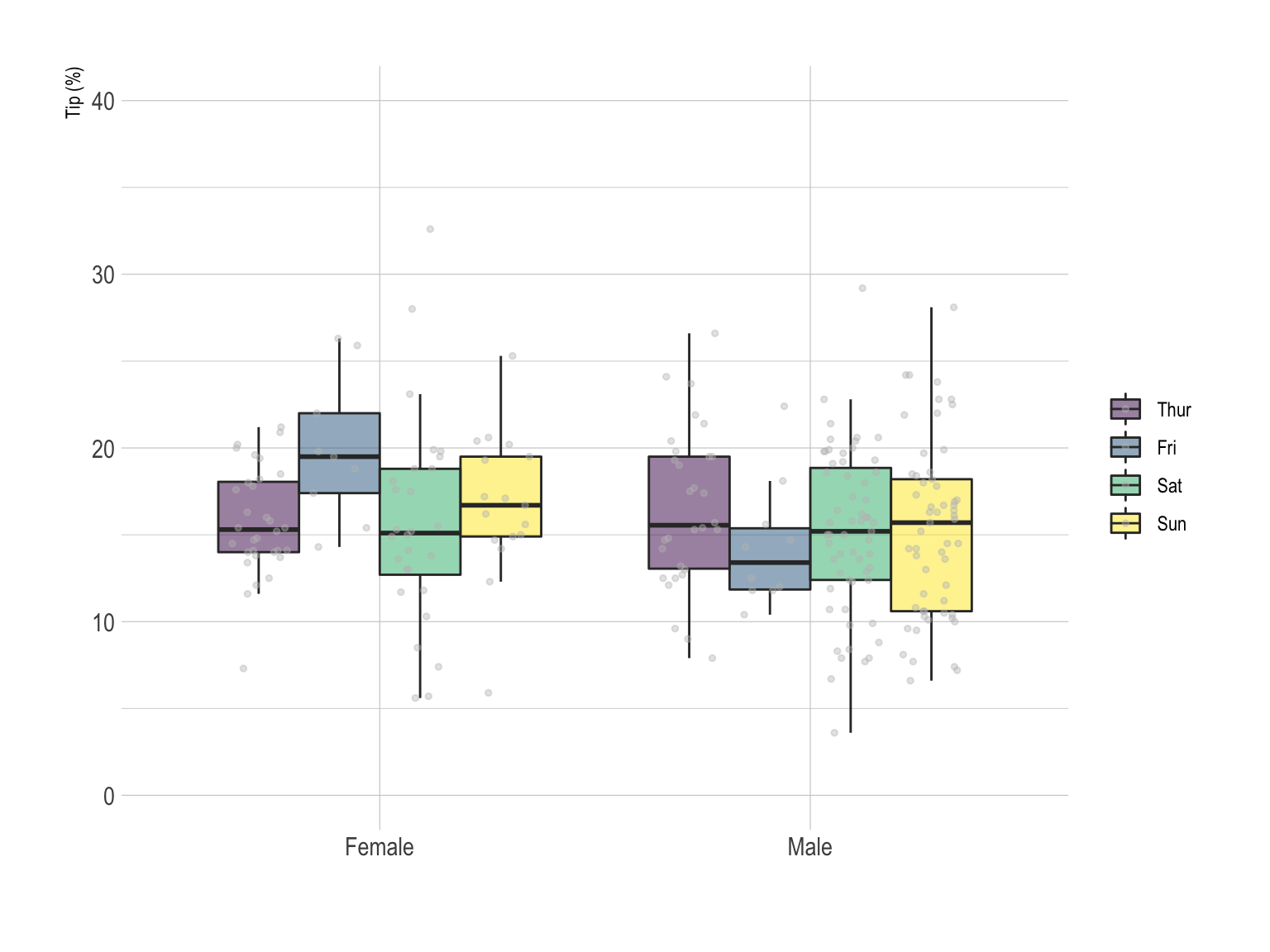
The violin plot can be used exactly in the same situation that the boxplot. Using the same grouping technique, we got here a grouped violin plot.
# Grouped
data %>%
  mutate(day = fct_reorder(day, tip)) %>%
  mutate(day = factor(day, levels=c("Thur", "Fri", "Sat", "Sun"))) %>%
  ggplot(aes(fill=sex, y=tip, x=day)) +
    geom_violin(position="dodge", alpha=0.5, outlier.colour="transparent") +
    scale_fill_viridis(discrete=T, name="") +
    theme_ipsum()  +
    xlab("") +
    ylab("Tip (%)") +
    ylim(0,40)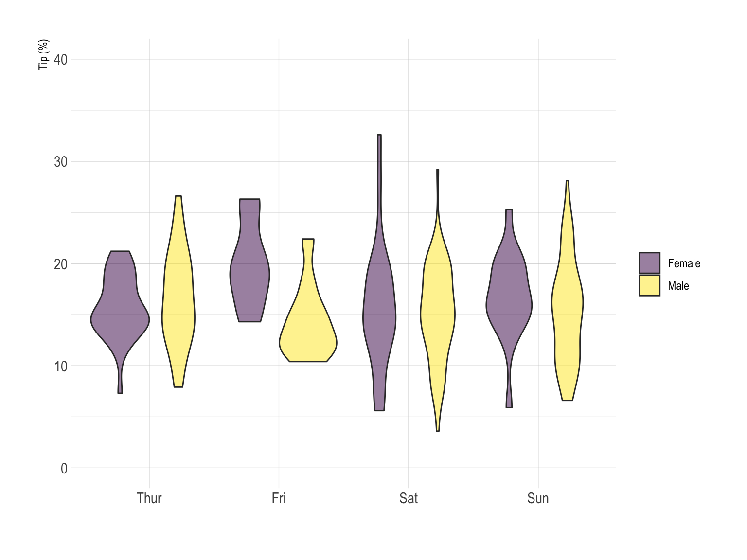
Small multiple is a powerful technique that can be used with that kind of data. Here, each combination is represented in a part of the grid, allowing a quick comparison between them. Histograms are used here, but the same result could be obtained with density plot.
# Grouped
data %>%
  mutate(day = fct_reorder(day, tip)) %>%
  mutate(day = factor(day, levels=c("Thur", "Fri", "Sat", "Sun"))) %>%
  ggplot(aes(x=tip)) +
    geom_histogram(bins=20, fill="#69b3a2", color="white") +
    facet_grid(sex~time) +
    theme_ipsum()  +
    xlab("") +
    ylab("Tip")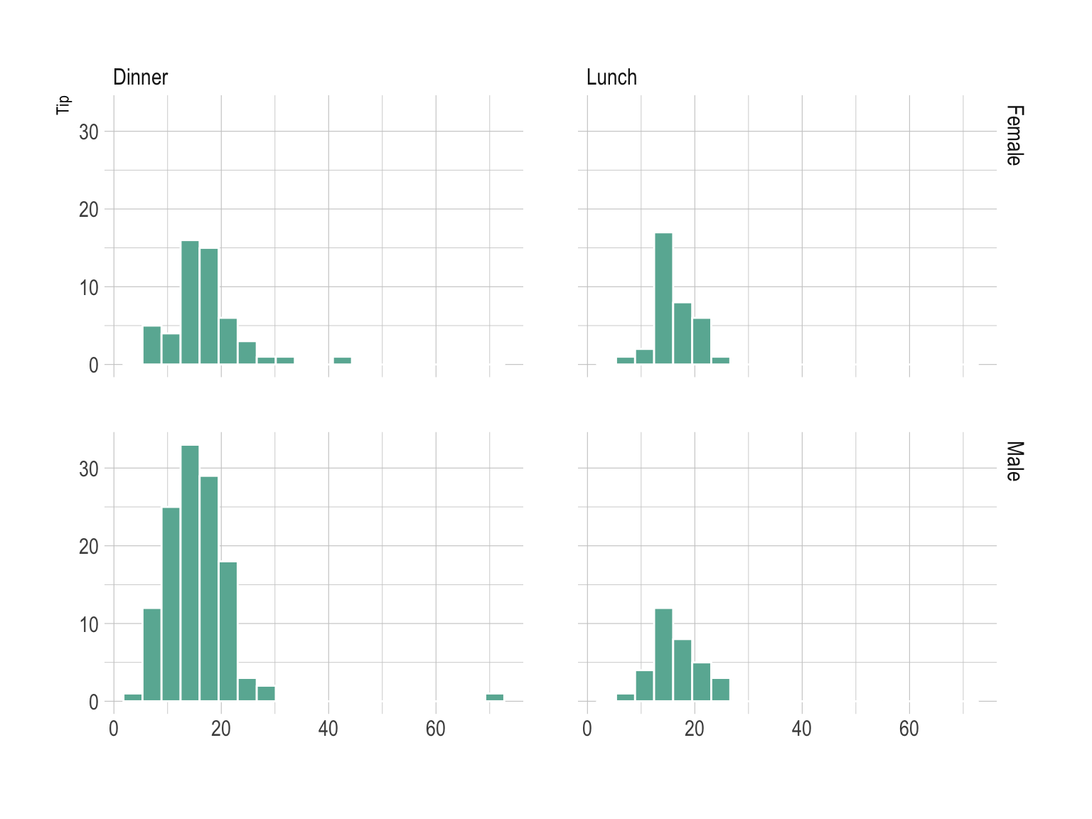
You can learn more about each type of graphic presented in this story in the dedicated sections. Click the icon below:
Data To Viz is a comprehensive classification of chart types organized by data input format. Get a high-resolution version of our decision tree delivered to your inbox now!

A work by Yan Holtz for data-to-viz.com