Visualizing the world population
A few data analytics ideas from
Data-to-Viz.com


This document gives a few suggestions to analyse a
nested or hierarchical dataset in which a
numeric value is available for each leaf. This kind of data has an
origine node that gives birth to subsequent nodes and so on until the
final leaves.
Take the world population of 250 countries as an example. The world is divided in continent (group), continent are divided in regions (subgroup), and regions are divided in countries. In this tree structure, countries are considered as leaves: they are at the end of the branches.
Data come from wikipedia, formatted thanks to these 2 pages. (1, 2). A clean
.csv file is available on github.
It looks like that:
# Libraries
library(tidyverse)
library(hrbrthemes)
library(kableExtra)
options(knitr.table.format = "html")
library(viridis)

# Load dataset from github
data <- read.table("https://raw.githubusercontent.com/holtzy/data_to_viz/master/Example_dataset/11_SevCatOneNumNestedOneObsPerGroup.csv", header=T, sep=";")
data[ which(data$value==-1),"value"] <- 1
colnames(data) <- c("Continent", "Region", "Country", "Pop")

# show data
data %>% head(3) %>% kable() %>%
kable_styling(bootstrap_options = "striped", full_width = F)| Continent | Region | Country | Pop |
|---|---|---|---|
| Asia | Southern Asia | Afghanistan | 25500100 |
| Europe | Northern Europe | Åland Islands | 28502 |
| Europe | Southern Europe | Albania | 2821977 |
A treemap represents each node of the hierarchical structure as a square. Each square area is proportionnal to its value: the population here.
library(treemap)

p <- treemap(
  data,

  # data
  index=c("Continent", "Region", "Country"),
  vSize="Pop",
  type="index",
  title="",
  palette="Dark2",

  # Borders
  border.col=c("black", "grey", "grey"),
  border.lwds=c(1,0.5,0.1),

  # Labels
  fontcolor.labels=c("white", "white", "black"),
  fontface.labels=1,
  bg.labels=c("transparent"),
  align.labels=list( c("center", "center"), c("left", "top"), c("right", "bottom")),
  overlap.labels=0.5,
  fontsize.labels=c(32, 20, 13)
)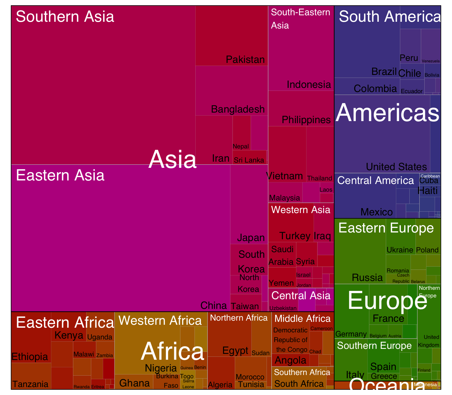
Here, the importance of Asia pops out obviously. It is also possible to understand that Southern and Eastern Asia are the most densely populated part of Asia.
Circle packing follows the same idea than treemap, except that it uses circles instead of squares to represent each nodes. Because of that it uses space less efficiently. However groups are more obvious and the figure appear less cluttered.
# Libraries
library(circlepackeR)


# Remove a few problematic lines
data <- data %>% filter(Continent!="") %>% droplevels()

# Change the format. This use the data.tree library. This library needs a column that looks like root/group/subgroup/..., so I build it
library(data.tree)
data$pathString <- paste("world", data$Continent, data$Region, data$Country, sep = "/")
population <- as.Node(data)

# You can custom the minimum and maximum value of the color range.
circlepackeR(population, size = "Pop", color_min = "hsl(56,80%,80%)", color_max = "hsl(341,30%,40%)")A lollipop plot is basically a barplot, where the bar is transformed in a line and a dot. It shows the relationship between a numeric and a categoric variable.
It can be a good option if your interested in the value of each leaf, but do not really care about the hierarchy of the dataset. For instance, if you wonder which country as the highest population size. Here, China and India pop out clearly.
data %>%
  filter(!is.na(Pop)) %>%
  arrange(Pop) %>%
  tail(20) %>%
  mutate(Country=factor(Country, Country)) %>%
  mutate(Pop=Pop/1000000) %>%
  ggplot( aes(x=Country, y=Pop) ) +
    geom_segment( aes(x=Country ,xend=Country, y=0, yend=Pop), color="grey") +
    geom_point(size=3, color="#69b3a2") +
    coord_flip() +
    theme_ipsum() +
    theme(
      panel.grid.minor.y = element_blank(),
      panel.grid.major.y = element_blank(),
      legend.position="none"
    ) +
    xlab("") +
    ylab("Population (M)")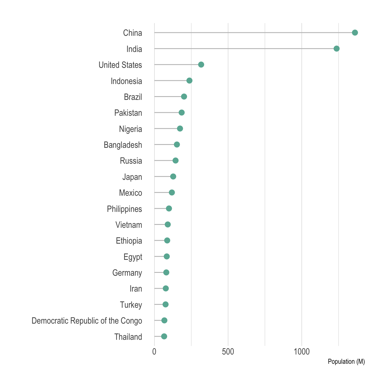
Note that you can still show a few levels of the hierarchy using color, small multiple, or simply sorting entities by group and then by population. Here is an example using this last approach:
data %>%
  filter(!is.na(Pop)) %>%
  arrange(Pop) %>%
  tail(50) %>%
  arrange(Continent, Pop) %>%
  mutate(Country=factor(Country, Country)) %>%
  mutate(Pop=Pop/1000000) %>%
  ggplot( aes(x=Country, y=Pop, color=Continent) ) +
    geom_segment( aes(x=Country ,xend=Country, y=0, yend=Pop), color="grey") +
    geom_point(size=3) +
    scale_color_viridis(discrete=TRUE) +
    coord_flip() +
    theme_ipsum() +
    theme(
      panel.grid.minor.y = element_blank(),
      panel.grid.major.y = element_blank(),
      legend.position="none"
    ) +
    xlab("") +
    ylab("Population (M)")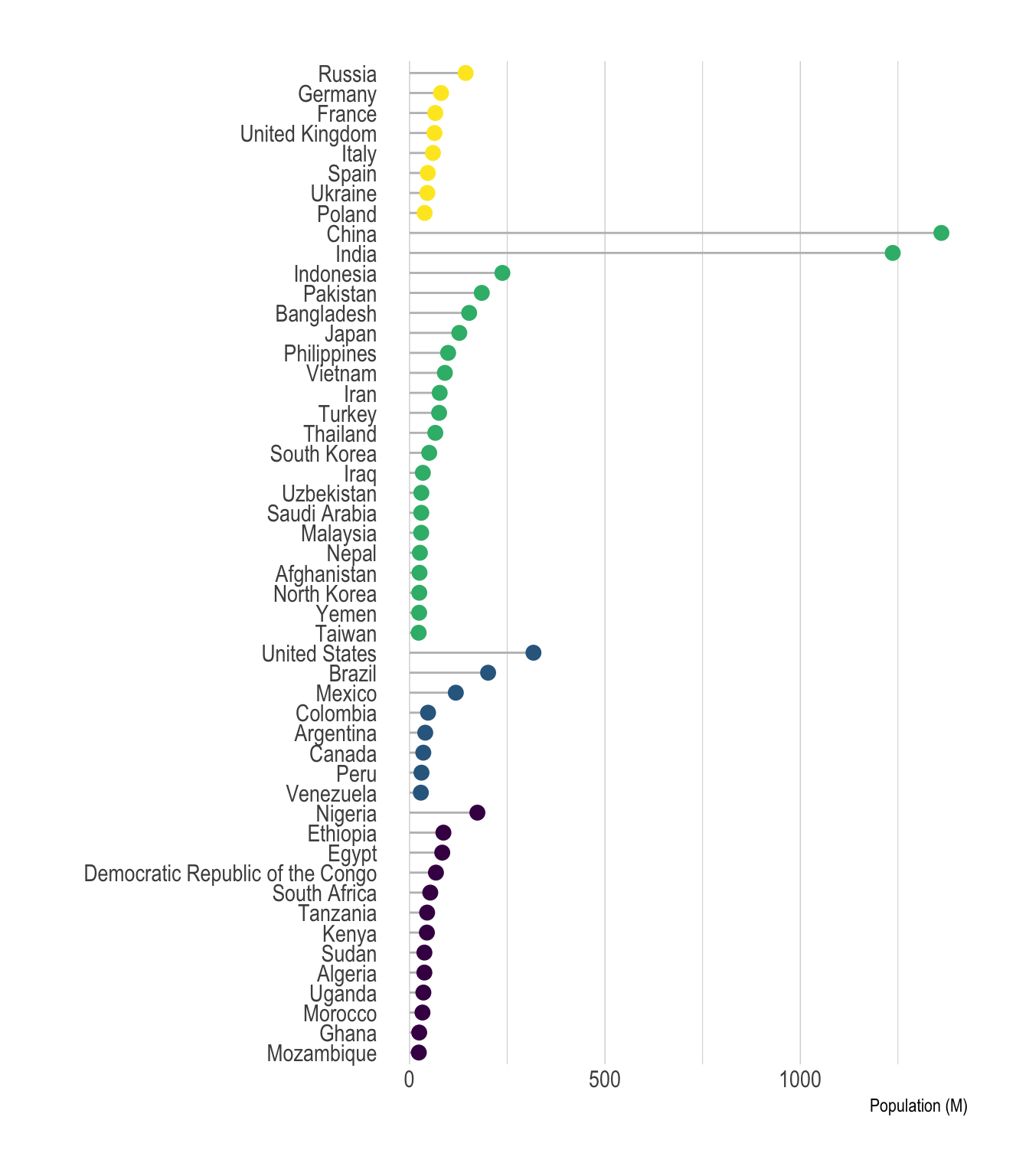
Note that it is possible to make a circular version of your barplot or lollipop plot. In my opinion, this kind of representation works especially well when you have several groups and obvious patterns. Indeed, it suits the world population dataset not too bad:
# prepare data:
data <- data %>%
  filter(!is.na(Pop)) %>%
  filter(Continent=="Africa") %>%
  arrange(Pop) %>%
  arrange(Region, Pop) %>%
  mutate(Country=factor(Country, Country)) %>%
  mutate(Pop=Pop/1000000) %>%
  select(Region, Country, Pop) %>%
  droplevels()
colnames(data) <- c("group", "individual", "value")

# Set a number of 'empty bar' to add at the end of each group
empty_bar=3
to_add = data.frame( matrix(NA, empty_bar*nlevels(data$group), ncol(data)) )
colnames(to_add) = colnames(data)
to_add$group=rep(levels(data$group), each=empty_bar)
data=rbind(data, to_add)
data=data %>% arrange(group)
data$id=seq(1, nrow(data))

# Get the name and the y position of each label
label_data=data
number_of_bar=nrow(label_data)
angle= 90 - 360 * (label_data$id-0.5) /number_of_bar     # I substract 0.5 because the letter must have the angle of the center of the bars. Not extreme right(1) or extreme left (0)
label_data$hjust <-ifelse( angle < -90, 1, 0)
label_data$angle <-ifelse(angle < -90, angle+180, angle)
label_data$individual <- gsub("Democratic Republic of the Congo", "R. D. Congo", label_data$individual)
label_data$value[which(label_data$individual == "Nigeria")] <- 130

# prepare a data frame for base lines
base_data=data %>%
  group_by(group) %>%
  summarize(start=min(id), end=max(id) - empty_bar) %>%
  rowwise() %>%
  mutate(title=mean(c(start, end))) %>%
  mutate(group = gsub(" Africa", "", group)) %>%
  mutate(group = gsub("ern", "", group))

# prepare a data frame for grid (scales)
grid_data = base_data
grid_data$end = grid_data$end[ c( nrow(grid_data), 1:nrow(grid_data)-1)] + 1
grid_data$start = grid_data$start - 1
grid_data=grid_data[-1,]

# Make the plot
p = ggplot(data, aes(x=as.factor(id), y=value, fill=group)) +       # Note that id is a factor. If x is numeric, there is some space between the first bar

  # Main bars
  geom_bar(aes(x=as.factor(id), y=value, fill=group), stat="identity", alpha=0.5) +
  scale_fill_viridis(discrete=T) +

  # Add a val=100/75/50/25 lines. I do it at the beginning to make sur barplots are OVER it.
  geom_segment(data=grid_data, aes(x = end, y = 80, xend = start, yend = 80), colour = "grey", alpha=1, size=0.3 , inherit.aes = FALSE ) +
  geom_segment(data=grid_data, aes(x = end, y = 60, xend = start, yend = 60), colour = "grey", alpha=1, size=0.3 , inherit.aes = FALSE ) +
  geom_segment(data=grid_data, aes(x = end, y = 40, xend = start, yend = 40), colour = "grey", alpha=1, size=0.3 , inherit.aes = FALSE ) +
  geom_segment(data=grid_data, aes(x = end, y = 20, xend = start, yend = 20), colour = "grey", alpha=1, size=0.3 , inherit.aes = FALSE ) +

  # Add text showing the value of each 100/75/50/25 lines
  ggplot2::annotate("text", x = rep(max(data$id),4), y = c(20, 40, 60, 80), label = c("20", "40", "60", "80") , color="grey", size=3 , angle=0, fontface="bold", hjust=1) +

  geom_bar(aes(x=as.factor(id), y=value, fill=group), stat="identity", alpha=0.5) +
  ylim(-70,180) +
  theme_minimal() +
  theme(
    legend.position = "none",
    axis.text = element_blank(),
    axis.title = element_blank(),
    panel.grid = element_blank(),
    plot.margin = unit(c(-3,-5,-5,-5), "cm")
  ) +
  coord_polar() +
  geom_text(data=label_data, aes(x=id, y=value+10, label=individual, hjust=hjust), color="black", fontface="bold",alpha=0.6, size=2.5, angle= label_data$angle, inherit.aes = FALSE ) +

  # Add base line information
  geom_segment(data=base_data, aes(x = start, y = -5, xend = end, yend = -5), colour = "black", alpha=0.8, size=0.6 , inherit.aes = FALSE )  +
  geom_text(data=base_data, aes(x = title, y = -15, label=group), hjust=c(1,1,0.5,0,0), colour = "black", alpha=0.8, size=3, fontface="bold", inherit.aes = FALSE)

p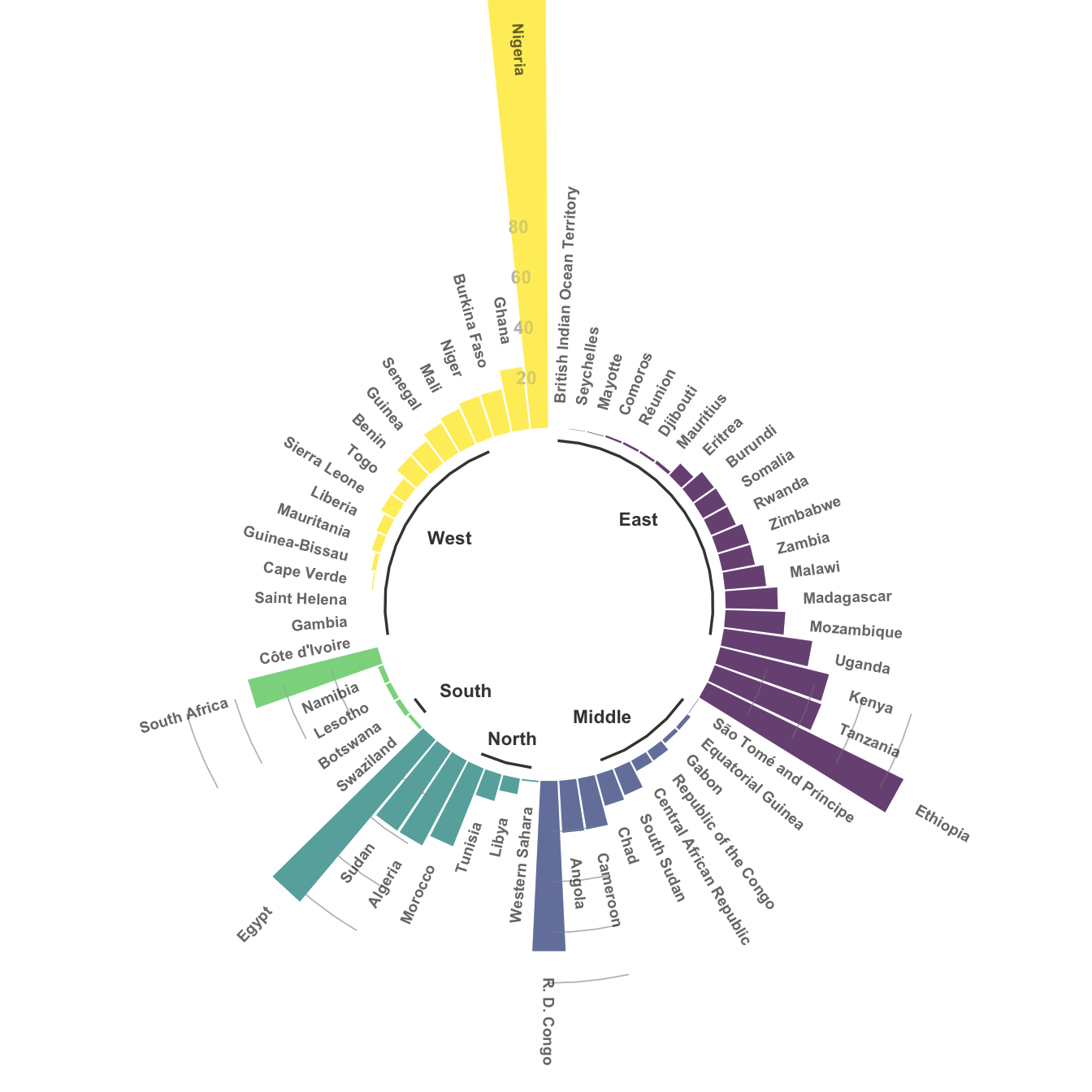
You can learn more about each type of graphic presented in this story in the dedicated sections. Click the icon below:
Data To Viz is a comprehensive classification of chart types organized by data input format. Get a high-resolution version of our decision tree delivered to your inbox now!

A work by Yan Holtz for data-to-viz.com