
Lollipop chart
definition - mistake - related - code
A lollipop plot is basically a barplot, where
the bar is transformed in a line and a dot. It
shows the relationship between a numeric and a categoric variable.
Here is an example showing the quantity of weapons exported by the top 20 largest exporters in 2017 (more info here):
# Libraries
library(tidyverse)
library(hrbrthemes)
library(kableExtra)
options(knitr.table.format = "html")
library(patchwork)

# Load dataset from github
data <- read.table("https://raw.githubusercontent.com/holtzy/data_to_viz/master/Example_dataset/7_OneCatOneNum.csv", header=TRUE, sep=",")

# Plot
data %>%
  filter(!is.na(Value)) %>%
  arrange(Value) %>%
  tail(20) %>%
  mutate(Country=factor(Country, Country)) %>%
  ggplot( aes(x=Country, y=Value) ) +
    geom_segment( aes(x=Country ,xend=Country, y=0, yend=Value), color="grey") +
    geom_point(size=3, color="#69b3a2") +
    coord_flip() +
    theme_ipsum() +
    theme(
      panel.grid.minor.y = element_blank(),
      panel.grid.major.y = element_blank(),
      legend.position="none"
    ) +
    xlab("") +
    ylab("Weapon quantity (SIPRI trend-indicator value)")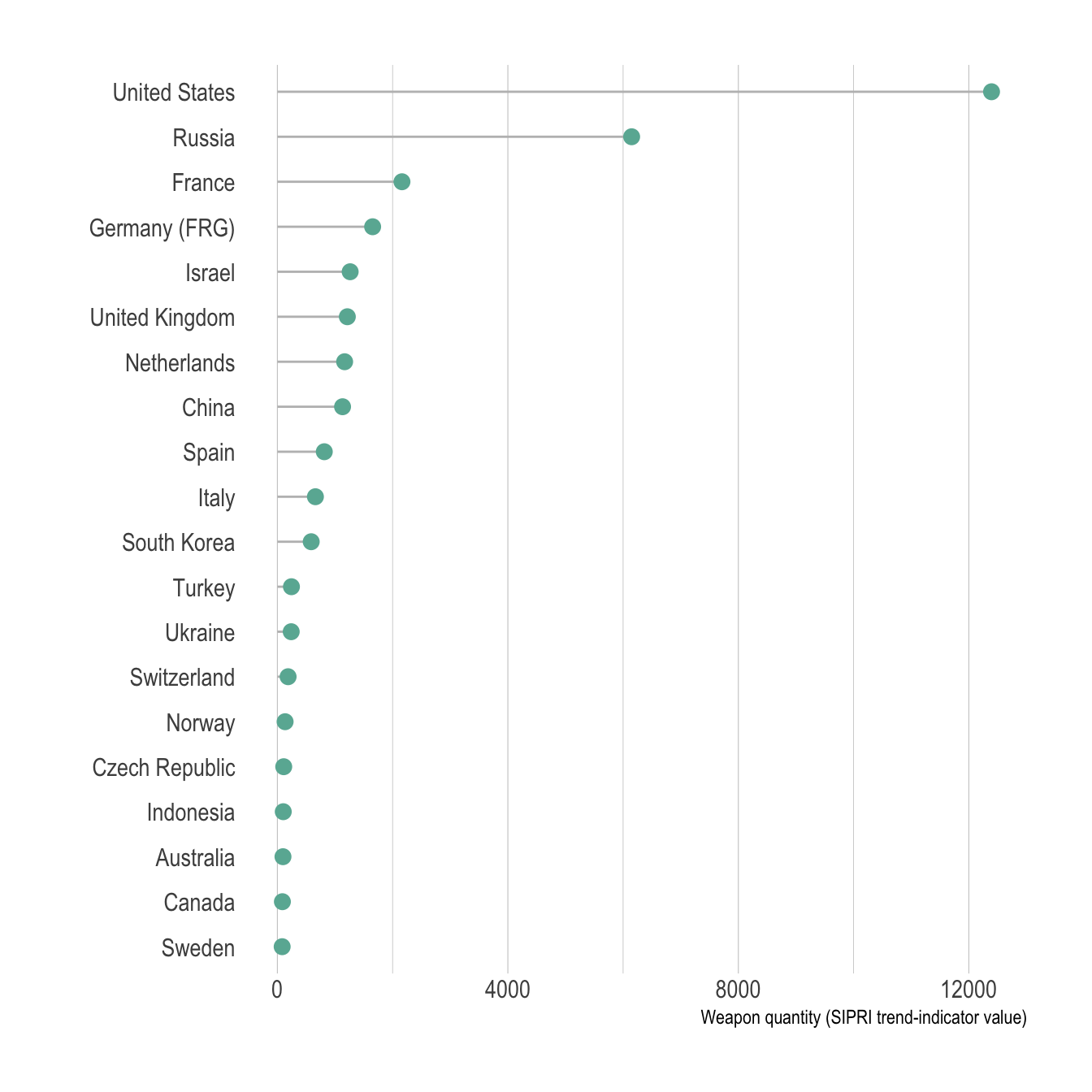
The lollipop plot is used exactly in the same situation than a
barplot. However it is somewhat more appealing and convey as well the
information. It is especially useful when you have several bars of the
same height: it avoids to have a cluttered figure and a Moiré effect.
don <- data.frame(
  group = LETTERS[1:20],
  val = 20 + rnorm(20)
)

p1 <- don %>%
    arrange(val) %>%
    mutate(group=factor(group, group)) %>%
    ggplot( aes(x=group, y=val) ) +
      geom_bar(stat="identity", fill="#69b3a2") +
      coord_flip() +
      theme_ipsum() +
      theme(
        panel.grid.minor.y = element_blank(),
        panel.grid.major.y = element_blank(),
        legend.position="none"
      ) +
      xlab("") +
      ylab("Weapon quantity (SIPRI trend-indicator value)")

p2 <- don %>%
    arrange(val) %>%
    mutate(group=factor(group, group)) %>%
    ggplot( aes(x=group, y=val) ) +
      geom_segment( aes(x=group ,xend=group, y=0, yend=val), color="grey") +
      geom_point(size=3, color="#69b3a2") +
      coord_flip() +
      theme_ipsum() +
      theme(
        panel.grid.minor.y = element_blank(),
        panel.grid.major.y = element_blank(),
        legend.position="none"
      ) +
      xlab("") +
      ylab("Weapon quantity (SIPRI trend-indicator value)")

p1 + p2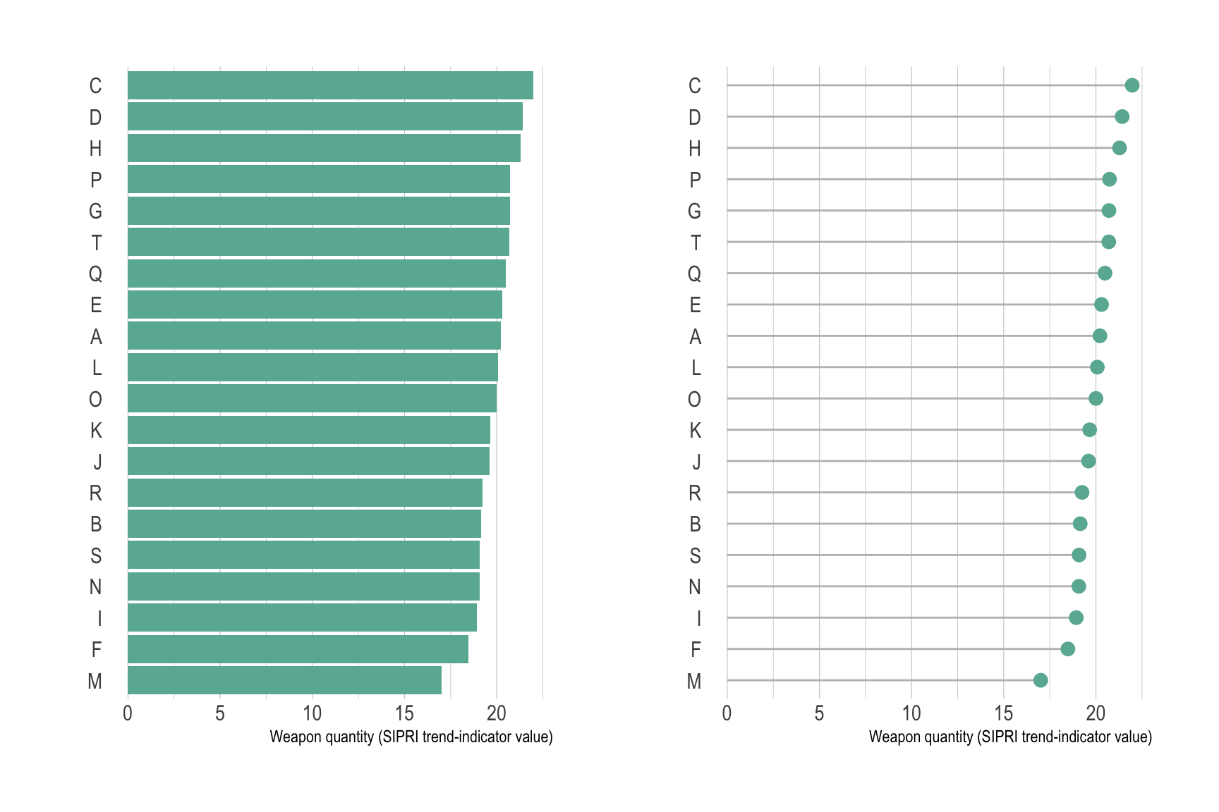
The Cleveland dotplot is a handy variation, allowing to
compare the value of 2 numeric values for each group. This kind of data
could also be visualized using a grouped or stack barplot.
However, this representation is less cluttered and way easier to read.
Use it if you have 2 subgroups per group.
# Create data (could be way easier but it's late)
value1 <- abs(rnorm(26))*2
don <- data.frame(
  x=LETTERS[1:26],
  value1=value1,
  value2=value1+1+rnorm(26, sd=1)
  ) %>%
  rowwise() %>%
  mutate( mymean = mean(c(value1,value2) )) %>%
  arrange(mymean) %>%
  mutate(x=factor(x, x))


# With a bit more style
ggplot(don) +
  geom_segment( aes(x=x, xend=x, y=value1, yend=value2), color="grey") +
  geom_point( aes(x=x, y=value1), color=rgb(0.2,0.7,0.1,0.8), size=3 ) +
  geom_point( aes(x=x, y=value2), color=rgb(0.7,0.2,0.1,0.8), size=3 ) +
  coord_flip()+
  theme_ipsum() +
  theme(
    legend.position = "none",
    panel.border = element_blank(),
  ) +
  xlab("") +
  ylab("Value of Y")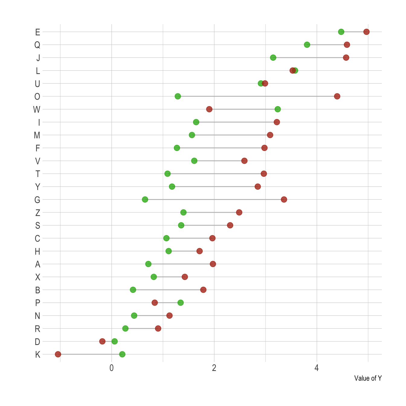
Note: The term cleveland dotplot does not look
to be very well defined as far as I know, and looks to be sometimes used
for dotplots
or classic
lollipop plots as well. The previous chart is also called Dumbbell dot
plots. Further investigation is needed on this matter and any
feedback is more than welcome.
Note that with a number of subgroups between 3 and ~7 this type of lollipop plot is nice as well:
# Create data (could be way easier but it's late)
value1 <- abs(rnorm(6))*2
don <- data.frame(
  x=LETTERS[1:24],
  val=c( value1, value1+1+rnorm(6, 14,1) ,value1+1+rnorm(6, sd=1) ,value1+1+rnorm(6, 12, 1) ),
  grp=rep(c("grp1", "grp2", "grp3", "grp4"), each=6)
  ) %>%
  arrange(val) %>%
  mutate(x=factor(x, x))


# With a bit more style
ggplot(don) +
  geom_segment( aes(x=x, xend=x, y=0, yend=val), color="grey") +
  geom_point( aes(x=x, y=val, color=grp), size=3 ) +
  coord_flip()+
  theme_ipsum() +
  theme(
    legend.position = "none",
    panel.border = element_blank(),
    panel.spacing = unit(0.1, "lines"),
    strip.text.x = element_text(size = 8)
  ) +
  xlab("") +
  ylab("Value of Y") +
  facet_wrap(~grp, ncol=1, scale="free_y")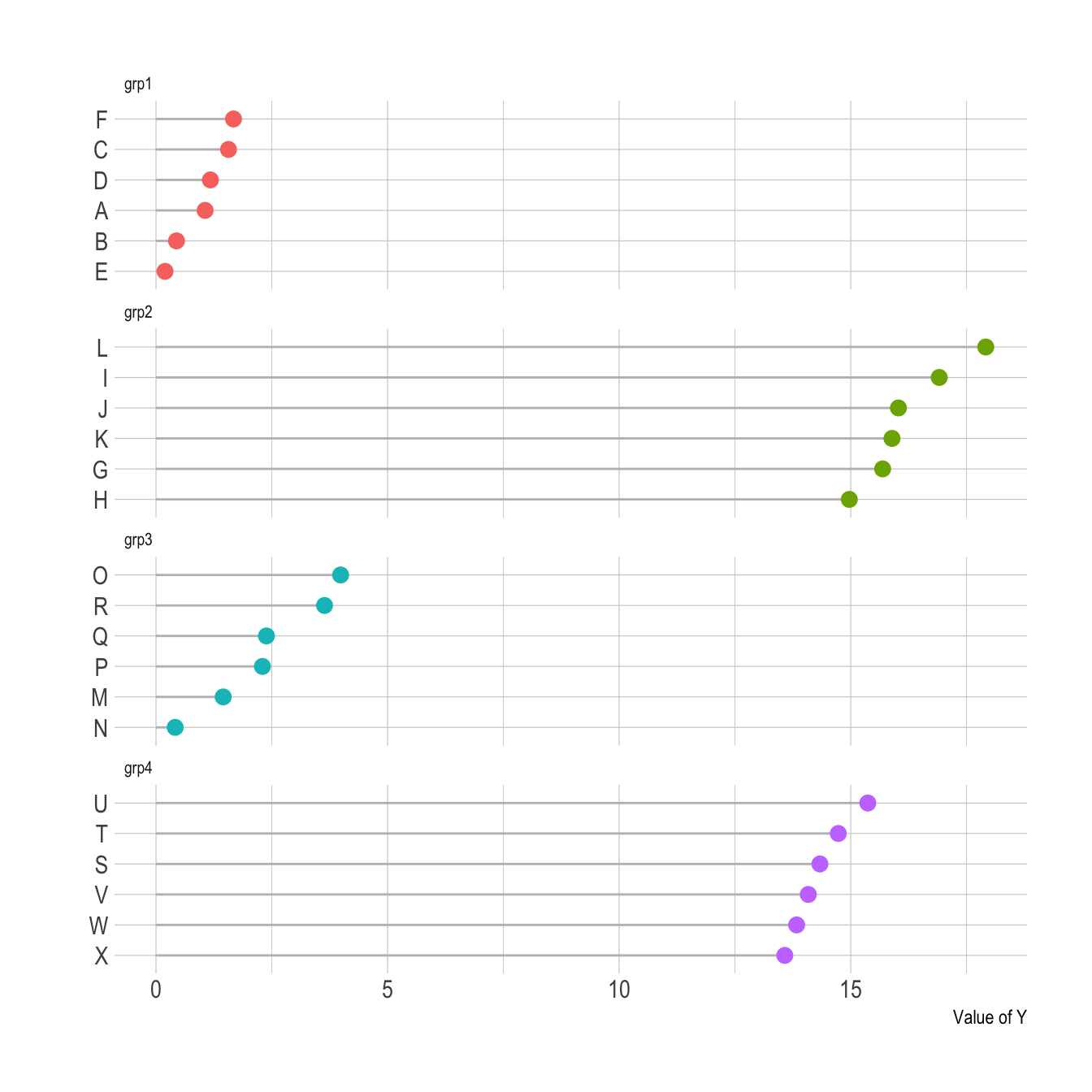
Order your groups. If the levels of your categoric variable have no obvious order, order the bars following their values.
If for whatever reason your bars must remain unsorted, it is probably better to use a barplot instead. Lollipop would be harder to read.
Several values per group? Don’t use a lollipop. Even with error bars, it hides information and other type of graphic like boxplot or violin are much more appropriate.
Think about the horizontal verison, it makes the labels easier to read.
Data To Viz is a comprehensive classification of chart types organized by data input format. Get a high-resolution version of our decision tree delivered to your inbox now!

A work by Yan Holtz for data-to-viz.com


