
Parallel coordinates plot
definition - mistake - related - code
Parallel plot or parallel coordinates plot allows to
compare the feature of several individual observations
(series) on a set of numeric variables. Each vertical bar
represents a variable and often has its own scale. (The units can even
be different). Values are then plotted as series of lines connected
across each axis.
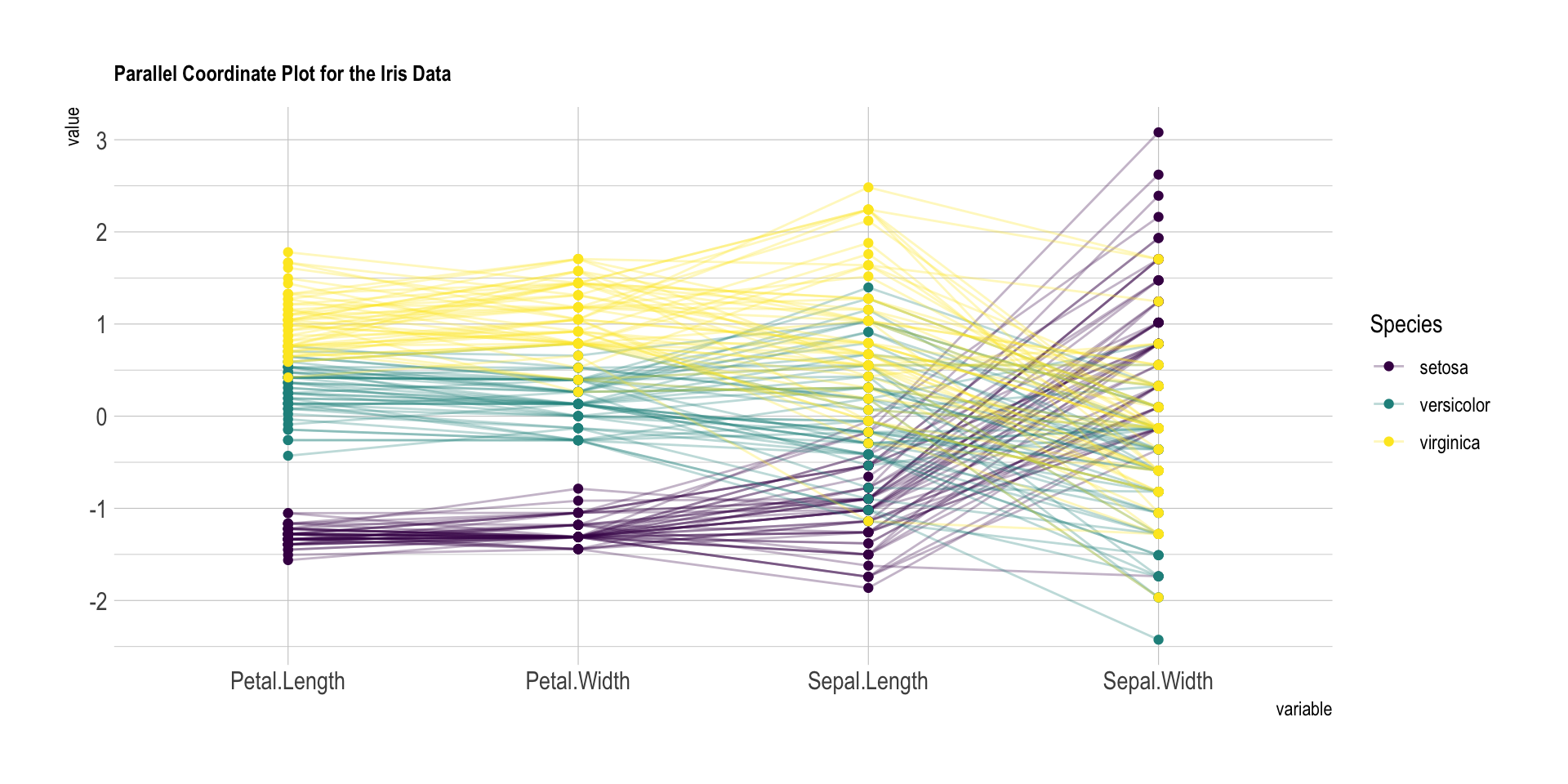
The ìris dataset provides four features (each
represented with a vertical line) for 150 flower samples (each
represented with a color line). Samples are grouped in three species.
The chart below highlights efficiently that setosa has smaller Petals,
but its sepal tends to be wider.
# Libraries
library(tidyverse)
library(hrbrthemes)
library(patchwork)
library(GGally)
library(viridis)

# Data set is provided by R natively
data <- iris

# Plot
data %>%
  ggparcoord(
    columns = 1:4, groupColumn = 5, order = "anyClass",
    showPoints = TRUE,
    title = "Parallel Coordinate Plot for the Iris Data",
    alphaLines = 0.3
    ) +
  scale_color_viridis(discrete=TRUE) +
  theme_ipsum()+
  theme(
    plot.title = element_text(size=10)
  )
Note: Parallel plot is the equivalent of a spider chart, but with cartesian coordinates. Thus, it is often prefered.
A parallel plot allows to study the features of samples for
several quantitative variables. Its strength is that the
variables can even be completely different: different
ranges and even different units.
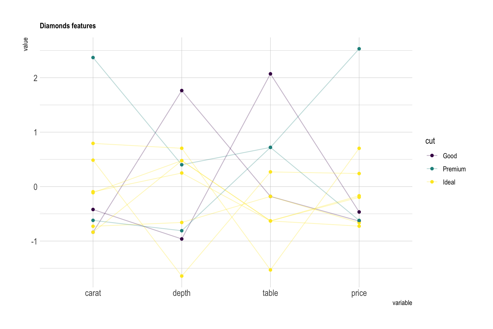
In the graphic above flower features were grouped in species, and all variables were normalized and sharing the same unit (cm). Here is another example where diamonds are compared for 4 variables that share different units, like the price in $ or depth in %. Note the use of scaling to be able to compare them.
diamonds %>%
  sample_n(10) %>%
    ggparcoord(
      columns = c(1,5:7),
      groupColumn = 2,
      #order = "anyClass",
      showPoints = TRUE,
      title = "Diamonds features",
      alphaLines = 0.3
      ) +
    scale_color_viridis(discrete=TRUE) +
    theme_ipsum()+
    theme(
      plot.title = element_text(size=10)
    )
Here is an overview of the parallel coordinates features you can play with:
# Plot
p1 <- data %>%
  ggparcoord(
    columns = 1:4, groupColumn = 5, order = "anyClass",
    scale="globalminmax",
    showPoints = TRUE,
    title = "No scaling",
    alphaLines = 0.3
    ) +
  scale_color_viridis(discrete=TRUE) +
  theme_ipsum()+
  theme(
    legend.position="none",
    plot.title = element_text(size=10)
  ) +
  xlab("")

p2 <- data %>%
  ggparcoord(
    columns = 1:4, groupColumn = 5, order = "anyClass",
    scale="uniminmax",
    showPoints = TRUE,
    title = "Standardize to Min = 0 and Max = 1",
    alphaLines = 0.3
    ) +
  scale_color_viridis(discrete=TRUE) +
  theme_ipsum()+
  theme(
    legend.position="none",
    plot.title = element_text(size=10)
  ) +
  xlab("")


p3 <- data %>%
  ggparcoord(
    columns = 1:4, groupColumn = 5, order = "anyClass",
    scale="std",
    showPoints = TRUE,
    title = "Normalize univariately (substract mean & divide by sd)",
    alphaLines = 0.3
    ) +
  scale_color_viridis(discrete=TRUE) +
  theme_ipsum()+
  theme(
    legend.position="none",
    plot.title = element_text(size=10)
  ) +
  xlab("")


p4 <- data %>%
  ggparcoord(
    columns = 1:4, groupColumn = 5, order = "anyClass",
    scale="center",
    showPoints = TRUE,
    title = "Standardize and center variables",
    alphaLines = 0.3
    ) +
  scale_color_viridis(discrete=TRUE) +
  theme_ipsum()+
  theme(
    legend.position="none",
    plot.title = element_text(size=10)
  ) +
  xlab("")


p1 + p2 + p3 + p4 + plot_layout(ncol = 2)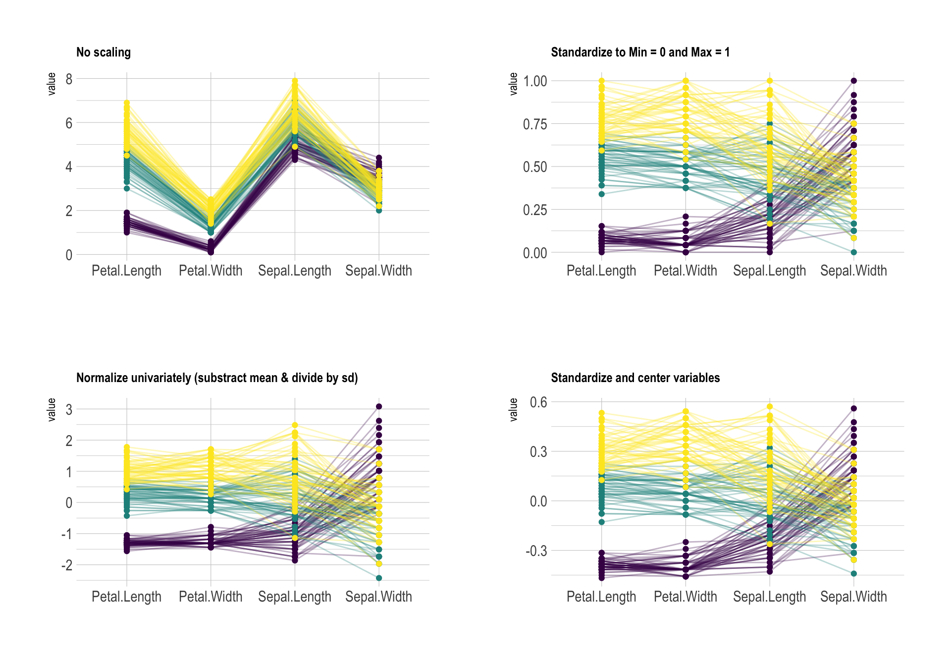
clutter of your parallel plot. Basically, the
goal is to minimize the number of cross between series. On the next
figure, the left plot is much harder to understand the the right one.
Only variable order is different.# Plot
p1 <- data %>%
ggparcoord(
columns = 1:4, groupColumn = 5, order = c(1:4),
showPoints = TRUE,
title = "Original",
alphaLines = 0.3
) +
scale_color_viridis(discrete=TRUE) +
theme_ipsum()+
theme(
legend.position="Default",
plot.title = element_text(size=10)
) +
xlab("")
p2 <- data %>%
ggparcoord(
columns = 1:4, groupColumn = 5, order = "anyClass",
showPoints = TRUE,
title = "Re-ordered",
alphaLines = 0.3
) +
scale_color_viridis(discrete=TRUE) +
theme_ipsum()+
theme(
legend.position="none",
plot.title = element_text(size=10)
) +
xlab("")
p1 + p2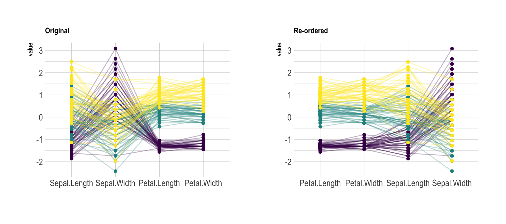
# Plot
data %>%
  ggparcoord(
    columns = 1:4, groupColumn = 5, order = "anyClass",
    showPoints = TRUE,
    title = "Original",
    alphaLines = 0.3
    ) +
  scale_color_manual(values=c( "#69b3a2", "grey", "grey") ) +
  theme_ipsum()+
  theme(
    legend.position="Default",
    plot.title = element_text(size=10)
  ) +
  xlab("")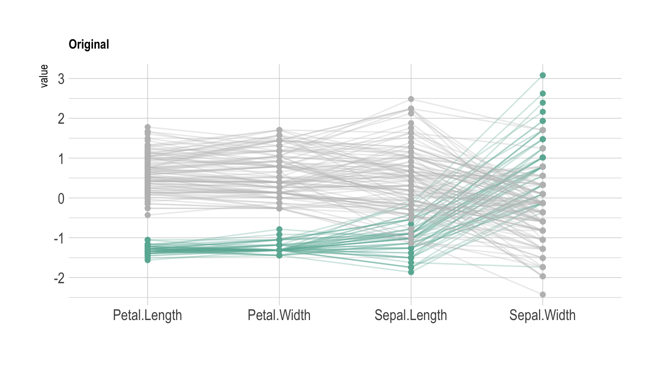
Data To Viz is a comprehensive classification of chart types organized by data input format. Get a high-resolution version of our decision tree delivered to your inbox now!

A work by Yan Holtz for data-to-viz.com


