Decluttering your chart
A collection of common
dataviz caveats
by Data-to-Viz.com
Getting rid of all the unnecessary elements can greatly improve the quality and impact of your chart. First, the chart will be cleaner and thus more likely to be read by people. Second, it will allow people to target directly what is important on the chart, and thus to get your point.
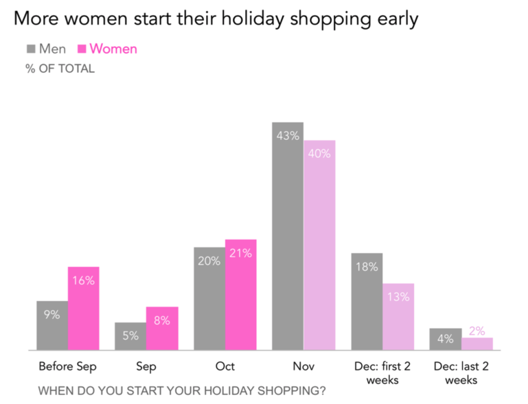
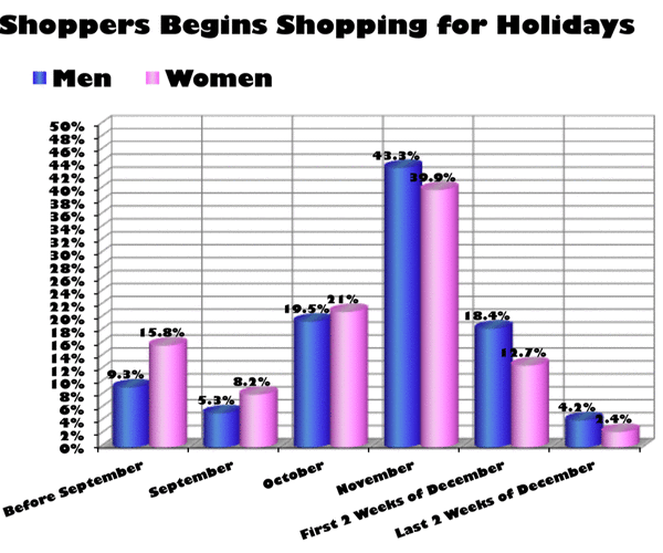
Here is a good example that takes a cluttered graphic from viz.wtf and gets rid of the unnecessary elements. This example comes from the website Storytelling with data by Cole Nussbaumer Knaflic.
The idea of the chart is to show that women tend to begin Christmas shopping earlier than men:

Here are the components you can consider removing when making a chart:
Here is an animation showing the evolution of the previous chart at each step of the improvement:
Data To Viz is a comprehensive classification of chart types organized by data input format. Get a high-resolution version of our decision tree delivered to your inbox now!

A work by Yan Holtz for data-to-viz.com