Life expectancy, gdp per capita and population size
A few data analytics ideas from
Data-to-Viz.com


This document gives a few suggestions to analyse a
dataset composed by three numeric variables. It considers
an abstract of the Gapminder dataset made famous
through the Hans
Rosling Ted Talk. It provides the average life expectancy, gdp per
capita and population size for more than 100 countries. This dataset is
available through the gapminder R package and you can
download it here.
The table beside shows a glimpse of it.
# Libraries
library(tidyverse)
library(hrbrthemes)
library(viridis)
library(kableExtra)
options(knitr.table.format = "html")
library(plotly)
library(gridExtra)
library(ggrepel)

# The dataset is provided in the gapminder library
library(gapminder)
data <- gapminder %>% filter(year=="2007") %>% select(-year)

# show data
data %>% head(6) %>%
  mutate(gdpPercap=round(gdpPercap,0)) %>%
  mutate(pop=round(pop/1000000,2)) %>%
  mutate(lifeExp=round(lifeExp,1)) %>%
  kable() %>%
kable_styling(bootstrap_options = "striped", full_width = F)| country | continent | lifeExp | pop | gdpPercap |
|---|---|---|---|---|
| Afghanistan | Asia | 43.8 | 31.89 | 975 |
| Albania | Europe | 76.4 | 3.60 | 5937 |
| Algeria | Africa | 72.3 | 33.33 | 6223 |
| Angola | Africa | 42.7 | 12.42 | 4797 |
| Argentina | Americas | 75.3 | 40.30 | 12779 |
| Australia | Oceania | 81.2 | 20.43 | 34435 |
The go to graph in that kind of situation is probably the bubble plot. The bubble plot is really close to a scatterplot since it shows the value of two numeric variables on the X and Y axis. However, it allows to study the value of a third variable using different sizes for the dots (that are thus called bubbles).
# Show a bubbleplot
data %>%
  mutate(pop=pop/1000000) %>%
  arrange(desc(pop)) %>%
  mutate(country = factor(country, country)) %>%
  ggplot( aes(x=gdpPercap, y=lifeExp, size = pop, color = continent)) +
    geom_point(alpha=0.7) +
    scale_size(range = c(1.4, 19), name="Population (M)") +
    scale_color_viridis(discrete=TRUE, guide=FALSE) +
    theme_ipsum() +
    theme(legend.position="bottom")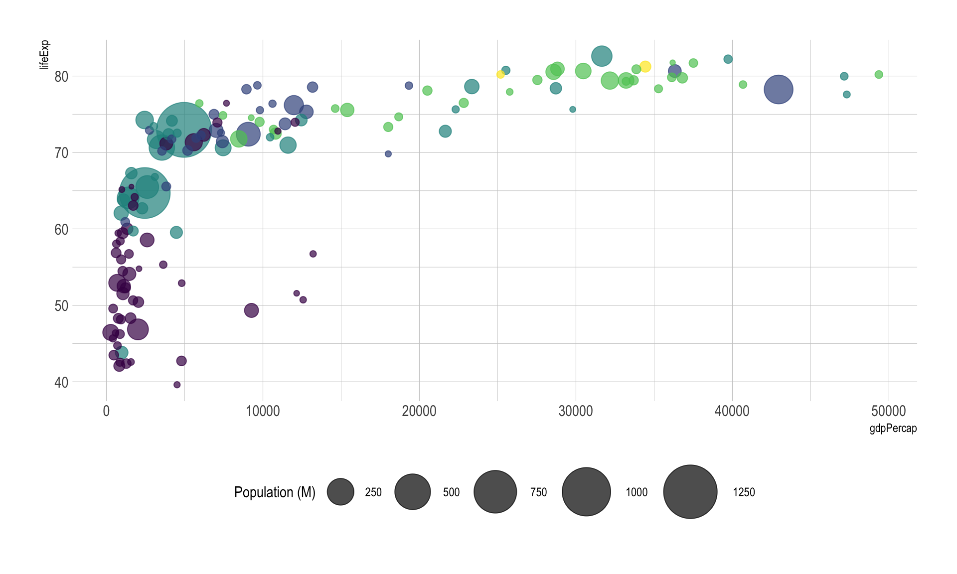
The problem with bubble plot is that the relationship between the variable of the X and Y axis is much more obvious than the relationship with the third variable. Thus you must prioritize your variables and be sure of what you want to show. Before doing that kind of chart, I believe it is a good practice to try other combinations:
p2 <- data %>%
  mutate(pop=pop/1000000) %>%
  arrange(desc(pop)) %>%
  mutate(country = factor(country, country)) %>%
  ggplot( aes(x=gdpPercap, y=pop, size = lifeExp, color = continent)) +
    geom_point(alpha=0.7) +
    scale_color_viridis(discrete=TRUE) +
    scale_y_log10() +
    theme_ipsum() +
    theme(legend.position="none")

p3 <- data %>%
  mutate(pop=pop/1000000) %>%
  arrange(desc(pop)) %>%
  mutate(country = factor(country, country)) %>%
  ggplot( aes(x=lifeExp, y=pop, size = gdpPercap, color = continent)) +
    geom_point(alpha=0.7) +
    scale_color_viridis(discrete=TRUE) +
    scale_y_log10() +
    theme_ipsum() +
    theme(legend.position="none")


grid.arrange(p2,p3, ncol=2)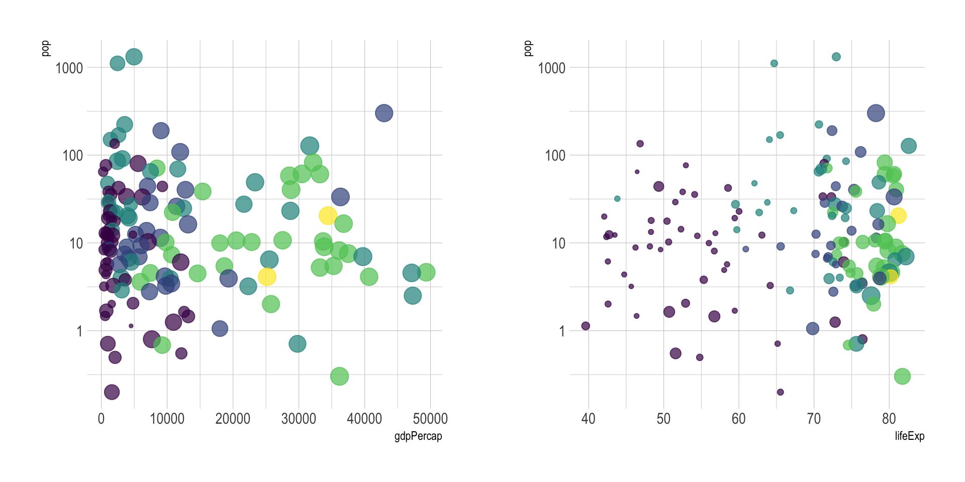
In this case there is no obvious relationship between opulation and other metrics so it makes sense to use population for the bubble size.
If you just want to highlight the relationship between gbp per capita and life Expectancy you’ve probably done most of the work now. However, it is a good practice to highlight a few interesting dots in this chart to give more insight to the plot:
# Prepare data
tmp <- data %>%
 mutate(
   annotation = case_when(
    gdpPercap > 5000 & lifeExp < 60 ~ "yes",
    lifeExp < 30 ~ "yes",
     gdpPercap > 40000 ~ "yes"
    )
) %>%
mutate(pop=pop/1000000) %>%
  arrange(desc(pop)) %>%
  mutate(country = factor(country, country))

# Plot
ggplot( tmp, aes(x=gdpPercap, y=lifeExp, size = pop, color = continent)) +
    geom_point(alpha=0.7) +
    scale_size(range = c(1.4, 19), name="Population (M)") +
    scale_color_viridis(discrete=TRUE) +
    theme_ipsum() +
    theme(legend.position="none") +
    geom_text_repel(data=tmp %>% filter(annotation=="yes"), aes(label=country), size=4 )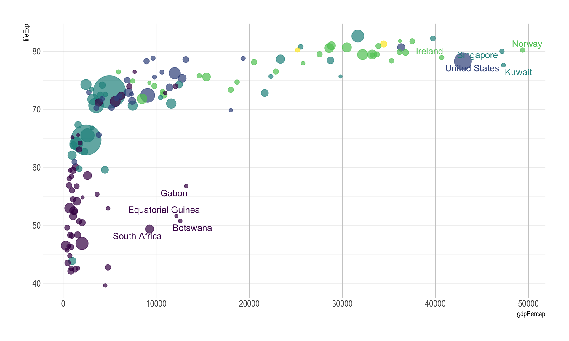
Last but not least, note that bubble plot is probably the type of chart where using interactivity makes the more sense. In the following plot you can hover bubbles to get more information and zoom on a specific part of the graphic.
# Interactive version
p <- data %>%
  mutate(gdpPercap=round(gdpPercap,0)) %>%
  mutate(pop=round(pop/1000000,2)) %>%
  mutate(lifeExp=round(lifeExp,1)) %>%
  arrange(desc(pop)) %>%
  mutate(country = factor(country, country)) %>%
  mutate(text = paste("Country: ", country, "\nPopulation (M): ", pop, "\nLife Expectancy: ", lifeExp, "\nGdp per capita: ", gdpPercap, sep="")) %>%
  ggplot( aes(x=gdpPercap, y=lifeExp, size = pop, color = continent, text=text)) +
    geom_point(alpha=0.7) +
    scale_size(range = c(1.4, 19), name="Population (M)") +
    scale_color_viridis(discrete=TRUE, guide=FALSE) +
    theme_ipsum() +
    theme(legend.position="none")

ggplotly(p, tooltip="text")
A specific use case where three numeric columns are
displayed is the grid system. In this case, the two first columns gives
the grid coordinates, and the third variable gives a numeric value for
each position of the grid. For example, the volcano data set provides
that altitude of each point of the grid of a volcano:
# prepare the dataset:
don <- volcano
colnames(don) <- seq(1,ncol(don))
don <- don %>%
  as.tibble() %>%
  mutate(lat=seq(1,nrow(don)) ) %>%
  gather(key="long", value="altitude", -lat)

# show data
don %>% head(6) %>% kable() %>%
kable_styling(bootstrap_options = "striped", full_width = F)| lat | long | altitude |
|---|---|---|
| 1 | 1 | 100 |
| 2 | 1 | 101 |
| 3 | 1 | 102 |
| 4 | 1 | 103 |
| 5 | 1 | 104 |
| 6 | 1 | 105 |
This kind of data can be represented using a heatmap (2d):
don %>%
  na.omit() %>%
  ggplot(aes(x=as.numeric(long), y=lat, fill=altitude)) +
    geom_tile() +
    scale_fill_viridis() +
    theme_ipsum() +
    xlab("longitude") +
    ylab("latitude")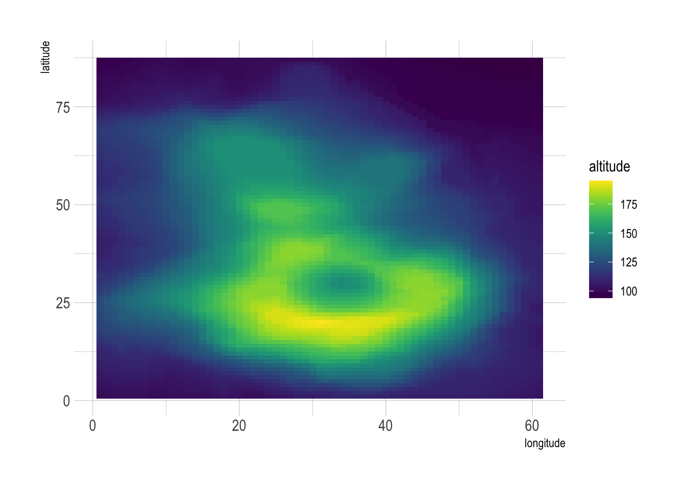
Another way is to build a surface plot. It really makes sense to use 3D in this special case since it allows to visualize the real shape of the volcano:
You can learn more about each type of graphic presented in this story in the dedicated sections. Click the icon below:
Data To Viz is a comprehensive classification of chart types organized by data input format. Get a high-resolution version of our decision tree delivered to your inbox now!

A work by Yan Holtz for data-to-viz.com