Evolution of baby names in the US
A few data analytics ideas from
Data-to-Viz.com


This document aims to describe a few dataviz that can be
applied to a dataset containing an ordered numeric variable, a categoric
variable and another numeric variable. An an example we will consider
the evolution of baby name frequencies in the US between 1880 and 2015.
This dataset is available through the babynames R library and a
.csv version is available on github.
It looks as follow:
# Libraries
library(tidyverse)
library(hrbrthemes)
library(kableExtra)
options(knitr.table.format = "html")
library(babynames)
library(streamgraph)
library(viridis)
library(DT)
library(plotly)

# Load dataset from github
data <- babynames %>%
  filter(name %in% c("Ashley", "Amanda", "Jessica",    "Patricia", "Linda", "Deborah",   "Dorothy", "Betty", "Helen")) %>%
  filter(sex=="F")

# Show long format
data %>%
  select(year, name, n) %>%
  head(5) %>%
  arrange(name) %>%
  kable() %>%
kable_styling(bootstrap_options = "striped", full_width = F)| year | name | n |
|---|---|---|
| 1880 | Amanda | 241 |
| 1880 | Betty | 117 |
| 1880 | Dorothy | 112 |
| 1880 | Helen | 636 |
| 1880 | Linda | 27 |
It is of importance to note that the following table provides exactly the same information, but in a different format. We call it ‘long’ and ‘wide’ format and most tools provide function to go from one to the other. In any case, we will apply the same kind of visualization to both format.
wide <- data %>%
  select(year, name, n) %>%
  spread(name, n)

wide %>%
  head(3) %>%
  select(1:5) %>%
  kable() %>%
kable_styling(bootstrap_options = "striped", full_width = F)| year | Amanda | Ashley | Betty | Deborah |
|---|---|---|---|---|
| 1880 | 241 | NA | 117 | 12 |
| 1881 | 263 | NA | 112 | 14 |
| 1882 | 288 | NA | 123 | 15 |
The first obvious solution to represent this dataset is to produce a line chart. Each baby name is represented by a line. The X axis gives the year and the Y axis shows the number of babies.
data %>%
  ggplot( aes(x=year, y=n, group=name, color=name)) +
    geom_line() +
    scale_color_viridis(discrete = TRUE) +
    theme(legend.position="none") +
    ggtitle("Popularity of American names in the previous 30 years") +
    theme_ipsum()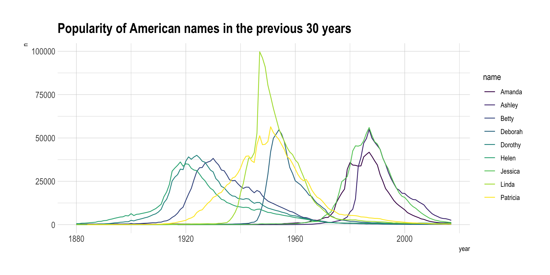
Line charts tend to be too cluttered as soon as more than a few groups are displayed. This is a common mistake in dataviz, so common that it has been named spaghetti chart. Thus this solution is usually applied if you want to highlight a specific group from the whole dataset. For example, let’s highlight the evolution of Amanda compared to the other first names:
data %>%
  mutate(highlight = ifelse(name == "Amanda", "Amanda", "Other")) %>%
  ggplot(aes(x = year, y = n, group = name, color = highlight, size = highlight)) +
  geom_line() +
  scale_color_manual(values = c("#69b3a2", "lightgrey")) +
  scale_size_manual(values = c(1.5, 0.2)) +
  theme(legend.position = "none") +
  ggtitle("Popularity of American names in the previous 30 years") +
  theme_ipsum() +
  geom_label(x = 1990, y = 55000, label = "Amanda reached 3550\nbabies in 1970", size = 4, color = "#69b3a2") +
  theme(
    legend.position = "none",
    plot.title = element_text(size = 14)
  )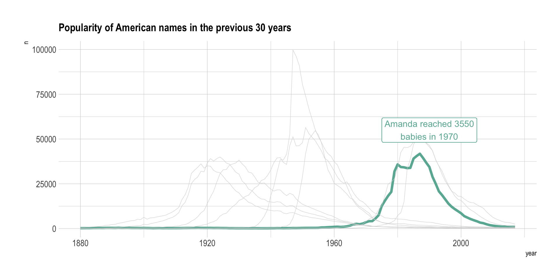
This is a good way to describe the behavior of a specific group in the dataset.
Area chart can be used to have a more general overview of the dataset, especially when used in combination with small multiple. In the following chart it is easy to get a glimpse of the evolution of any name:
data %>%
  ggplot( aes(x=year, y=n, group=name, fill=name)) +
    geom_area() +
    scale_fill_viridis(discrete = TRUE) +
    theme(legend.position="none") +
    ggtitle("Popularity of American names in the previous 30 years") +
    theme_ipsum() +
    theme(
      legend.position="none",
      panel.spacing = unit(0.1, "lines"),
      strip.text.x = element_text(size = 8)
    ) +
    facet_wrap(~name, scale="free_y")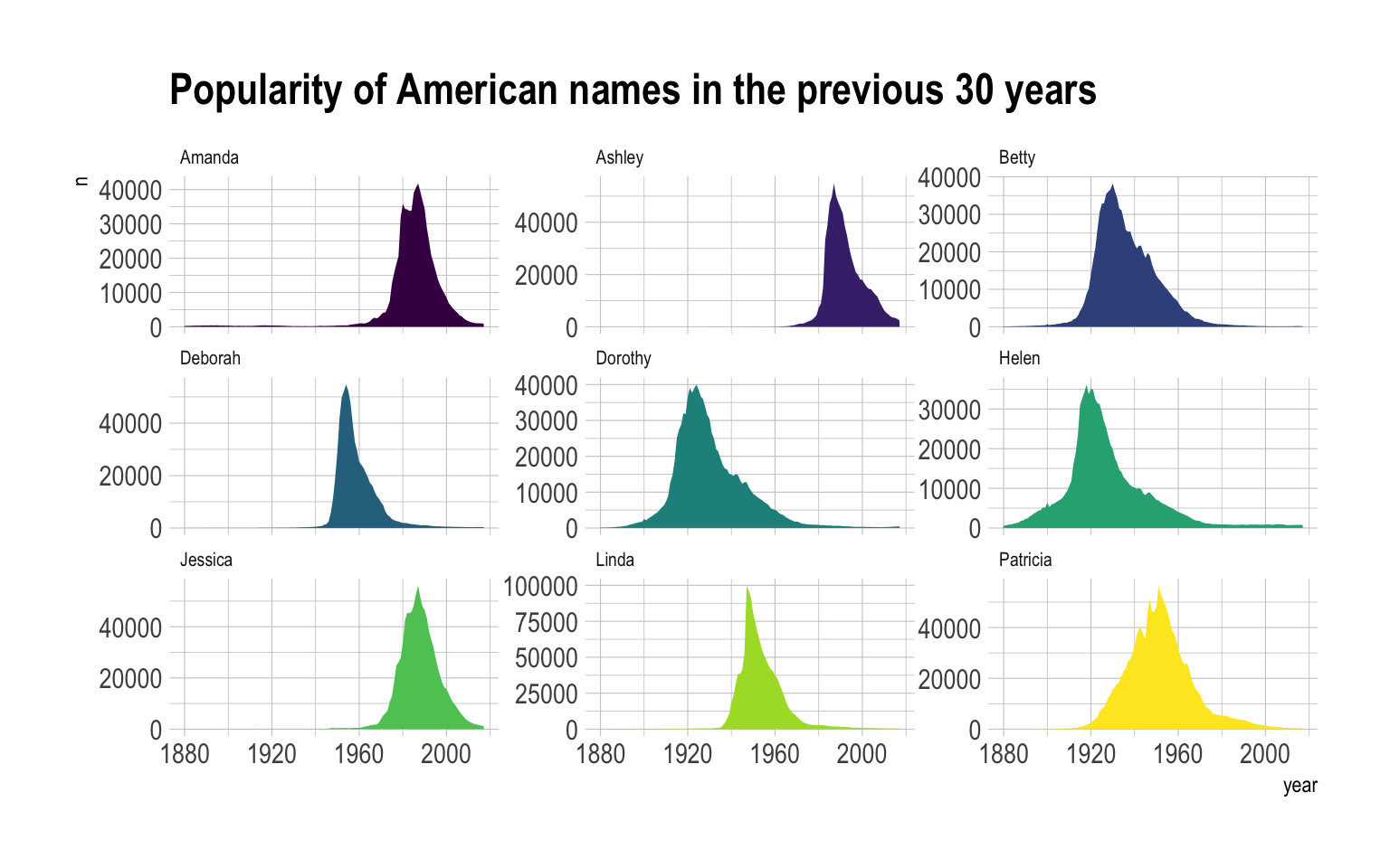
Stack area chart can be used to have a more general overview of the dataset: the goal here is not to study the evolution of each group individually, but more to understand if any group had a huge prevalence at a specific period. Note that the use of interactivity is a real plus here. Instead of having a complex legend hardly linked with the areas, hovering a specific group reveals its name.
p <- data %>%
  ggplot( aes(x=year, y=n, fill=name, text=name)) +
    geom_area( ) +
    scale_fill_viridis(discrete = TRUE) +
    theme(legend.position="none") +
    ggtitle("Popularity of American names in the previous 30 years") +
    theme_ipsum() +
    theme(legend.position="none")
ggplotly(p, tooltip="text")
A variation of the stacked area graph is the percent
stacked area graph. It is the same thing but value of each group are
normalized at each time stamp. That allows to study the percentage of
each group in the whole.
# Compute the proportions:
p <- data %>%
  group_by(year) %>%
  mutate(freq = n / sum(n)) %>%
  ungroup() %>%
  ggplot( aes(x=year, y=freq, fill=name, color=name, text=name)) +
    geom_area(  ) +
    scale_fill_viridis(discrete = TRUE) +
    scale_color_viridis(discrete = TRUE) +
    theme(legend.position="none") +
    ggtitle("Popularity of American names in the previous 30 years") +
    theme_ipsum() +
    theme(legend.position="none")
ggplotly(p, tooltip="text")The streamgraph is a variation fo the stacked area graph where edges are rounded, what gives this nice impression of flow. Moreover, areas are usually displaced around a central axis, resulting in a flowing and organic shape.
This probably overtakes the topic of data-to-viz.com but one probably wants to clusterise groups based on their evolution. For instance, it would be of interest to automatically detect that Patricia and Linda have similar patterns: very frequent between 1930 and 1970, and almost no occurence otherwise.
PCA can be used to find that kind of clusters:
fit <- wide %>%
  mutate_all(funs(replace(., is.na(.), 0))) %>%
  select(-1) %>%
  t() %>%
  prcomp(scale=T)

# A dataframe with position of individuals on PCs
data <- data.frame(obsnames=row.names(fit$x), fit$x)

# Plot
ggplot(data, aes(x=PC1, y=PC2)) +
  geom_text(alpha=.4, linewidth=3, aes(label=obsnames)) +
  geom_hline(aes(yintercept=0), linewidth=.2) +
  geom_vline(aes(xintercept=0), linewidth=.2) +
  coord_equal() +
  theme_ipsum()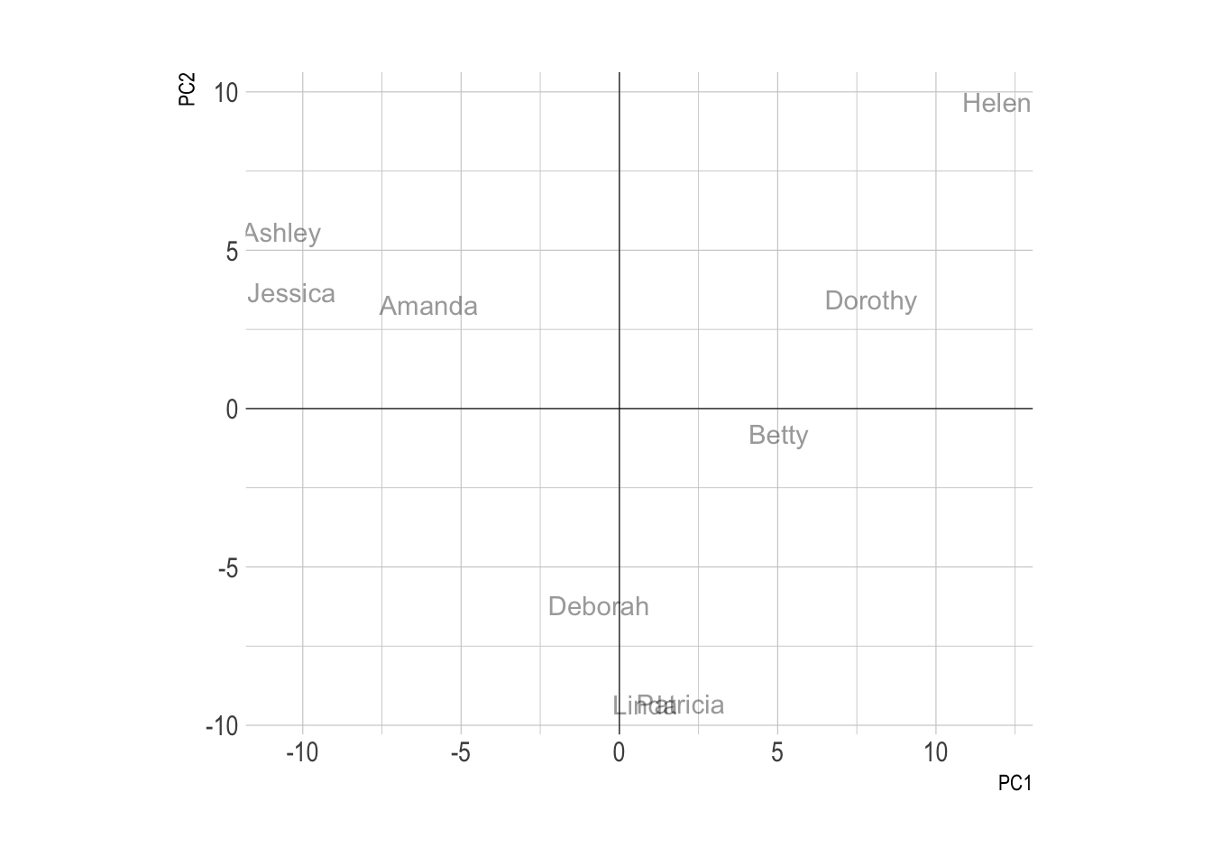
You can learn more about each type of graphic presented in this story in the dedicated sections. Click the icon below:
Data To Viz is a comprehensive classification of chart types organized by data input format. Get a high-resolution version of our decision tree delivered to your inbox now!

A work by Yan Holtz for data-to-viz.com