Visualizing geographic connections
A few data analytics ideas from
Data-to-Viz.com

This document provides a few suggestions for the visualization of geographical connections.
The dataset considered here is available on github. It is based on about 13,000 tweets containing the #surf hashtag. These tweets have been recovered on a 10 months period, and those with both current geo location and correct city of origin have been kept. You can learn more on this project in this dedicated github repository.
The dataset provides longitude and latitude for both the home location of tweeters, and their instant geolocation as well. Basically it looks like that:
# Libraries
library(tidyverse)
library(hrbrthemes)
library(viridis)
library(DT)
library(kableExtra)
options(knitr.table.format = "html")
library(jpeg)
library(maps)
library(geosphere)
library(grid)

#load(url("https://github.com/holtzy/About-Surfers-On-Twitter/raw/master/DATA/Surf_Hashtag_Data.Rdata"))
#data <- data %>% select(homename, homecontinent, homecountry, homelat, homelon, travelcontinent, travelcountry, travellat, travellon) %>% na.omit()
#write.table(data, file="/Users/y.holtz/Dropbox/data_to_viz/Example_dataset/19_MapConnection.csv", quote=TRUE, row.names=FALSE, sep=",")

# Load dataset from github (Surfer project)
data <- read.table("https://github.com/holtzy/data_to_viz/raw/master/Example_dataset/19_MapConnection.csv", header=T, sep=",")

# Show long format
tmp <- data %>%
  tail(5) %>%
  mutate(homename = gsub( ", Western Australia", "", homename)) %>%
  mutate(homename = gsub( ", France", "", homename)) %>%
  mutate(homename = gsub( " - Bali - Indonesia", "", homename)) %>%
  mutate(homelat=round(homelat,1), homelon=round(homelon,1), travellat=round(travellat,1), travellon=round(travellon,1)) %>%
  select(homename, homelat, homelon, travelcountry, travellat, travellon)

tmp %>% kable() %>% kable_styling(bootstrap_options = "striped", full_width = F)| homename | homelat | homelon | travelcountry | travellat | travellon | |
|---|---|---|---|---|---|---|
| 9507 | Bridgetown | -34.0 | 116.1 | Australia | -34.2 | 115.0 |
| 9508 | Lille | 50.6 | 3.1 | France | 45.0 | -1.2 |
| 9509 | MX | 23.6 | -102.6 | Mexico | 21.0 | -101.2 |
| 9510 | Kuta | -8.7 | 115.2 | Indonesia | -8.7 | 115.2 |
| 9511 | Kuta | -8.7 | 115.2 | Indonesia | -8.7 | 115.2 |
Before showing all the relationships provided in this dataset, it is important to understand how to visualize a unique connection on a map. It is a common practice to link 2 points using the shortest route between them instead of a straight line. It is called great circles. A special care is given for situations where cities are very far from each other and where the shortest connection thus passes behind the map.
Here are the connection between 7 major cities on a world map:
don=rbind(
    Paris=c(2,49),
    Melbourne=c(145,-38),
    Saint.Petersburg=c(30.32, 59.93),
    Abidjan=c(-4.03, 5.33),
    Montreal=c(-73.57, 45.52),
    Nairobi=c(36.82, -1.29),
    Salvador=c(-38.5, -12.97)
    )  %>% as.data.frame()
colnames(don)=c("long","lat")


all_pairs=cbind(t(combn(don$long, 2)), t(combn(don$lat, 2))) %>% as.data.frame()
colnames(all_pairs)=c("long1","long2","lat1","lat2")

plot_my_connection=function( dep_lon, dep_lat, arr_lon, arr_lat, ...){
    inter <- gcIntermediate(c(dep_lon, dep_lat), c(arr_lon, arr_lat), n=50, addStartEnd=TRUE, breakAtDateLine=F)
    inter=data.frame(inter)
    diff_of_lon=abs(dep_lon) + abs(arr_lon)
    if(diff_of_lon > 180){
        lines(subset(inter, lon>=0), ...)
        lines(subset(inter, lon<0), ...)
    }else{
        lines(inter, ...)
        }
}

# background map
par(mar=c(0,0,0,0))
map('world',col="#f2f2f2", fill=TRUE, bg="white", lwd=0.05,mar=rep(0,4),border=0, ylim=c(-80,80) )

# add every connections:
for(i in 1:nrow(all_pairs)){
    plot_my_connection(all_pairs$long1[i], all_pairs$lat1[i], all_pairs$long2[i], all_pairs$lat2[i], col="#69b3a2", lwd=1)
    }

# add points and names of cities
points(x=don$long, y=don$lat, col="#69b3a2", cex=2, pch=20)
text(rownames(don), x=don$long, y=don$lat,  col="black", cex=1, pos=4)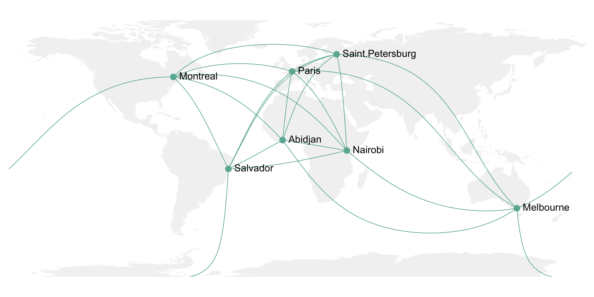
It is then possible to use the same method for the whole dataset composed of about 10,000 connections. With such a sample size, it makes sense to group the connections that have exactly the same starting and ending points. Then it is important to represent the connections with high volume on top of the graphic, and those with small volume below it. Indeed this will allow to highlight the most important pattern and hide the noise of rare connections.
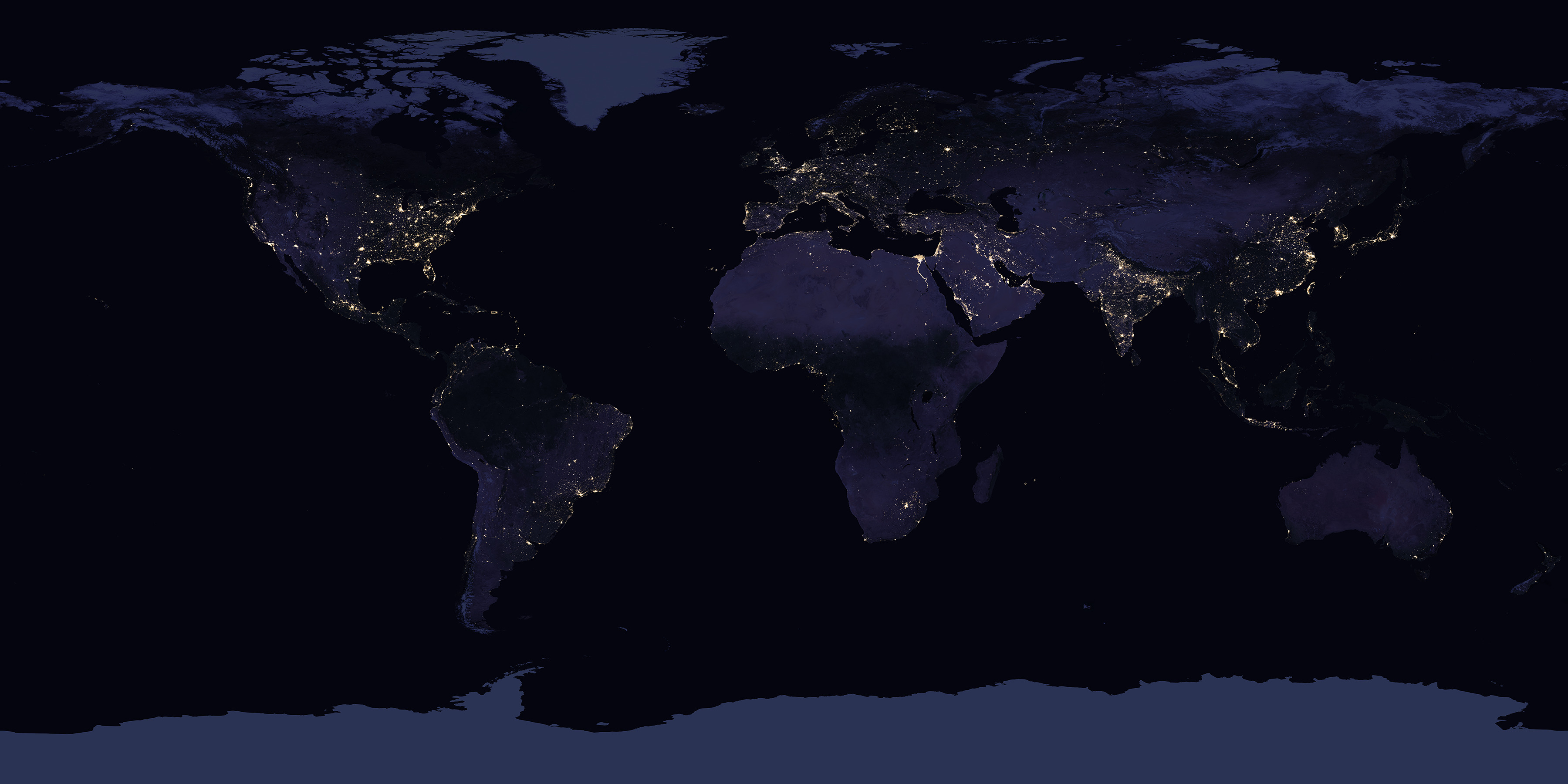
Here I choosed to use a NASA night lights image as a background, inspired from this blog post.
# Load dataset from github (Surfer project)
data <- read.table("https://github.com/holtzy/data_to_viz/raw/master/Example_dataset/19_MapConnection.csv", header=T, sep=",")

# Download NASA night lights image
download.file("https://raw.githubusercontent.com/holtzy/data_to_viz/master/story/IMG/BlackMarble_2016_01deg.jpg",
destfile = "IMG/BlackMarble_2016_01deg.jpg", mode = "wb")
# Load picture and render
earth <- readJPEG("IMG/BlackMarble_2016_01deg.jpg", native = TRUE)
earth <- rasterGrob(earth, interpolate = TRUE)

# Count how many times we have each unique connexion + order by importance
summary=data %>%
  dplyr::count(homelat,homelon,homecontinent, travellat,travellon,travelcontinent) %>%
  arrange(n)

# A function that makes a dateframe per connection (we will use these connections to plot each lines)
data_for_connection=function( dep_lon, dep_lat, arr_lon, arr_lat, group){
  inter <- gcIntermediate(c(dep_lon, dep_lat), c(arr_lon, arr_lat), n=50, addStartEnd=TRUE, breakAtDateLine=F)
  inter=data.frame(inter)
  inter$group=NA
  diff_of_lon=abs(dep_lon) + abs(arr_lon)
  if(diff_of_lon > 180){
    inter$group[ which(inter$lon>=0)]=paste(group, "A",sep="")
    inter$group[ which(inter$lon<0)]=paste(group, "B",sep="")
  }else{
    inter$group=group
  }
  return(inter)
}

# Création d'un dataframe complet avec les points de toutes les lignes à faire.
data_ready_plot=data.frame()
for(i in c(1:nrow(summary))){
  tmp=data_for_connection(summary$homelon[i], summary$homelat[i], summary$travellon[i], summary$travellat[i] , i)
  tmp$homecontinent=summary$homecontinent[i]
  tmp$n=summary$n[i]
  data_ready_plot=rbind(data_ready_plot, tmp)
}
data_ready_plot$homecontinent=factor(data_ready_plot$homecontinent, levels=c("Asia","Europe","Australia","Africa","North America","South America","Antarctica"))

# Plot
p <- ggplot() +
  annotation_custom(earth, xmin = -180, xmax = 180, ymin = -90, ymax = 90) +
  geom_line(data=data_ready_plot, aes(x=lon, y=lat, group=group, colour=homecontinent, alpha=n), size=0.6) +
  scale_color_brewer(palette="Set3") +
  theme_void() +
  theme(
        legend.position="none",
        panel.background = element_rect(fill = "black", colour = "black"),
        panel.spacing=unit(c(0,0,0,0), "null"),
        plot.margin=grid::unit(c(0,0,0,0), "cm"),
  ) +
  ggplot2::annotate("text", x = -150, y = -45, hjust = 0, size = 11, label = paste("Where surfers travel."), color = "white") +
  ggplot2::annotate("text", x = -150, y = -51, hjust = 0, size = 8, label = paste("data-to-viz.com | NASA.gov | 10,000 #surf tweets recovered"), color = "white", alpha = 0.5) +
  #ggplot2::annotate("text", x = 160, y = -51, hjust = 1, size = 7, label = paste("Cacedédi Air-Guimzu 2018"), color = "white", alpha = 0.5) +
  xlim(-180,180) +
  ylim(-60,80) +
  scale_x_continuous(expand = c(0.006, 0.006)) +
  coord_equal()

# Save at PNG
ggsave("IMG/Surfer_travel.png", width = 36, height = 15.22, units = "in", dpi = 90)
Please note that this map is available here if needed. Even if a connecting map is probably the best option for plotting this kind of dataset, please note that other representation like chord diagrams or networks could make a good job as well.
You can learn more about each type of graphic presented in this story in the dedicated sections. Click the icon below:
Data To Viz is a comprehensive classification of chart types organized by data input format. Get a high-resolution version of our decision tree delivered to your inbox now!

A work by Yan Holtz for data-to-viz.com